Order Subscription, 31st to 38th issue
Issues 31, 32, 33, 34, 35, 36, 37 & 38
8 × 20 pages and sometimes more
21 × 29,7 cm, CMYK
Design: Syndicat
2021-2022
Order Subscription, 31st to 38th issue
Issues 31, 32, 33, 34, 35, 36, 37 & 38
8 × 20 pages and sometimes more
21 × 29,7 cm, CMYK
Design: Syndicat
2021-2022
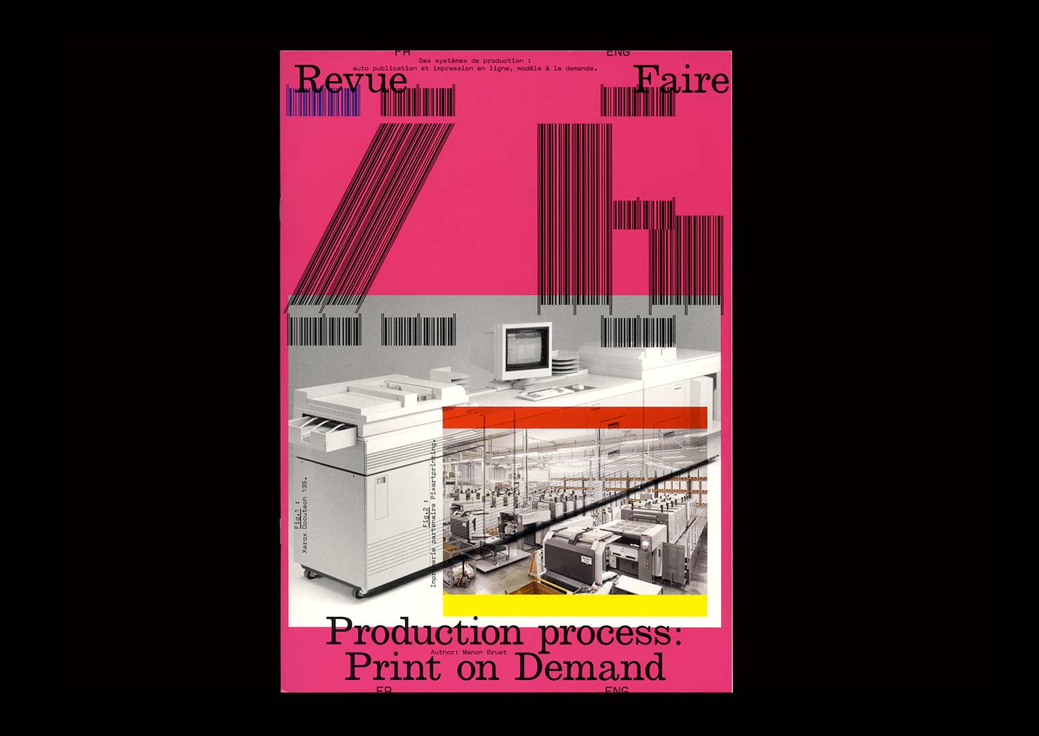
n°26 — Production process: Print on Demand. Author: Manon Bruet
Author: Manon Bruet
20 pages, 21 × 29,7 cm, CMYK
4th November 2020
ISBN: 979-10-95991-17-5
ISSN: 2558-2062
Author: Manon Bruet
20 pages, 21 × 29,7 cm, CMYK
4th November 2020
ISBN: 979-10-95991-17-5
ISSN: 2558-2062
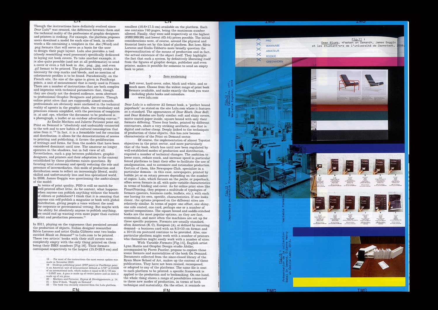
In 2008, English Graphic Designer James Goggin ran a two-day workshop with design students at the Hochschule Darmstadt in Germany. The object which resulted gradually took on the appearance of a photo album, a typeface specimen, and a color chart. On the cover, the phrase “Dear Lulu, Please try and print these line, color, pattern, format, texture and typography tests for us” is clearly addressed to the online print platform for which this book was proposed as a test.
Ten years later, the offer has become more diverse and the success of such online platforms is undeniable—indeed the phenomenon has spread well beyond the field of publishing. While some bemoan unfair competition for printers, others, professionals and amateurs, see in it a freedom to print and distribute relatively well finished objects at low cost.
The possibilities of these systems of production, are multiple but nonetheless limited, and this obviously raises the question of a possible standardization of forms and formats. However, when it comes to Print On Demand, it seems that the issue is not so much the materiality of an object (the choice of format, paper or a particular manufacture) but rather the actual existence of this object itself, outside of usual channels of production and distribution.
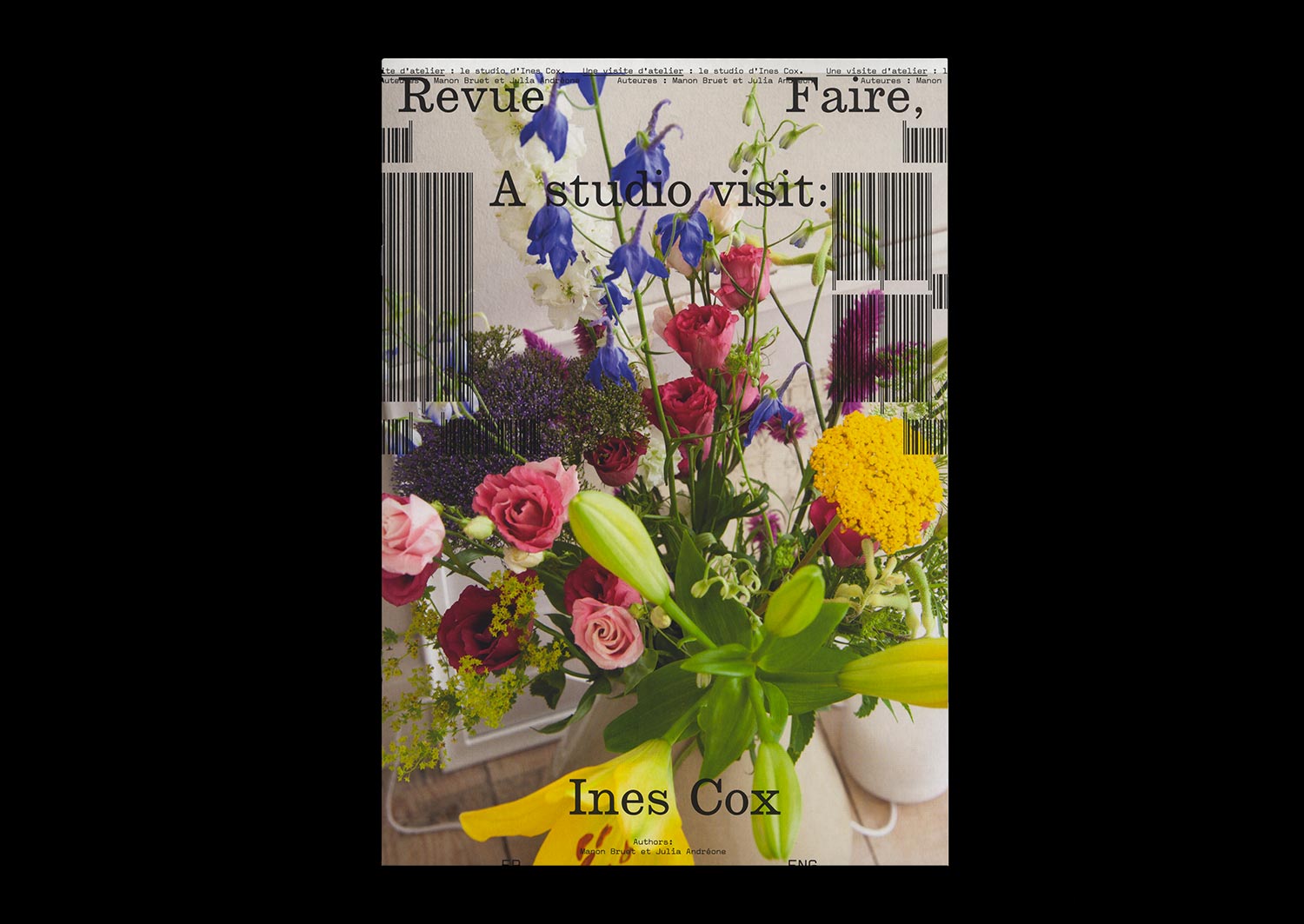
n°18 — A studio visit: Ines Cox. Authors: Manon Bruet and Julia Andréone
Author: Manon Bruet
Photos: Julia Andréone
20 pages, 21 × 29,7 cm, CMYK+1PMS
17 December 2019
ISBN: 979-10-95991-15-1
ISSN: 2558-2062
Author: Manon Bruet
Photos: Julia Andréone
20 pages, 21 × 29,7 cm, CMYK+1PMS
17 December 2019
ISBN: 979-10-95991-15-1
ISSN: 2558-2062
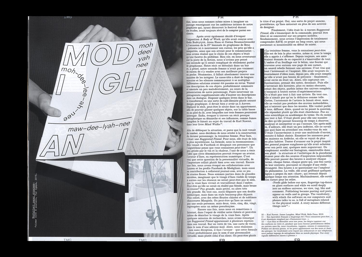
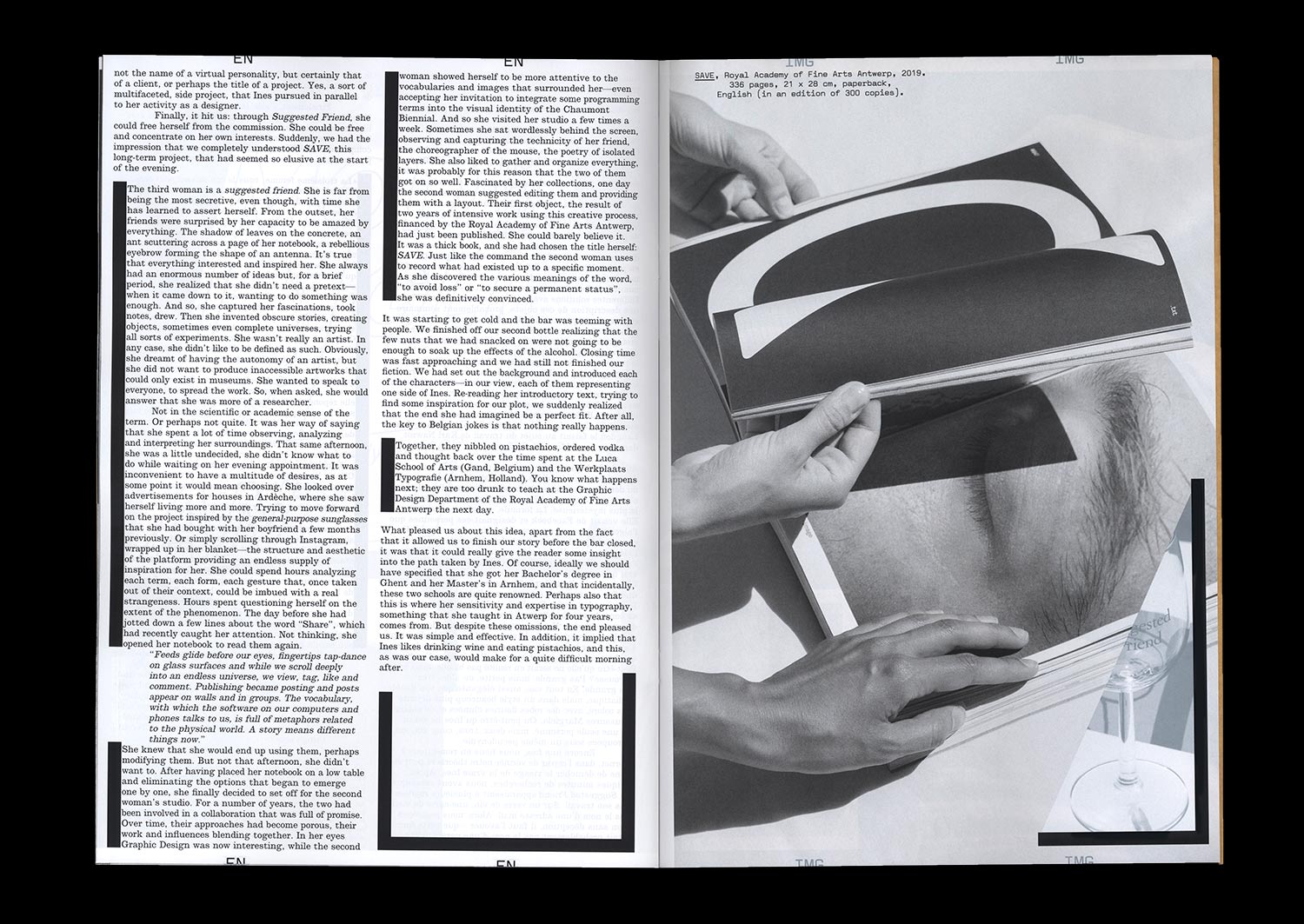
Three women walk into a bar. The first lives in a large apartment in Anvers, Belgium. The second is an independent Graphic Designer who founded her own studio. The third is an avatar—you might even know her—with a certain interest in creative processes, their interfaces, and their vocabularies. Together, they eat some pistachio nuts, order vodka, and are not at all sure about getting up the next day to teach at the Royal Academy of Fine Arts. But together, more than anything else, they form the troubling multiple personality of Ines Cox, a Belgian Graphic Designer who met Julia Andréone and Manon Bruet in her studio in June 2019. An opportunity to develop a narrative driven by three voices and to trace the outline of a path, a practice, and a figure.
Jonathan Monk, «Exhibit Model Four», 2019 Kindl, Berlin. Photographie: Jens Ziehe. Affiche A1 imprimée en CMJN sur papier dos bleu, exemplaire signé par l’artiste (1/25)