n°55 — Matrix font
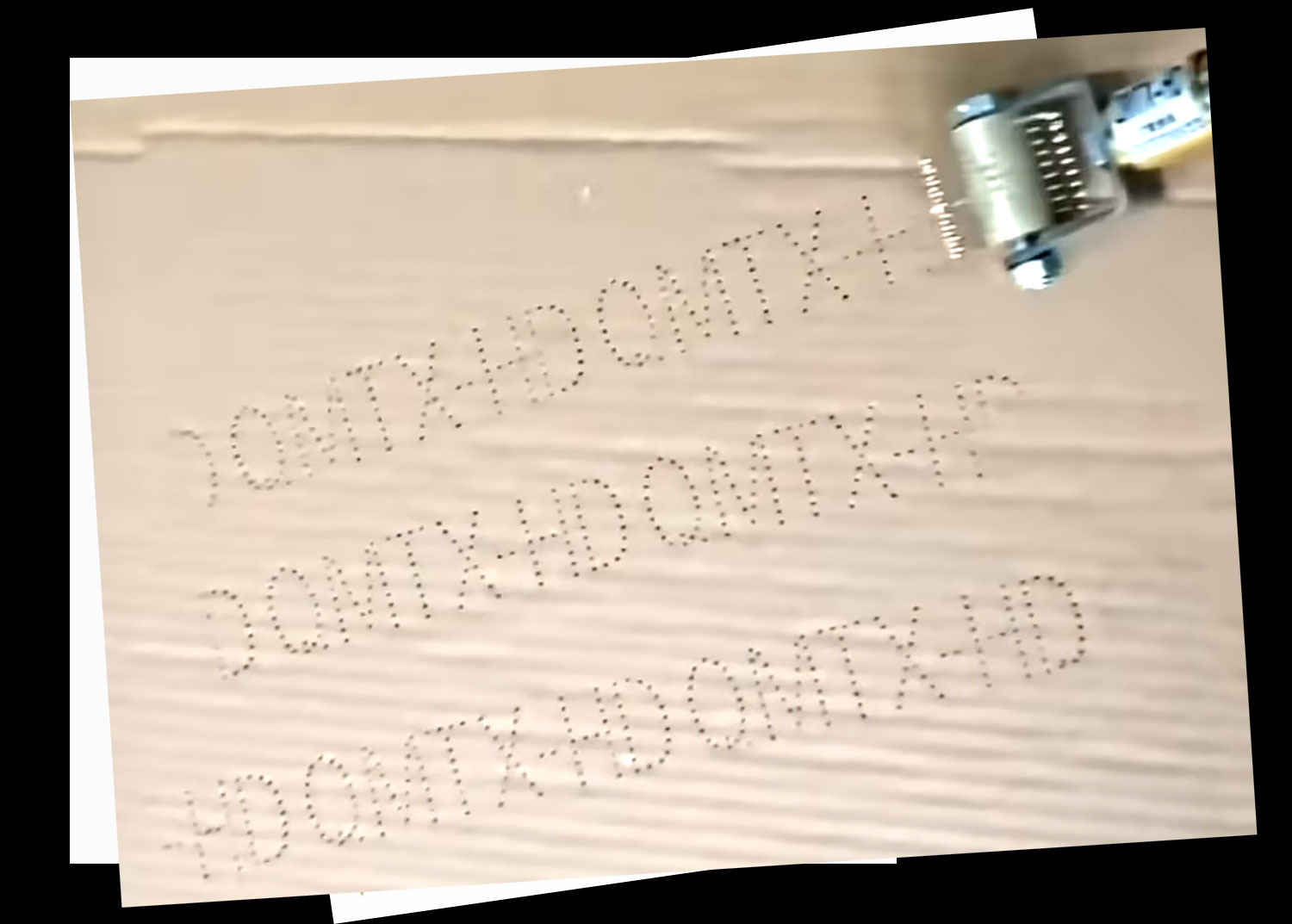
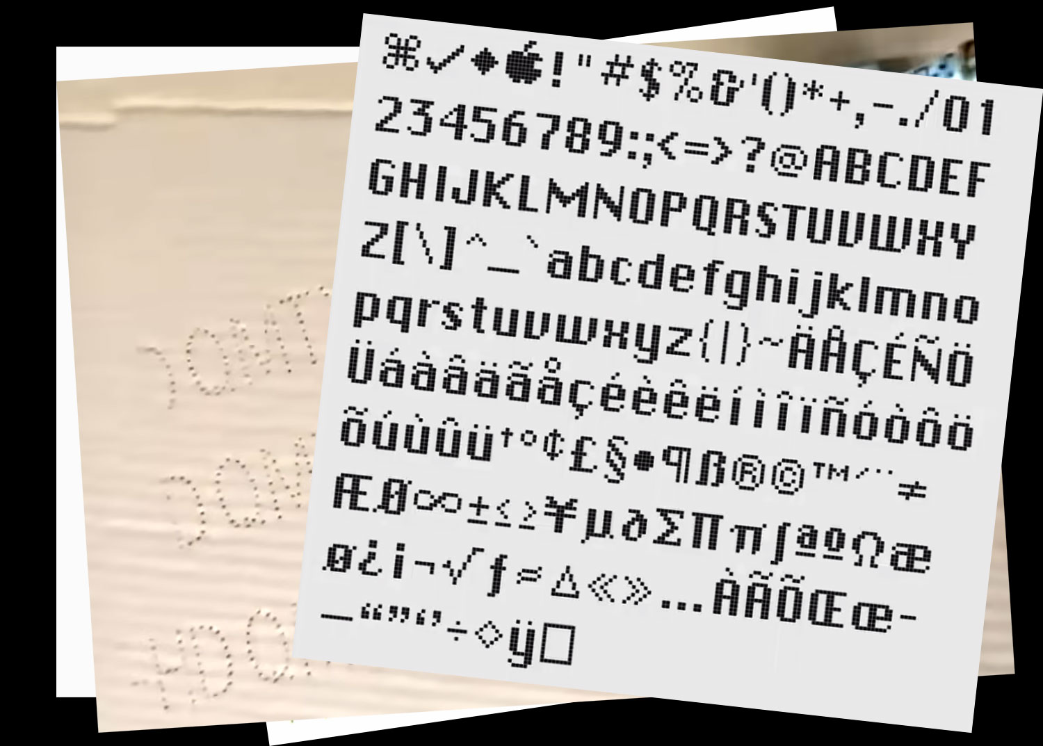
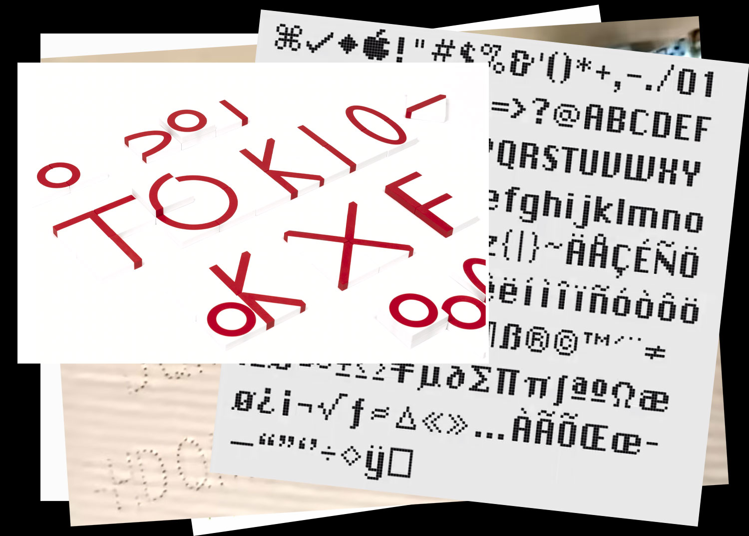
End of 2025
more infos to come
n°55 — Matrix font
End of 2025
more infos to come
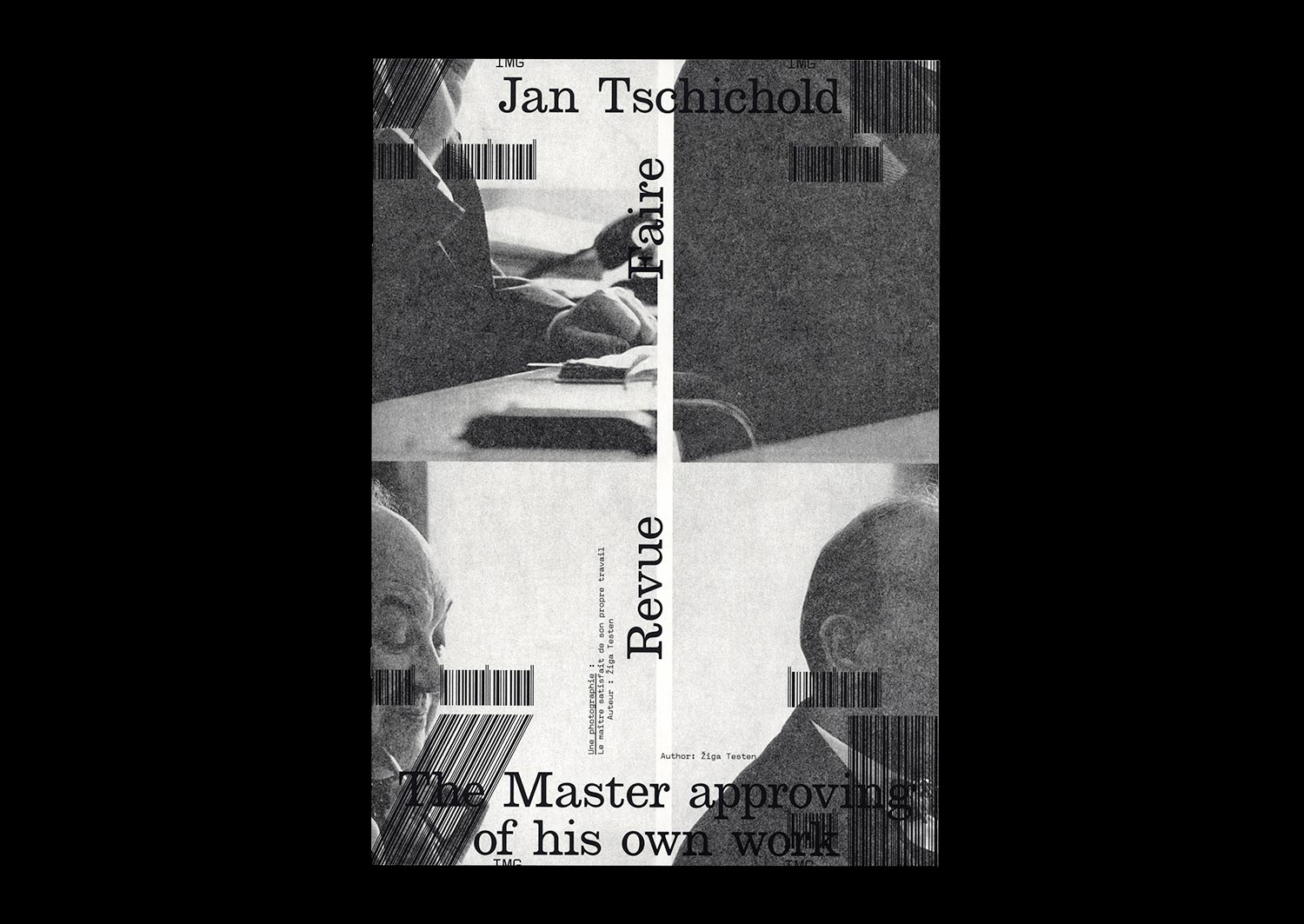
n°23 — Jan Tschichold: The Master approving of his own work. Author: Žiga Testen
Author: Žiga Testen
24 pages, 21 × 29,7 cm, CMYK
9 September 2020
ISBN: 979-10-95991-17-5
ISSN: 2558-2062
Author: Žiga Testen
24 pages, 21 × 29,7 cm, CMYK
9 September 2020
ISBN: 979-10-95991-17-5
ISSN: 2558-2062
Design history as an independent discipline and field of study appears to be in trouble. Design historians complain about its diminishing influence within universities due to the ongoing instrumentalisation of higher education. The Eurocentric canon built upon values and methods adopted from art and architecture history has been contested by decolonial theories. And finally, it appears that the trust in the institution of ‘history’ itself and its meta-narratives has eroded.
A discipline that was once considered to provide reflection on what came before and guidance on what could come to be—under the auspice of a grand narrative of continuous progress—has been replaced by modest narratives, social anthropologies, and claims of the ‘end of history’.
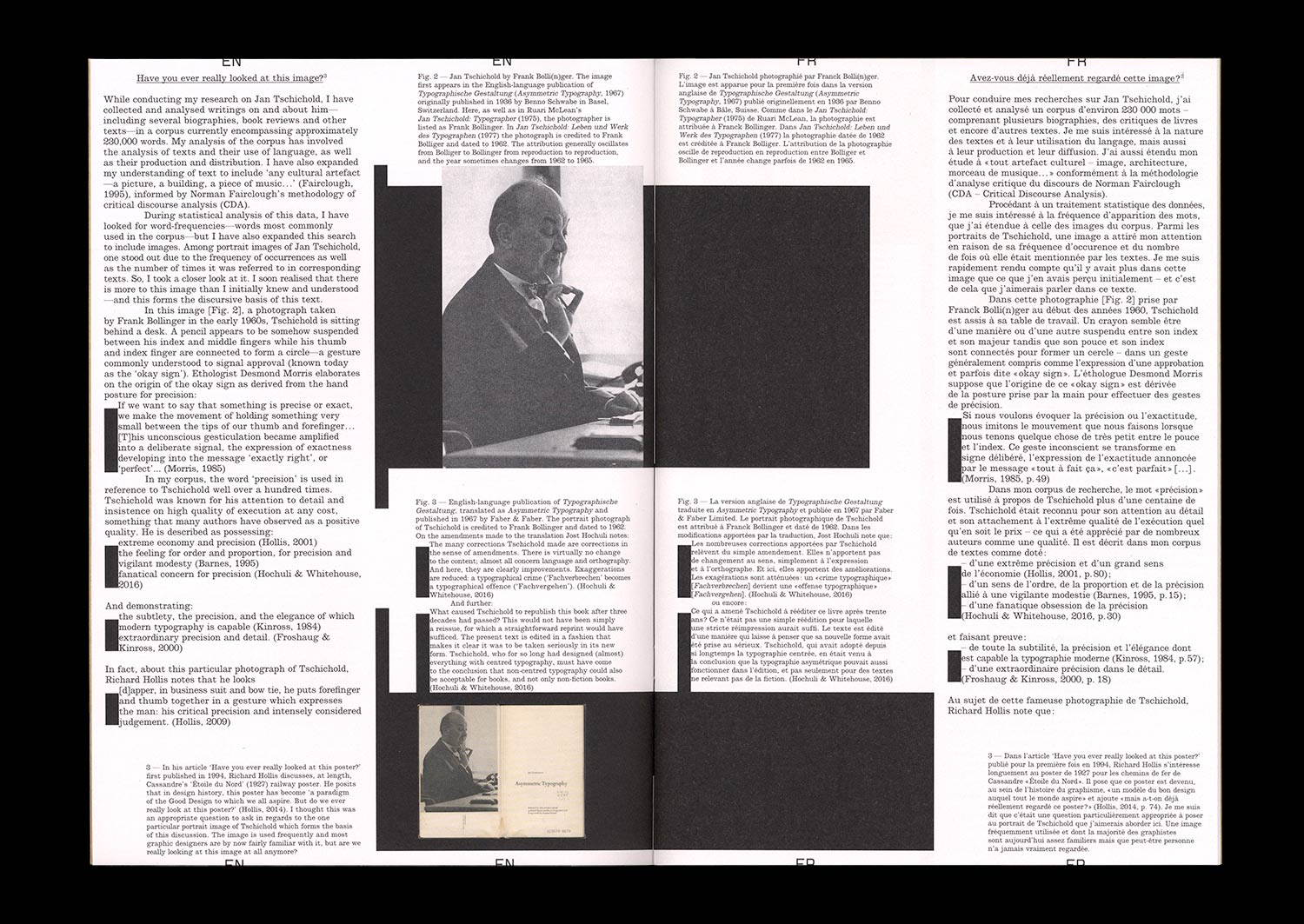
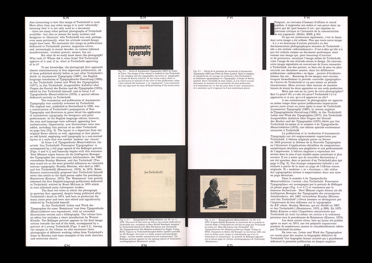
In this article, I rummage through the ruins of design history and try to unpack what it was that we once considered design history and our design history canon, how we wrote about it and to what end. In particular, I focus on this one image: a portrait photograph of a well-known historical figure, the designer and typographer Jan Tschichold. How is it used? And what stories do we tell about it?
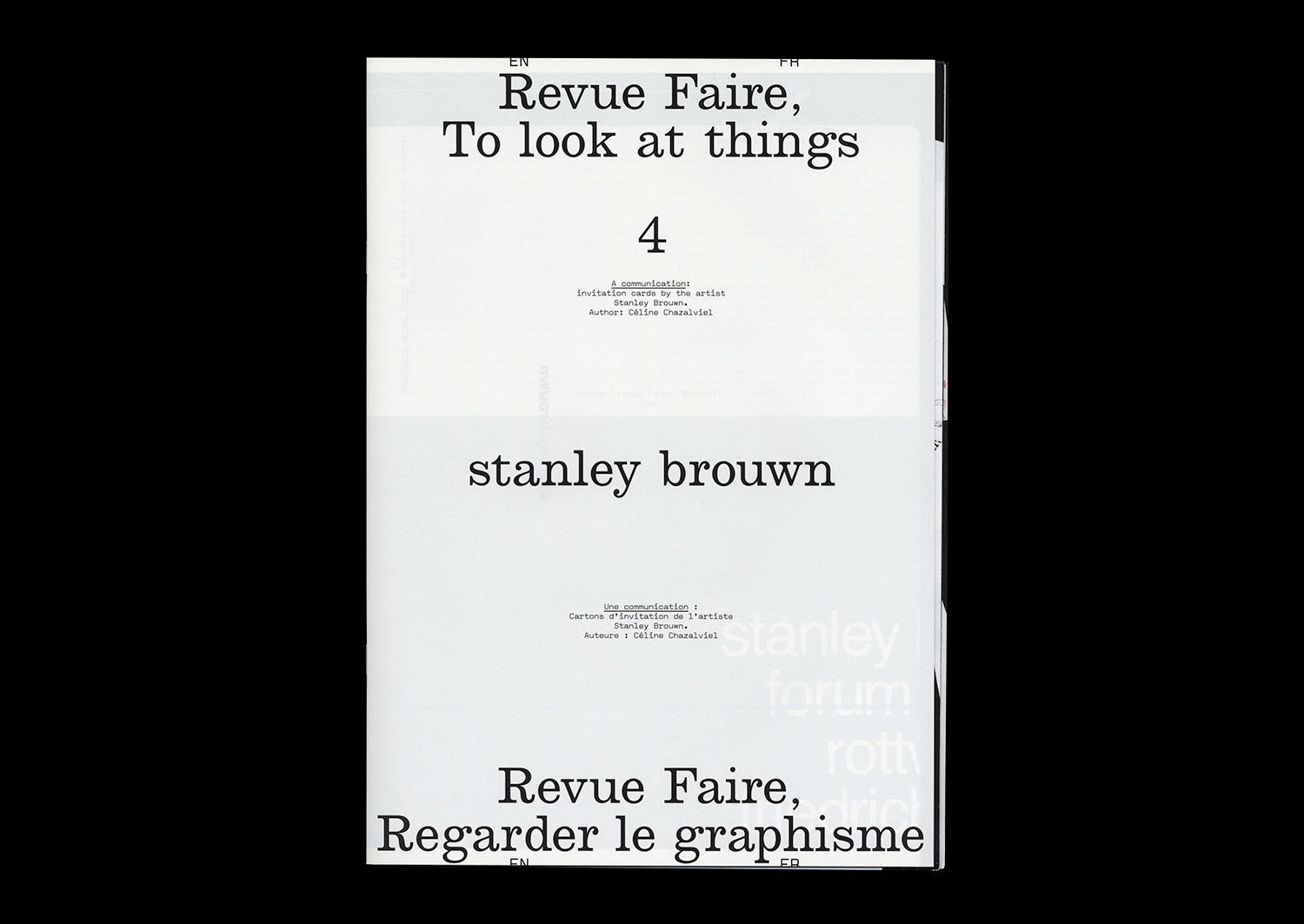
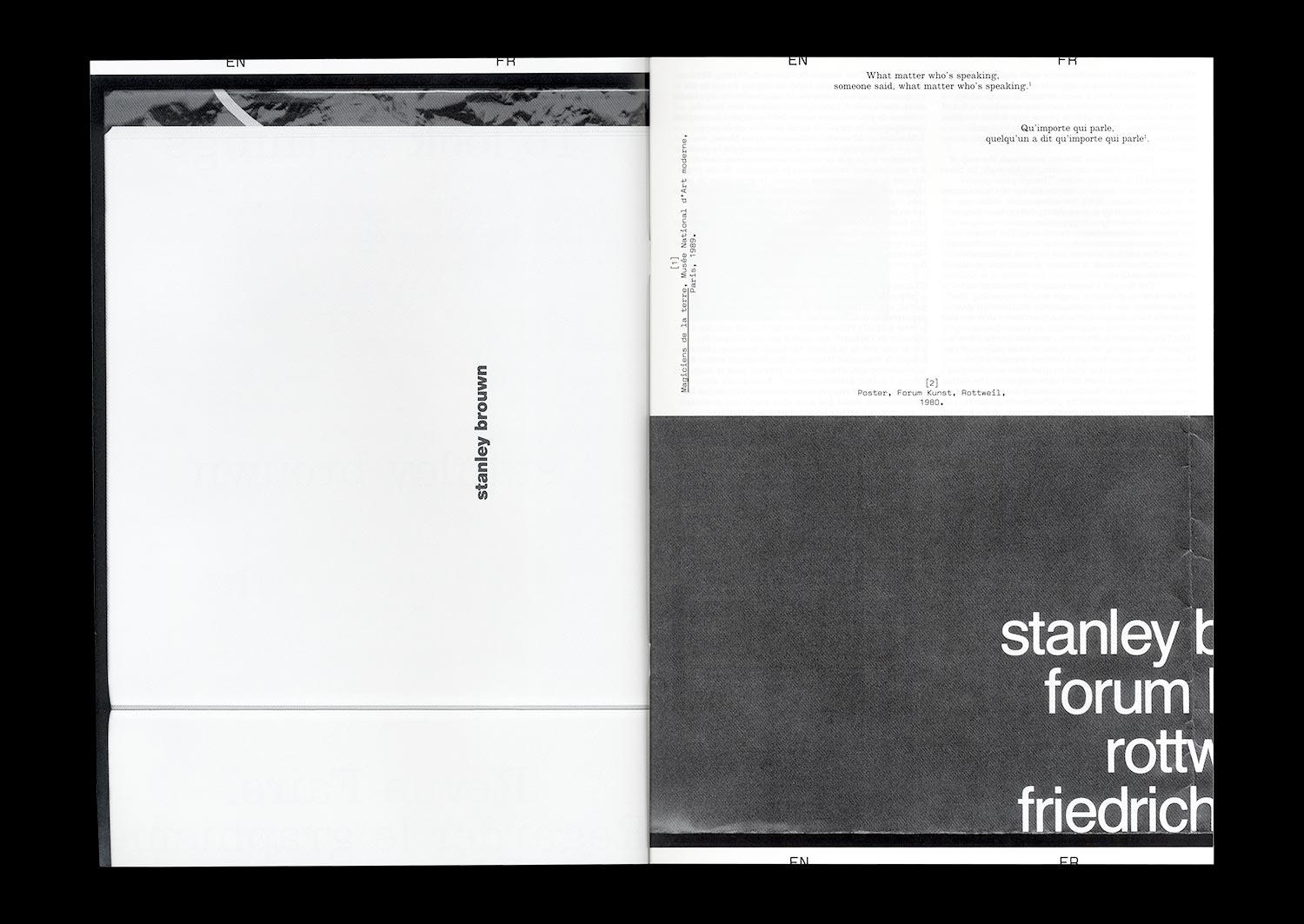
n°04 — A communication: invitation cards by the artist Stanley Brouwn. Author: Céline Chazalviel
Author: Céline Chazalviel.
20 pages, 21 × 29,7 cm, CMYK
+ 1 A1 poster, CMYK (reserved for subscribers or on demand)
6th December 2017
ISBN: 979-10-95991-04-5
ISSN: 2558-2062
Author: Céline Chazalviel.
20 pages, 21 × 29,7 cm, CMYK
+ 1 A1 poster, CMYK (reserved for subscribers or on demand)
6th December 2017
ISBN: 979-10-95991-04-5
ISSN: 2558-2062
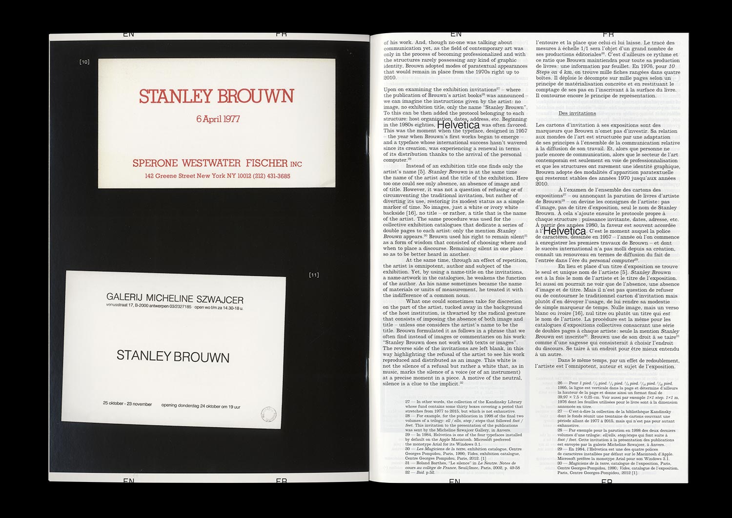
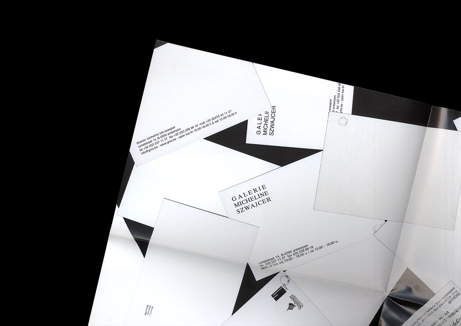
If we could attribute to Stanley Brouwn a desire to dissociate his artistic production from who he is and to reveal otherness through the mastery of his image and that of his work, we could also divine an intention to focus the public’s attention on his exhibitions. Behind the standards put in place for the communication related to his exhibitions—the use of lowercase and Helvetica exclusively, the refusal to reproduce images of his work, to produce (or allow production of) written commentary on the subject of the same work, to appear in the context of a vernissage or even to answer an interview—the artist builds his identity by way of ellipses. Since his participation in documenta 5 (1972), the stories linked to this attitude have come to draw the outlines of an artistic posture that goes beyond any one particular case. The invitation cards for his solo exhibitions provide a symptomatic example: set almost exclusively in Helvetica, the absence of uppercase, flying in the face of the graphic identity of the gallery or the host institution, they seem impossible to date, give or take twenty years.
This mastery reveals that graphic and typographic choices represent one of the spaces of neutrality built by Brouwn, like other artists and theoreticians of his generation, and generations that came after. According to one of the positions of Sol Lewitt, “conceptual artists are more mystical than rationalist,” and the case of Brouwn gives weight to this idea. Whether it be by way of a mediation adopted by the artist himself and the relationship with the institution that it entails, that of the myth of the autonomy of the artwork, of the relationship with documentation, with commentary and the analysis of an artwork or even the conditions of reception, Brouwn escapes the category of the conceptual artist and incites us to measure the contemporary echoes of his radicality.
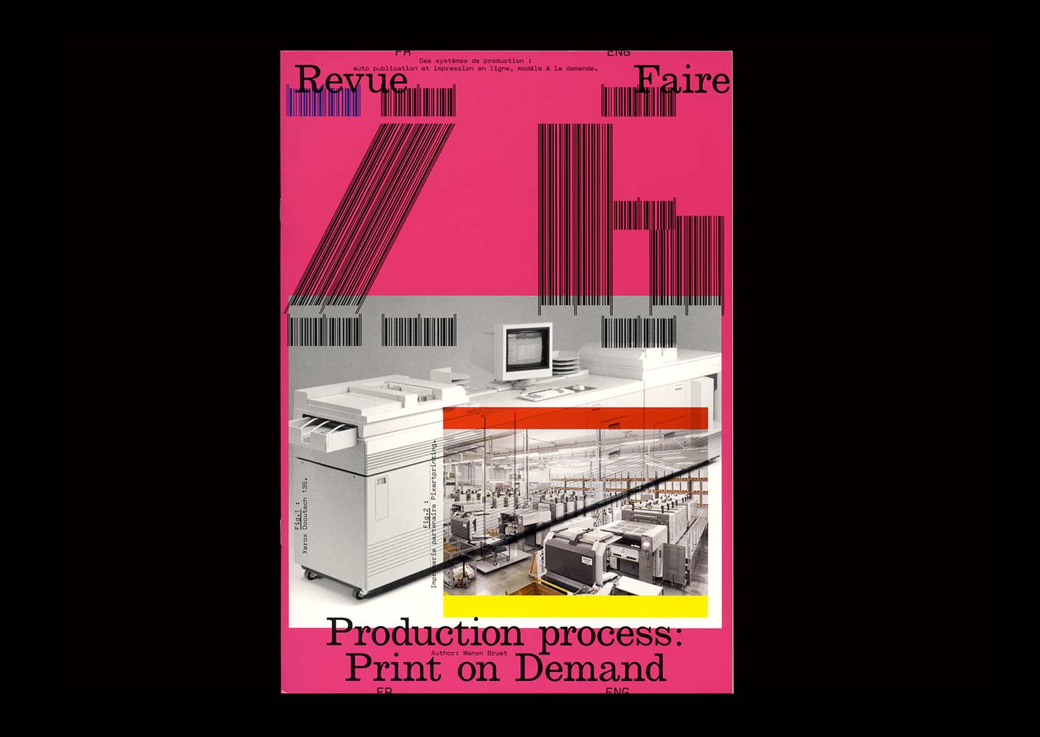
n°26 — Production process: Print on Demand. Author: Manon Bruet
Author: Manon Bruet
20 pages, 21 × 29,7 cm, CMYK
4th November 2020
ISBN: 979-10-95991-17-5
ISSN: 2558-2062
Author: Manon Bruet
20 pages, 21 × 29,7 cm, CMYK
4th November 2020
ISBN: 979-10-95991-17-5
ISSN: 2558-2062
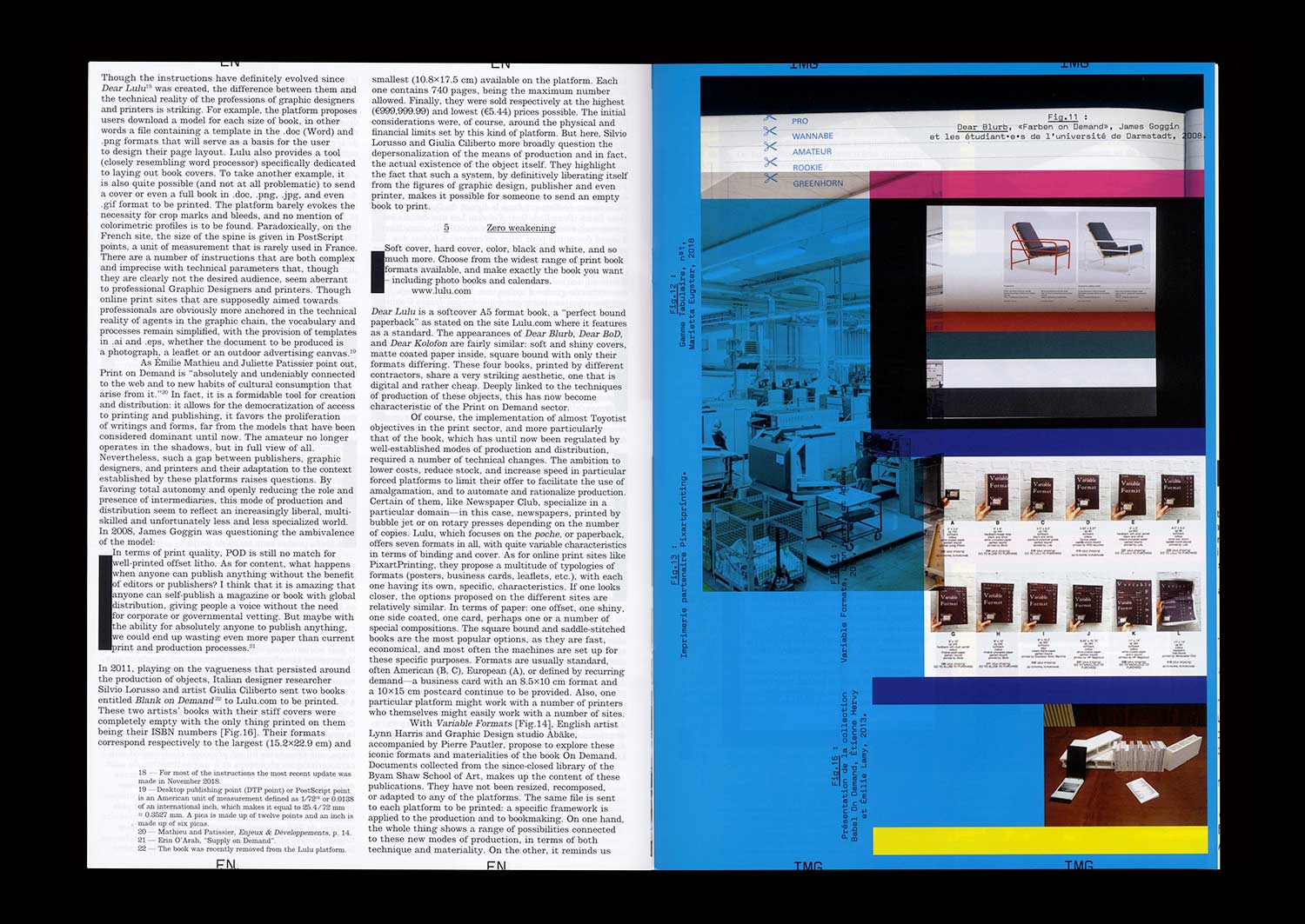
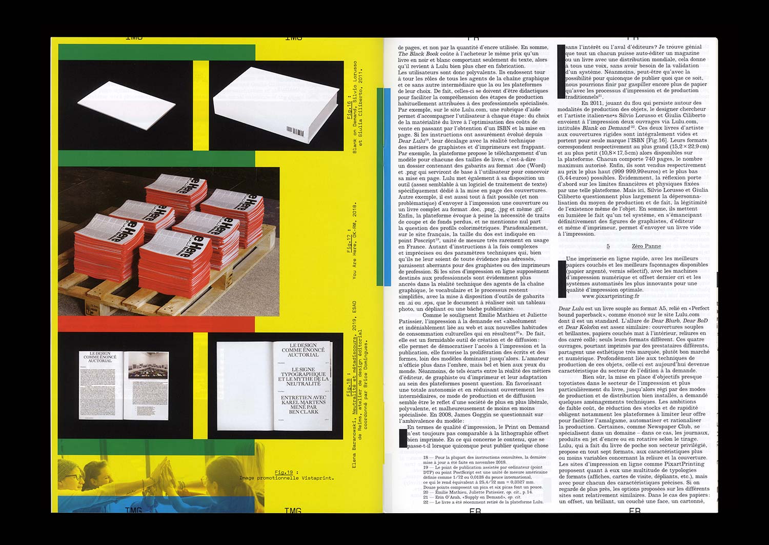
In 2008, English Graphic Designer James Goggin ran a two-day workshop with design students at the Hochschule Darmstadt in Germany. The object which resulted gradually took on the appearance of a photo album, a typeface specimen, and a color chart. On the cover, the phrase “Dear Lulu, Please try and print these line, color, pattern, format, texture and typography tests for us” is clearly addressed to the online print platform for which this book was proposed as a test.
Ten years later, the offer has become more diverse and the success of such online platforms is undeniable—indeed the phenomenon has spread well beyond the field of publishing. While some bemoan unfair competition for printers, others, professionals and amateurs, see in it a freedom to print and distribute relatively well finished objects at low cost.
The possibilities of these systems of production, are multiple but nonetheless limited, and this obviously raises the question of a possible standardization of forms and formats. However, when it comes to Print On Demand, it seems that the issue is not so much the materiality of an object (the choice of format, paper or a particular manufacture) but rather the actual existence of this object itself, outside of usual channels of production and distribution.