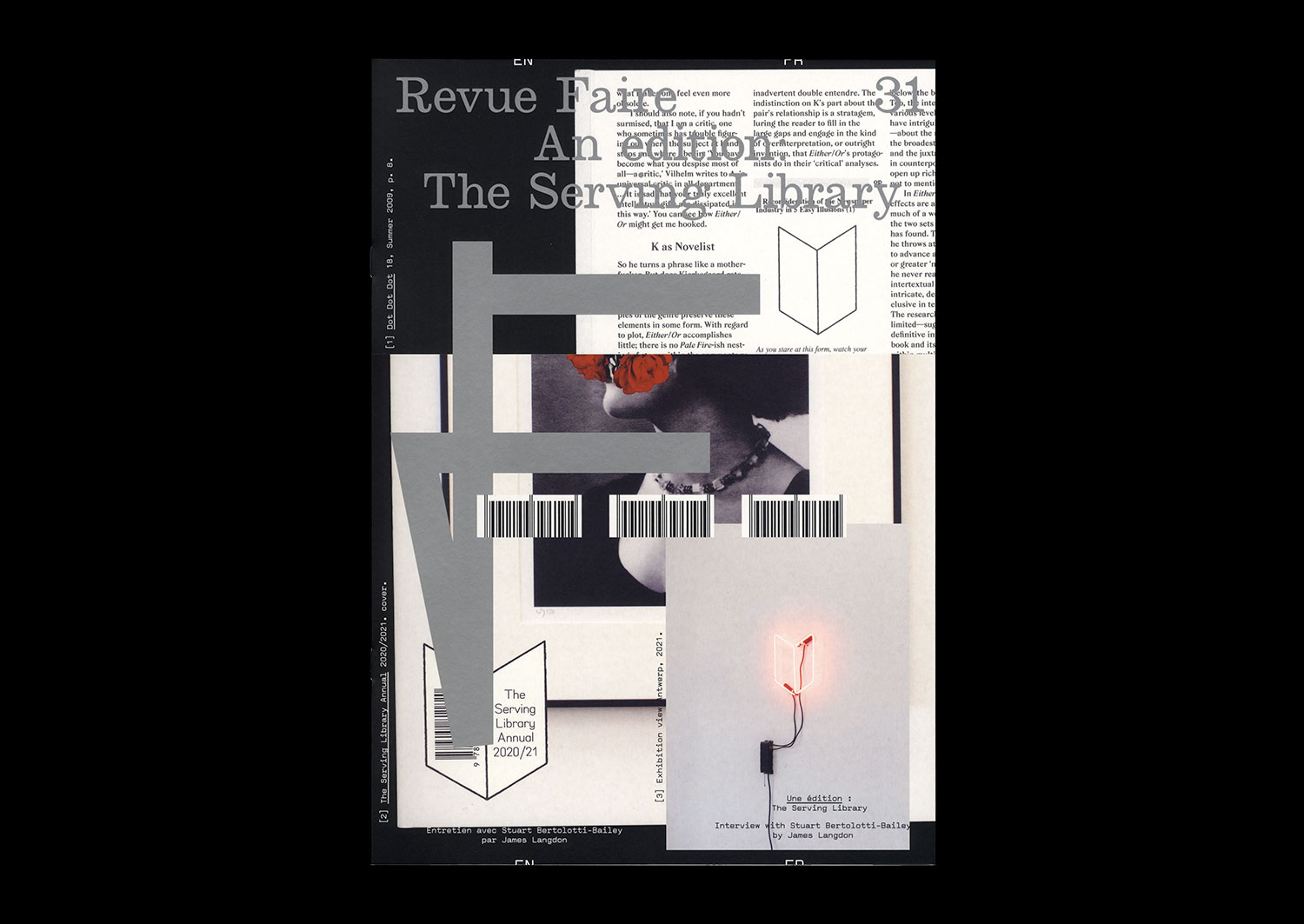
n°31 — An Edition: The Serving Library. Interview with Stuart Bertolotti-Bailey by James Langdon
Out of print, available only with the season 3 subscription
Interview with Stuart Bertolotti-Bailey by James Langdon
20 pages, 21 × 29,7 cm, CMYK + 1 PMS on cover
27th October 2021
ISBN: 979-10-95991-19-9
ISSN: 2558-2062
Dot Dot Dot magazine has always antagonised factions of the graphic design community. While it was definitely just a magazine about graphic design, Dot Dot Dot admitted that graphic design was itself *about* — or at least inseparable from — whatever content it might be used to express. With that innocent assertion, it became, without necessarily trying, a magazine about the potential subject matters of graphic design. A magazine about anything and everything, then! The final Dot Dot Dot was published in 2010. Its successor publication, Bulletins of The Serving Library, has continued its expanded editorial purview.
In the course of these 20 years of publishing, its editors have amassed a significant collection of almost 100 objects that have appeared in the magazines. The collection’s contents are by nature various, in format and intent: from images produced to commission for articles, to artworks representing particular histories, positions, and significant practitioners. In autumn of 2020 this collection relocated to an annex of the artist-run space 019 in Ghent, with the prospect of a long-term home there as a teaching space rich with connective threads leading in and out of the recent history and practice of graphic design.
You may also like…
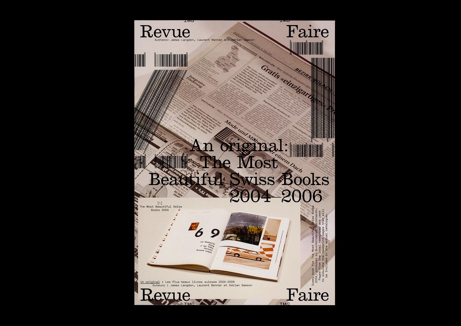
n°21 — An original: The Most Beautiful Swiss books 2004–2006. Authors: James Langdon, Laurent Benner & Adrian Samson
Interview with Laurent Benner by James Langdon
Photos: Adrian Samson
20 pages, 21 × 29,7 cm, CMYK
25th March 2020
ISBN: 979-10-95991-16-8
ISSN: 2558-2062
Interview with Laurent Benner by James Langdon
Photos: Adrian Samson
20 pages, 21 × 29,7 cm, CMYK
25th March 2020
ISBN: 979-10-95991-16-8
ISSN: 2558-2062
The awards programme The Most Beautiful Swiss Books has been organised almost without interruption by the Swiss Federal Office of Culture since 1943. A book design award with such history, particularly in a book-making culture as rich as Switzerland’s, offers insightful perspectives on Graphic Design for publishing, the culture that commissions and values it, and the critical discourse that surrounds it.
Each year the awarded books are documented in a substantial catalogue, made by one of the graphic designers awarded in previous years. The inherently self-reflexive tendencies of such catalogues—books about books, Graphic Design in the context of Graphic Design—present stimulating yet rather fraught conditions for graphic designers to work in. Looking back over the catalogues produced during the last two decades, a conversation-through-practice is clearly legible. After a conceptually sophisticated catalogue or series (often designers have been commissioned for series of two or three catalogues) follows a simple visual document. After a modest, finely-crafted production comes something more lavish or experimental.
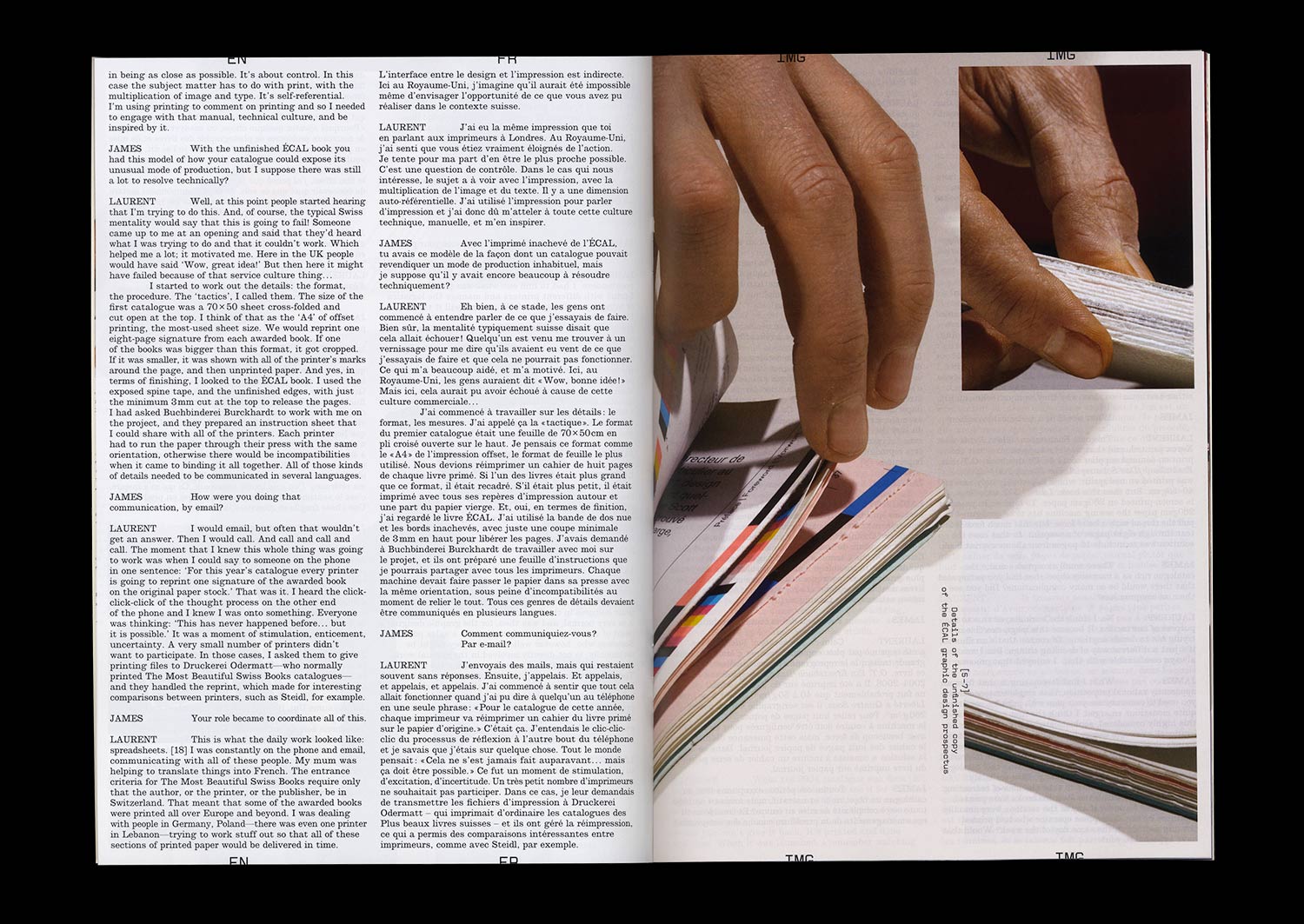
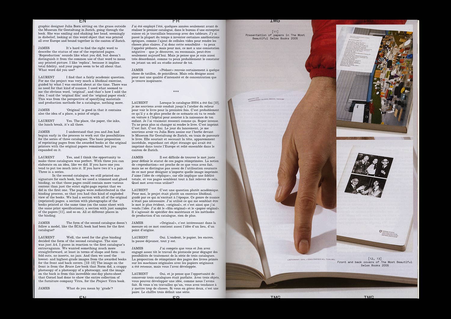
The 2004–2006 catalogues were conceived by Laurent Benner, a Swiss designer working in London, and designed with English designer Jonathan Hares. Laurent’s proposition for the 2004 catalogue was audacious. He contacted the printers of each of the 20 awarded books from that year and asked them to reprint a section of their book. These reprinted sections were then transported to a single Swiss bookbinder and bound, with some additional pages of front- and back-matter, to comprise the catalogue.
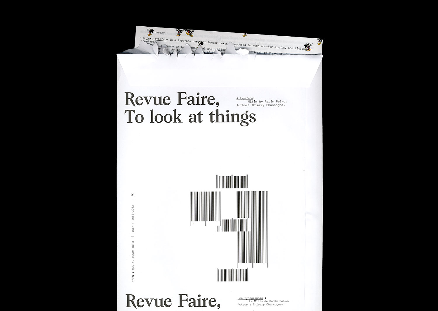
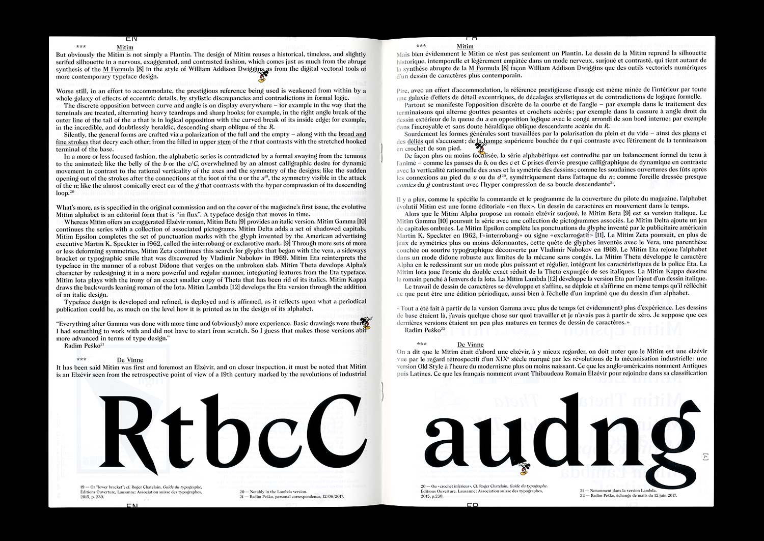
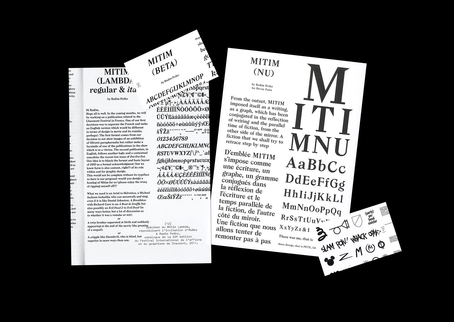
n°09 — A typeface: Mitim by Radim Pesko. Author: Thierry Chancogne
Sold out
Author: Thierry Chancogne
16 pages, 21 × 29,7 cm, CMYK + 4 cards in an envelope
28 February 2018
ISBN: 979-10-95991-08-3
ISSN: 2558-2062
Sold out
Author: Thierry Chancogne
16 pages, 21 × 29,7 cm, CMYK + 4 cards in an envelope
28 February 2018
ISBN: 979-10-95991-08-3
ISSN: 2558-2062
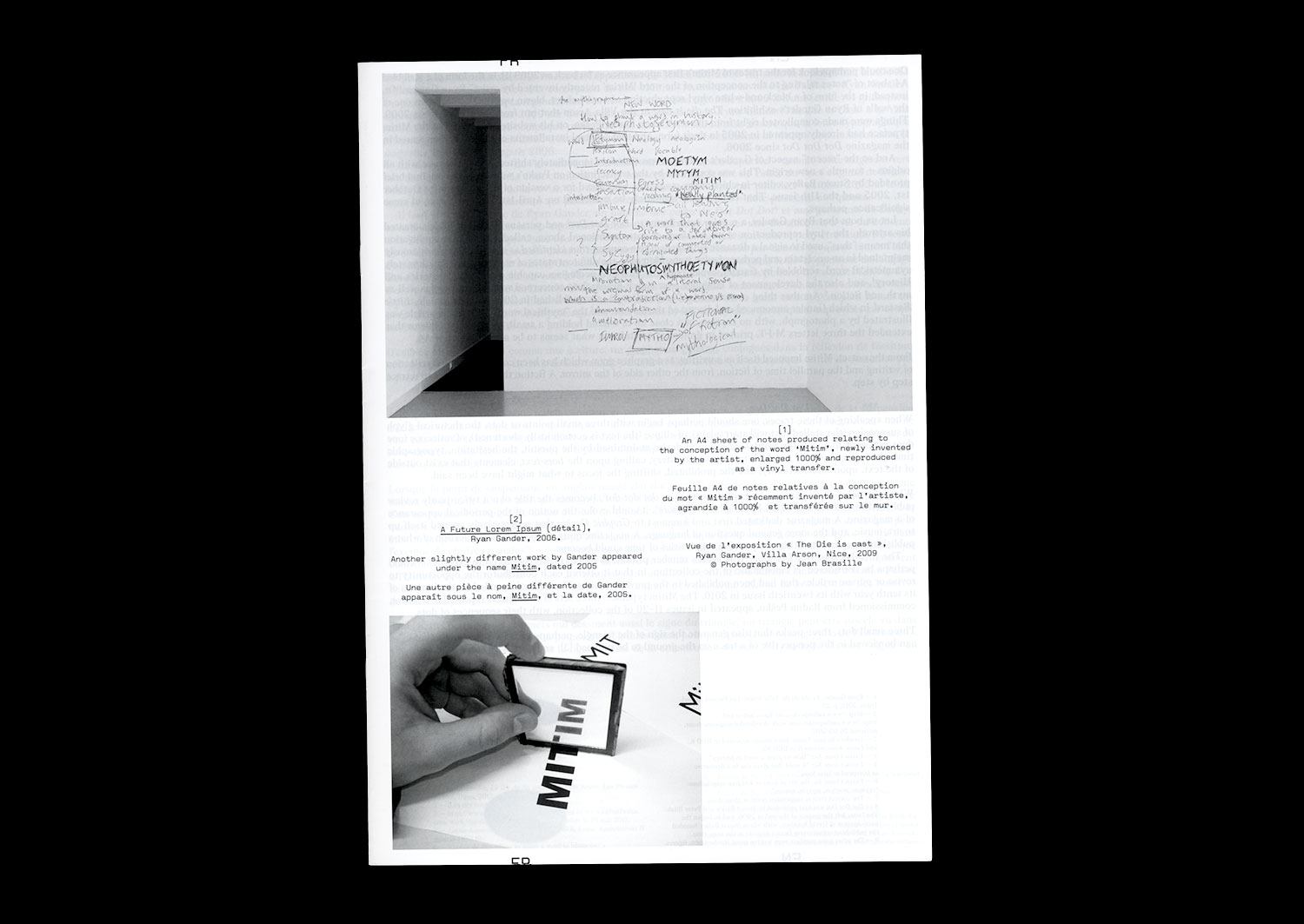
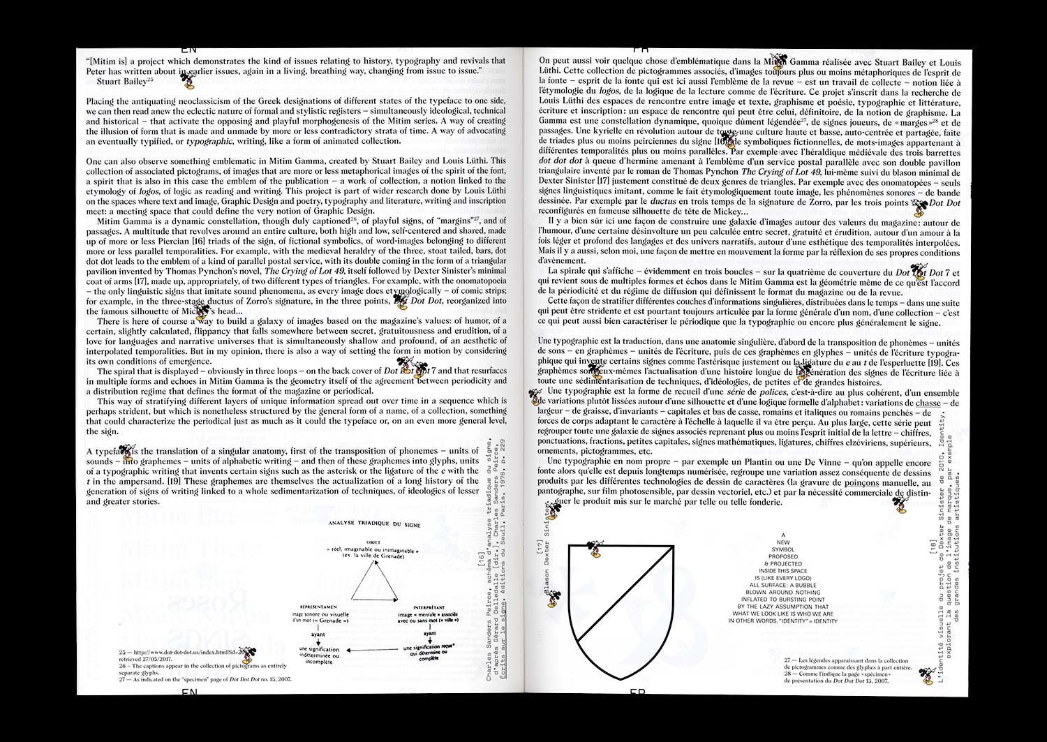
Mitim. Three letters interpolated into a palindrome and an ambigram, /Mit/ in Dutch, as in German, means “with.” Three peaks, an effect of symmetry and circulation. The triadic structure of the sign. Of what takes place. Of what binds. Signifier, Signified, Reference.
Mitim. A typeface designed by Radim Pesko for Dot Dot Dot. Again, three characters and a distribution. Three points that follow and invite pursuit, even if the period of this essential review ceased, ten years and twenty issues later.
Mitim. A spun figure of a triangle that calls on asterism, a constellation of stars that is the figure of the constitution of meaning, at the same time being the typographical sign of changing paragraphs, or tailpiece. A prolific sign of rupture and continuation that marks the condition of every text and any periodical publication. A sign that proposes, in its form of a horizontal line of stars, an equivalent of the ellipsis, or “dot dot dot” as it is more commonly known.
Mitim. A triangular figure that refers to typographic signs of logic and mathematical relationships: consequence ·˙·, cause ˙·˙. In certain Masonic expressions, a figure that is one of abbreviation, of predictability, and of redundancy like that which is hidden in the sign: the sign of the secret to be deployed, the secret to be pursued.
Mitim. A typeface design that extends to become a self-reflexive artistic and typographic project. An alphabet that evolves and adapts to the cycle of appearances of a publication in the form of a suite.
16 — A reproduction: what El Lissitzkzy wants. Author: James Langdon
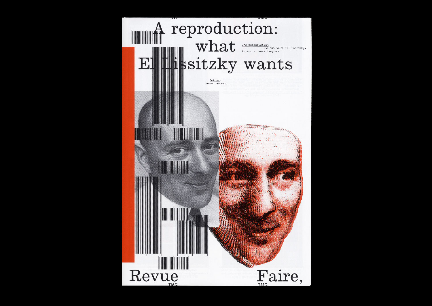
Sold out — Only available with season 2 subscription
Author: James Langdon
12 pages, 21 × 29,7 cm, CMYK
+ 1 A2 poster, CMYK + 1PMS
7th November 2019
ISBN: 979-10-95991-15-1
ISSN: 2558-2062
Sold out — Only available with season 2 subscription
Author: James Langdon
12 pages, 21 × 29,7 cm, CMYK
+ 1 A2 poster, CMYK + 1PMS
7th November 2019
ISBN: 979-10-95991-15-1
ISSN: 2558-2062
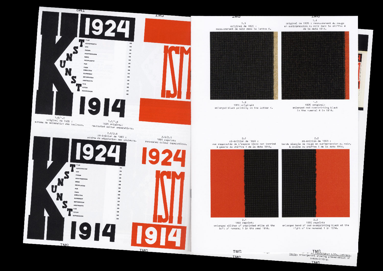
I am rarely convinced when I see graphic design that was originally printed in two inks reproduced in four- colour process. Before the advent of commercial colour offset printing, the elementary colours of printing — from Gutenberg to Tschichold — were black and red. In the early twentieth century, black and red were used by graphic designers not to attempt to recreate the spectrum of colours that appear to the human eye, but as graphic forces in themselves. To make a distinction. To create dynamism. To embody ideology on the page. In particular, the combination of black and red on white paper has become synonymous with Suprematism and revolutionary Russian graphic design.
A contemporary imaging workflow can enable extraordinary reproductions of these historical aesthetics. A high- resolution digital photograph of an original black and red printed book from the 1920s can be processed using a colour profile to calibrate its appearance across design, colour correction in computer software, proofing, and printing. This workflow can ultimately achieve a beautiful and precise image of that graphic artefact as it looks today, down to small details of its patination, its discoloration by exposure to sunlight, and the many more other subtleties that define it as an archival object.
But such a reproduction exhibits a strange technical anachronism. What about the constraints that originally shaped the design of that bookk — the implicit connection between the two colours of its graphics and the architecture of the one- or two-colour printing press on which it was printed? Are they not important? Can they even be reproduced?
I compare printed reproductions of the proud black and red cover of the book ‘Die Kunstismen’ (1925), designed by Russian artist and designer El Lissitzky. Published between 1967 and 2017, these images treat the material characteristics of the original book’s colour in different ways, appealing to contradictory notions of fidelity.