n°42 —12 ou 13 things I know about: F.R.DAVID. Authors : Victoire Le Bars and Benjamin Thorel
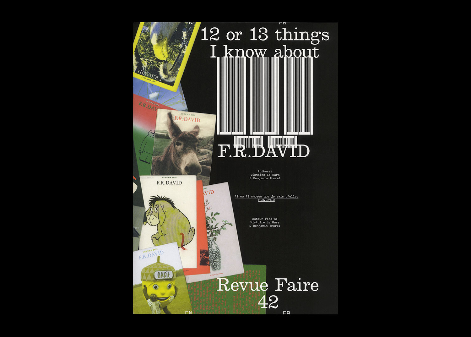
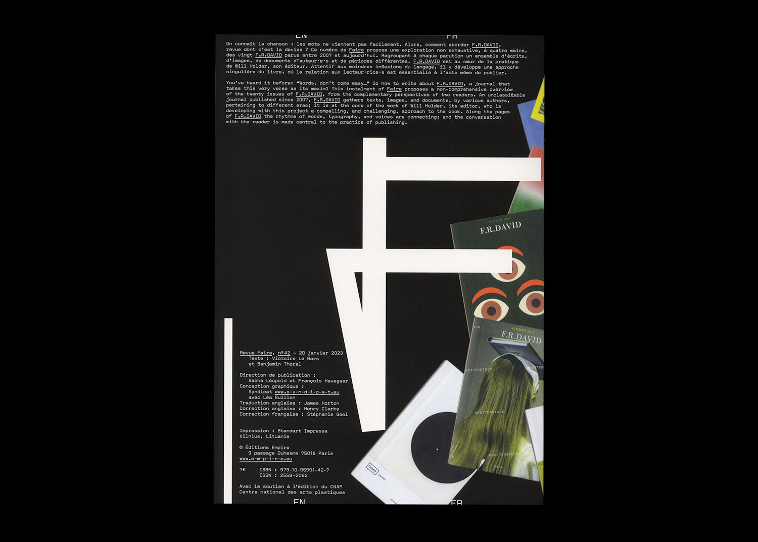
Authors: Victoire Le Bars and Benjamin Thorel
32 pages, 21 × 29,7 cm, CMYK
11th January 2023
ISBN: 979-10-95991-42-7
ISSN: 2558-2062
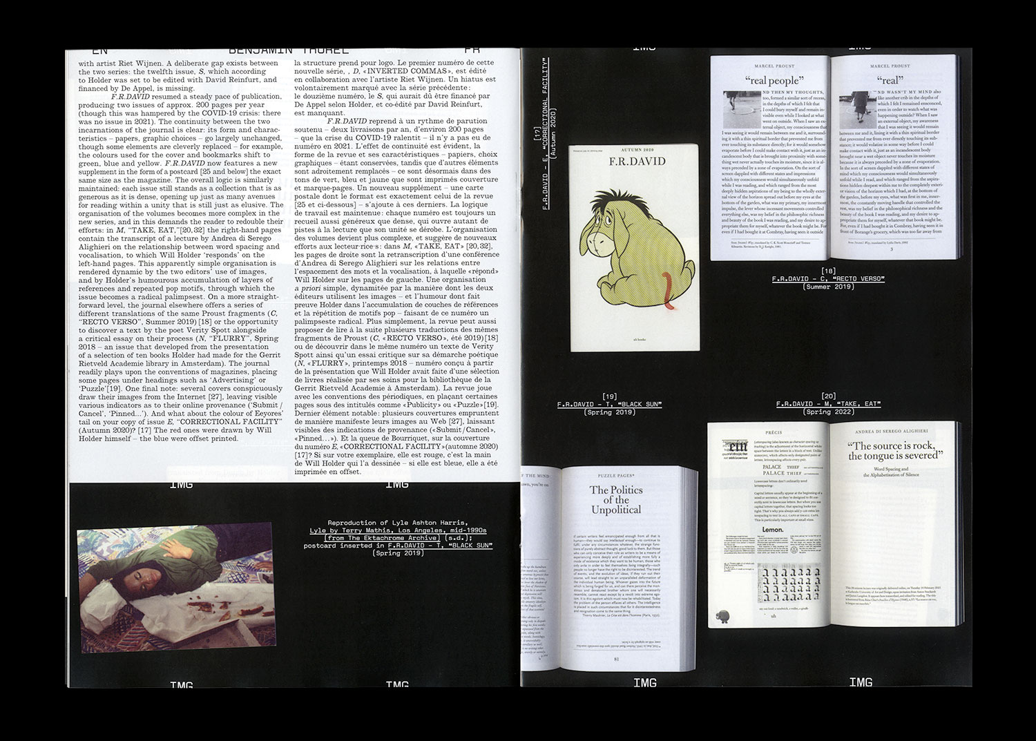
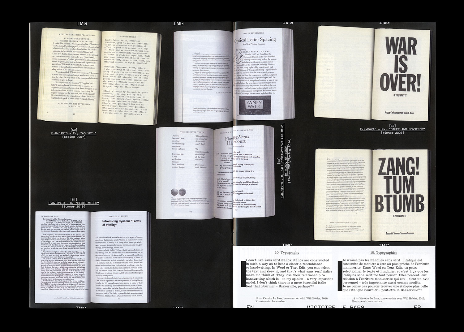
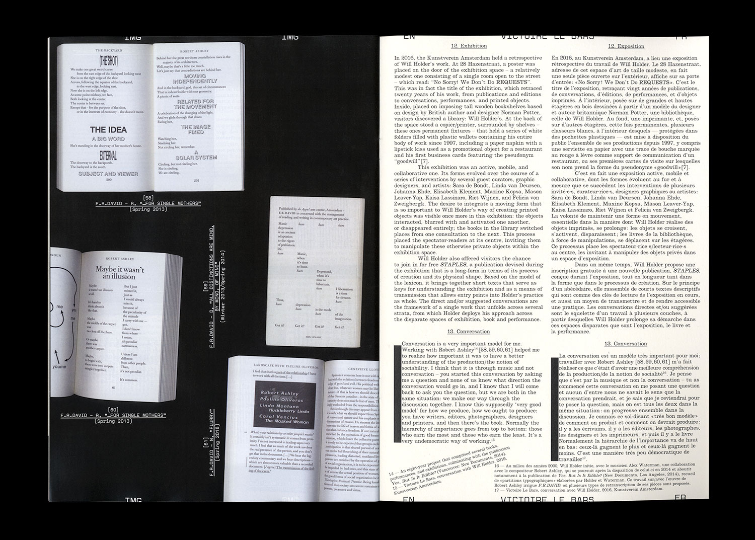
You’ve heard it before: “Words, don’t come easy…” So how to write about F.R.DAVID, a journal that takes this very verse as its maxim? This instalment of Faire proposes a non-comprehensive overview of the twenty issues of F.R.DAVID, from the complementary perspectives of two readers. An unclassifiable journal published since 2007, F.R.DAVID gathers texts, images, and documents, by various authors, pertaining to different eras; it is at the core of the work of Will Holder, its editor, who is developing with this project a compelling, and challenging, approach to the book. Along the pages of F.R.DAVID the rhythms of words, typography, and voices are connecting; and the conversation with the reader is made central to the practice of publishing.