n°56 — Photobook: The New Face of Photophilia. Author: Clément Chéroux + book selection with Théophile Calot
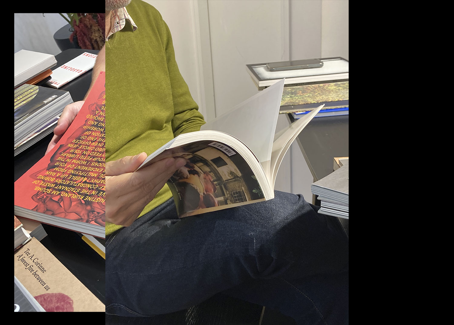
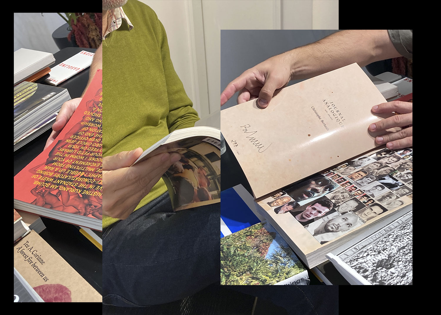
May 2025
n°56 — Photobook: The New Face of Photophilia. Author: Clément Chéroux + book selection with Théophile Calot
May 2025
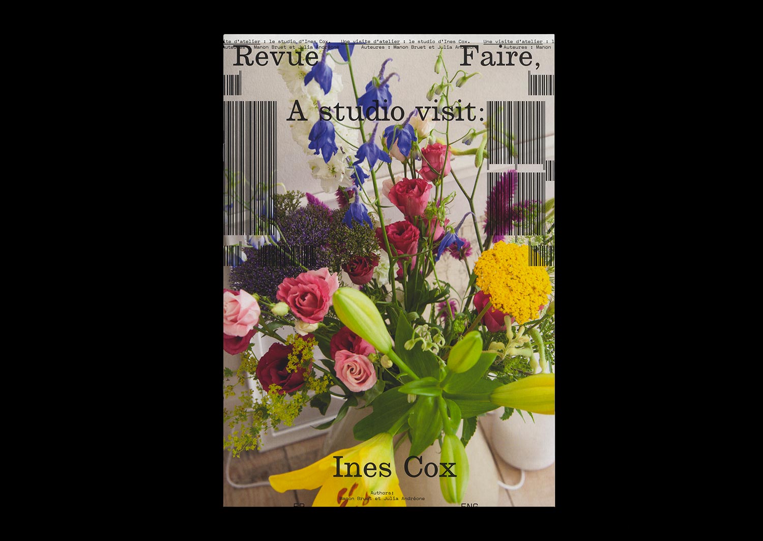
n°18 — A studio visit: Ines Cox. Authors: Manon Bruet and Julia Andréone
Author: Manon Bruet
Photos: Julia Andréone
20 pages, 21 × 29,7 cm, CMYK+1PMS
17 December 2019
ISBN: 979-10-95991-15-1
ISSN: 2558-2062
Author: Manon Bruet
Photos: Julia Andréone
20 pages, 21 × 29,7 cm, CMYK+1PMS
17 December 2019
ISBN: 979-10-95991-15-1
ISSN: 2558-2062
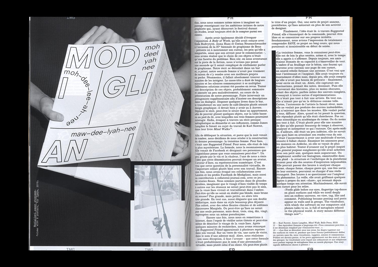
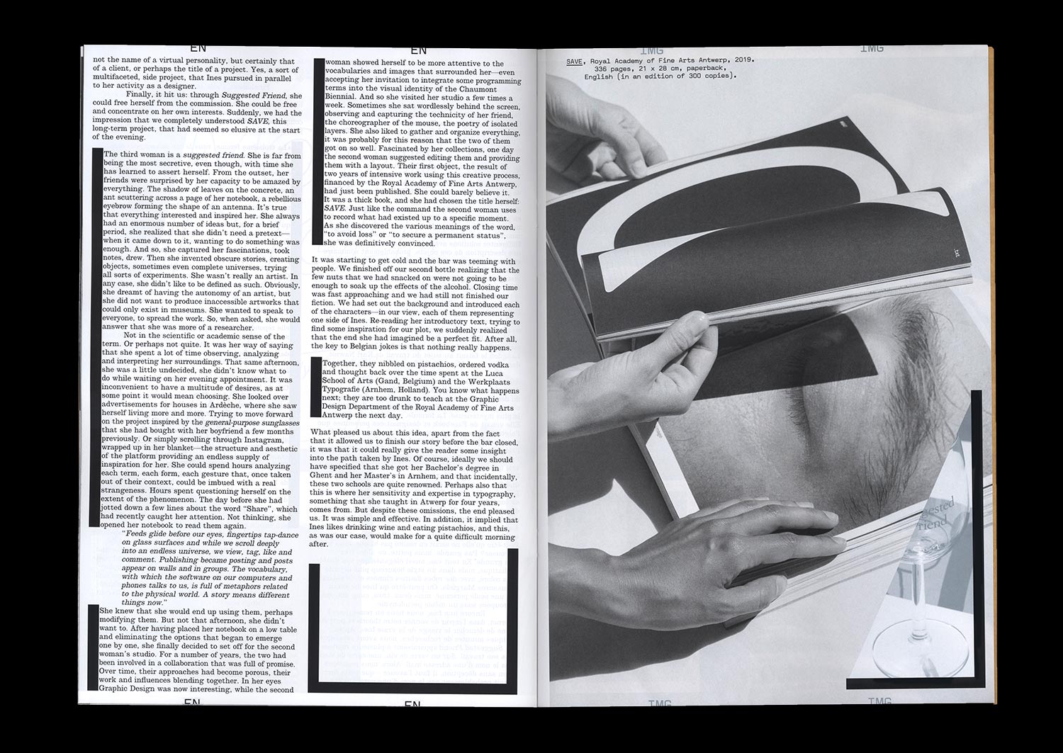
Three women walk into a bar. The first lives in a large apartment in Anvers, Belgium. The second is an independent Graphic Designer who founded her own studio. The third is an avatar—you might even know her—with a certain interest in creative processes, their interfaces, and their vocabularies. Together, they eat some pistachio nuts, order vodka, and are not at all sure about getting up the next day to teach at the Royal Academy of Fine Arts. But together, more than anything else, they form the troubling multiple personality of Ines Cox, a Belgian Graphic Designer who met Julia Andréone and Manon Bruet in her studio in June 2019. An opportunity to develop a narrative driven by three voices and to trace the outline of a path, a practice, and a figure.
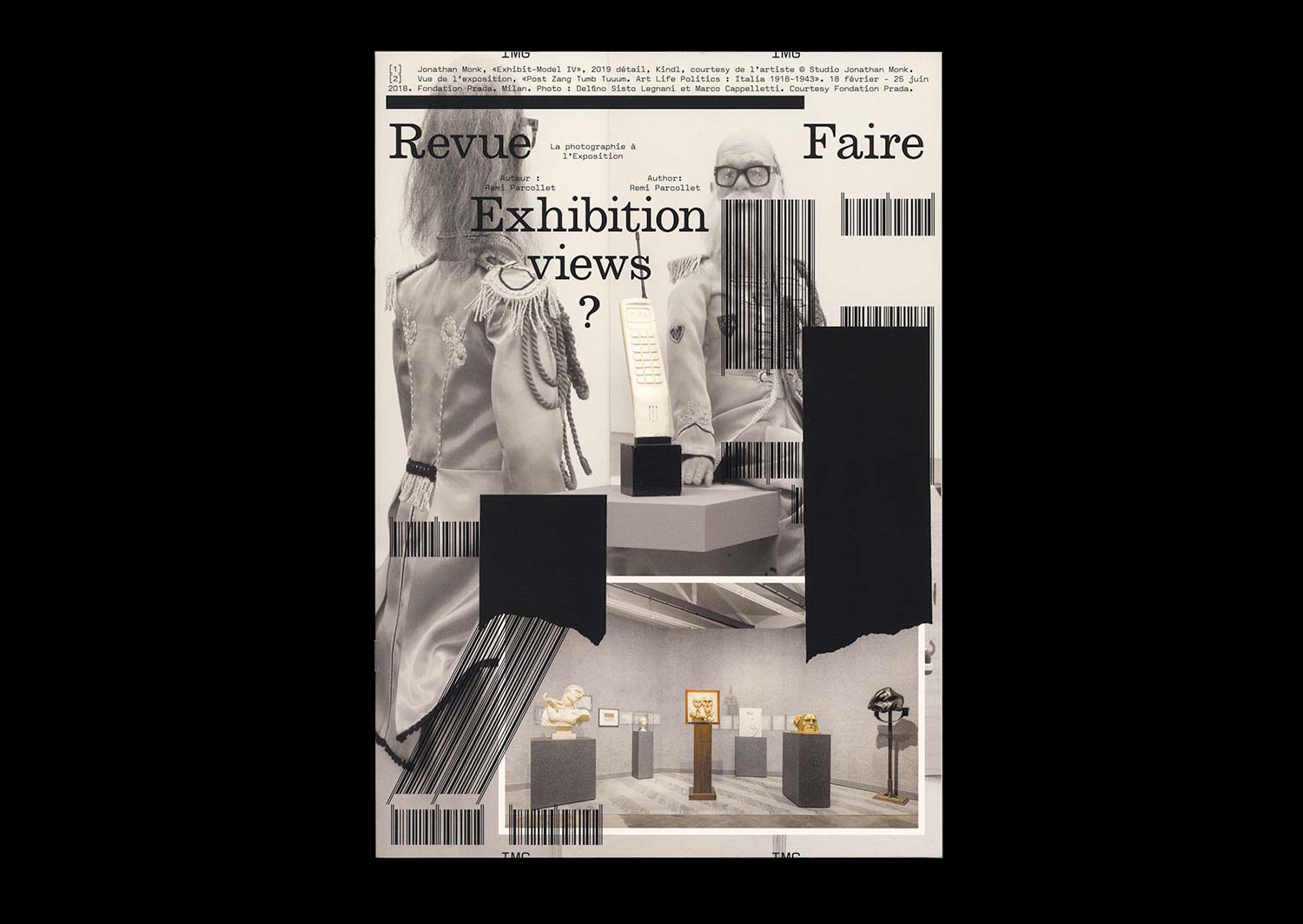
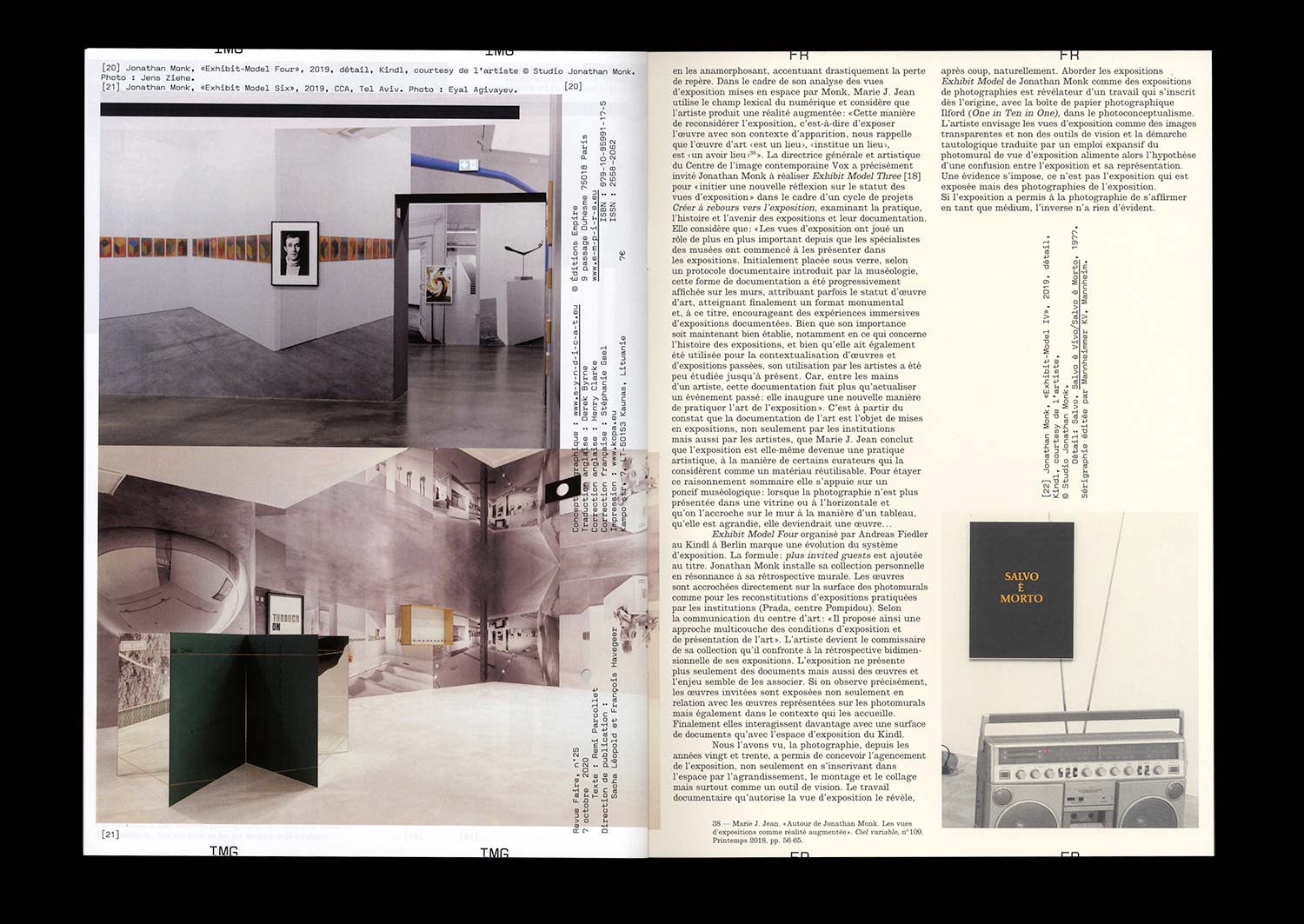
n°25 — Exhibition views? Jonathan Monk. Author: Remi Parcollet
Author: Remi Parcollet
20 pages, 21 × 29,7 cm, CMYK
24th October 2020
ISBN: 979-10-95991-17-5
ISSN: 2558-2062
Author: Remi Parcollet
20 pages, 21 × 29,7 cm, CMYK
24th October 2020
ISBN: 979-10-95991-17-5
ISSN: 2558-2062
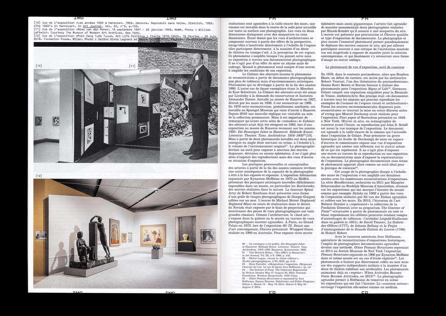
Photographs of works of art in an exhibition or studio setting, enlarged to the size of the wall, have become an essential and increasingly systematic element of contemporary museography. The institutional curator accompanied by his or her set designer, and the independent curator, both use them as much to recontextualize works as for their aesthetic qualities as documentary images that have become immersive and reflexive.
The obviously richer relationship that artists have with these unique images reveals in various ways what is currently at stake in the act of exhibiting.
To create a kind of retrospective of his work, in 2016 Johnathan Monk debuted a series of exhibitions entitled Exhibit Model*, which consisted of covering the walls of the exhibition space with archive photographs that documented his work in different contexts over the last 20 years. Marie J. Jean considers these staged exhibition views as a form of augmented reality: “This manner of considering the exhibition, in other words, of exhibiting the work along with the context of its appearance, reminds us that the work of art “is a place”, “establishes a place”, is “a has taken place**”.
However for Johnathan Monk, who often uses the work of other artists, isn’t it simply a way in which to appropriate his own work?”
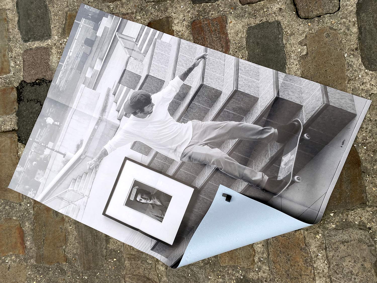
Jonathan Monk, «Exhibit Model Four», 2019 Kindl, Berlin. Photographie: Jens Ziehe. A1 format poster printed in CMYK on blue back paper
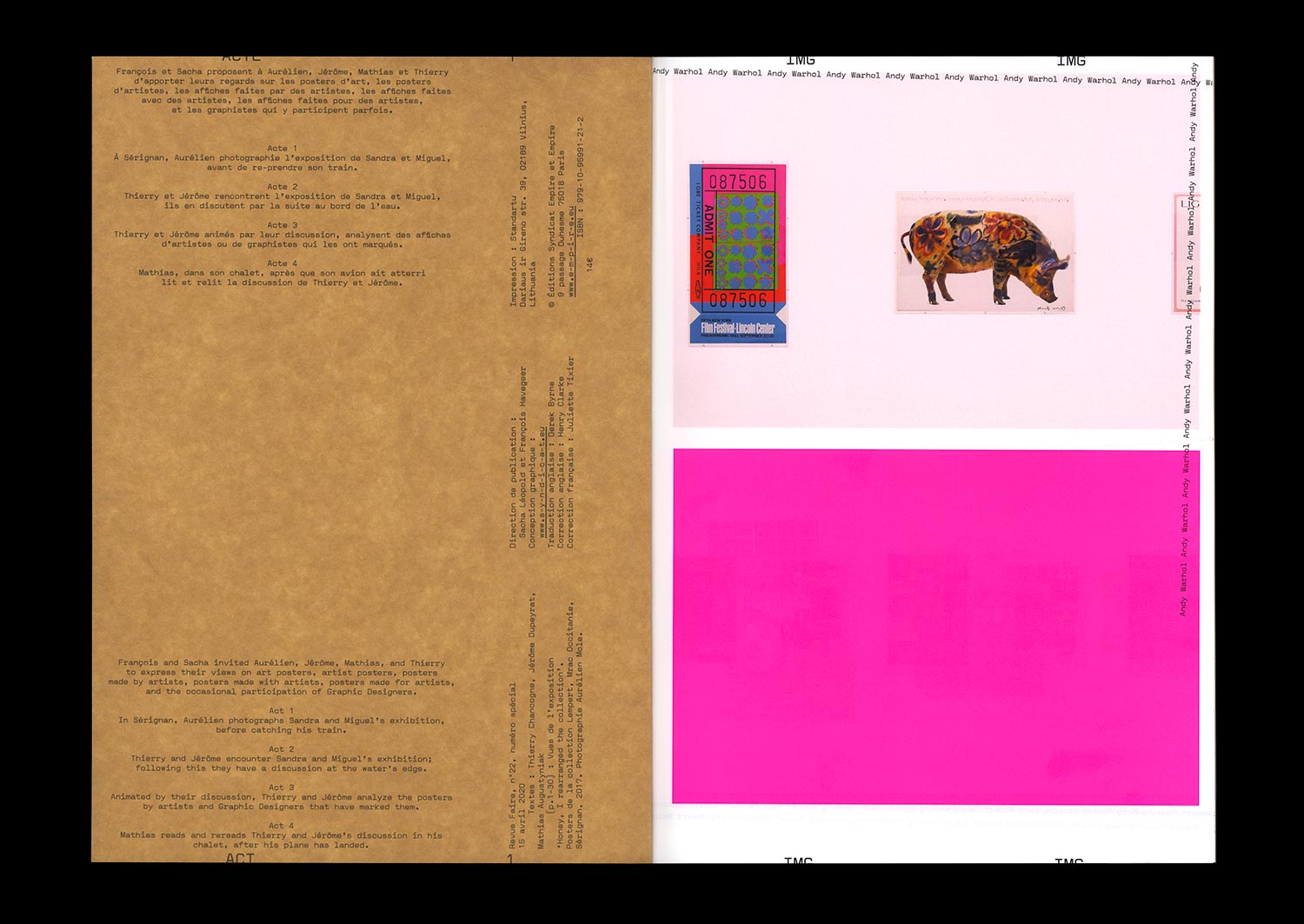
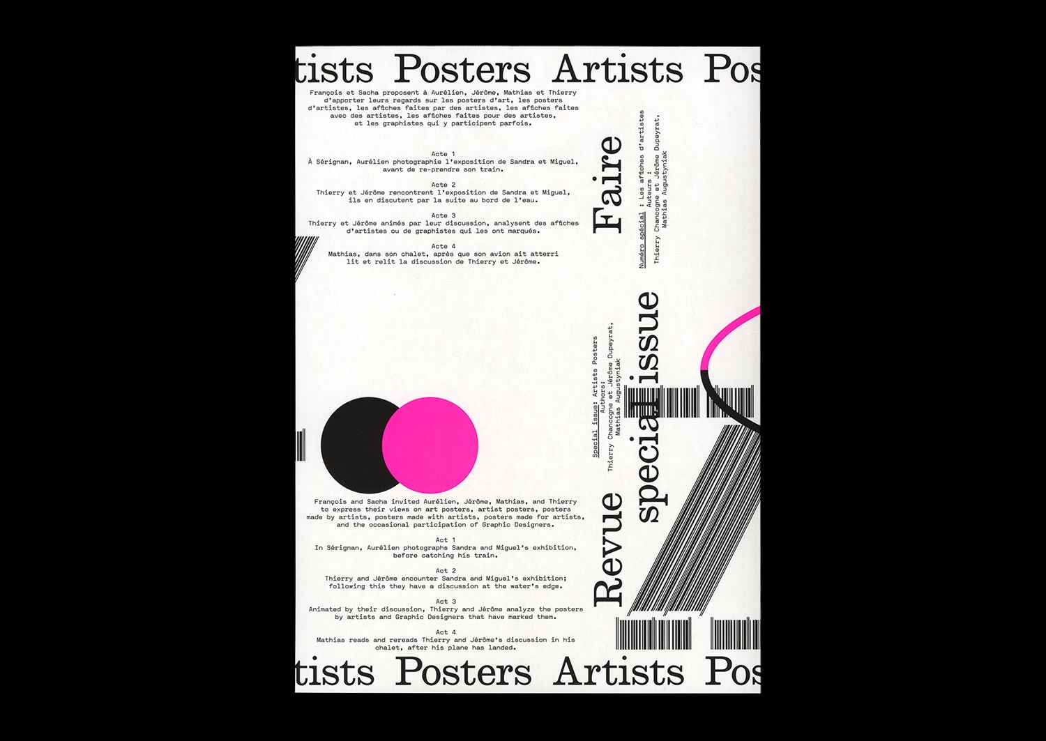
n°22 — Special Issue: Artists posters. Authors: Thierry Chancogne, Jérôme Dupeyrat, Mathias Augustyniak
Authors: Thierry Chancogne, Jérôme Dupeyrat, Mathias Augustyniak
72 pages, 21 × 29,7 cm
CMYK + 1 PMS
27 May 2020
ISBN: 979-10-95991-21-2
Authors: Thierry Chancogne, Jérôme Dupeyrat, Mathias Augustyniak
72 pages, 21 × 29,7 cm
CMYK + 1 PMS
27 May 2020
ISBN: 979-10-95991-21-2
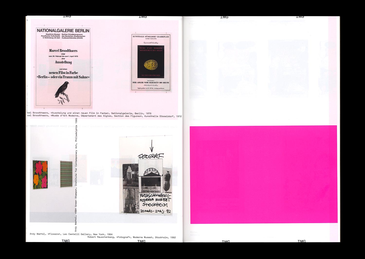
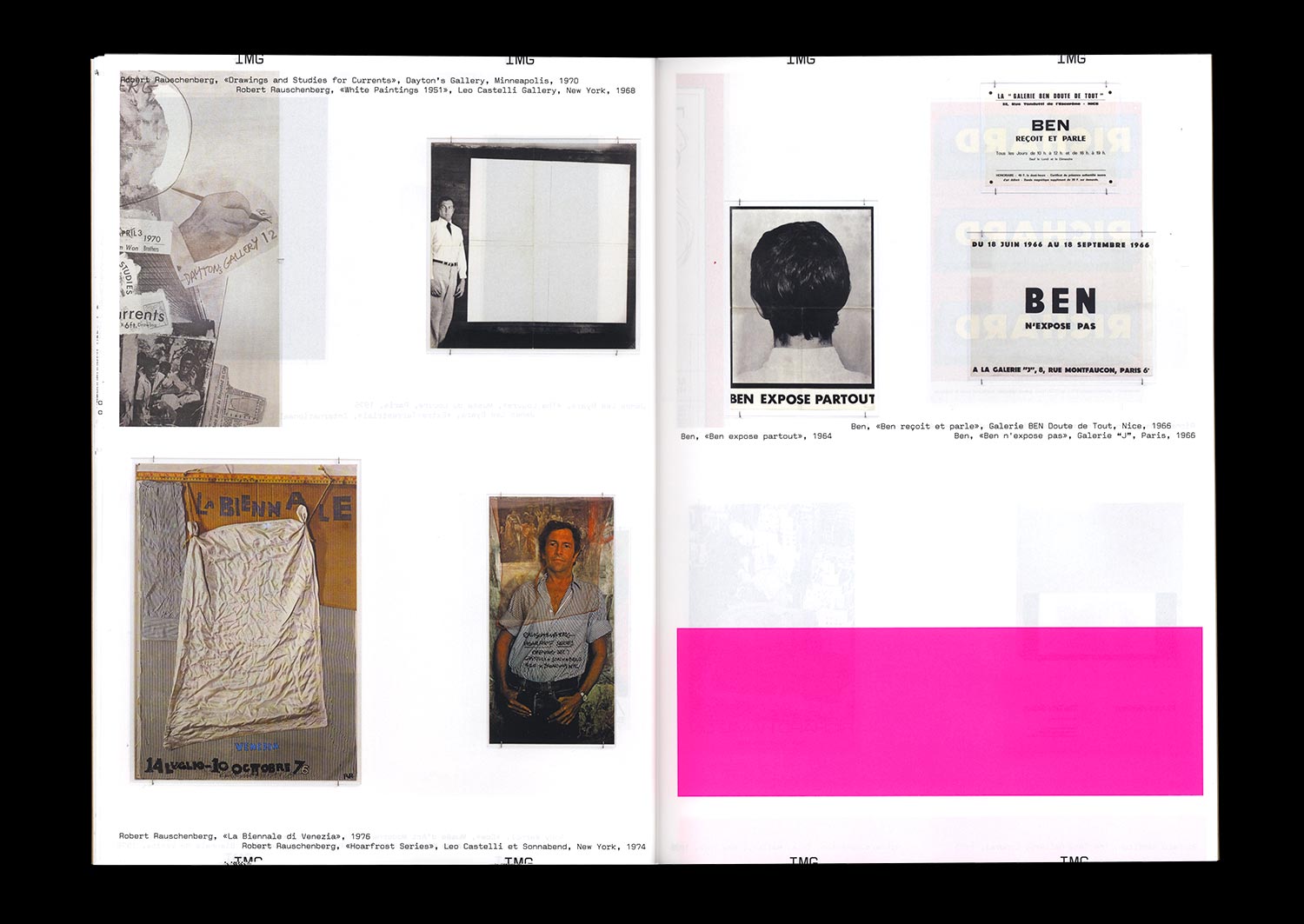
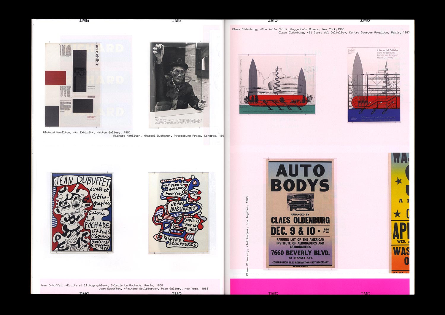
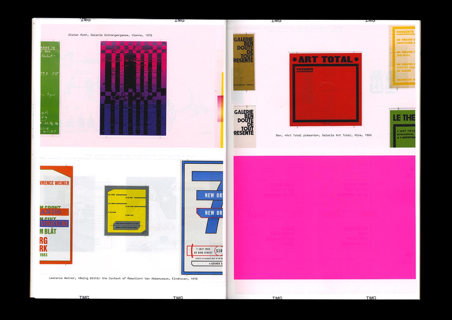
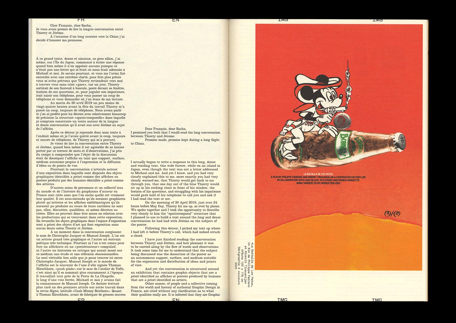
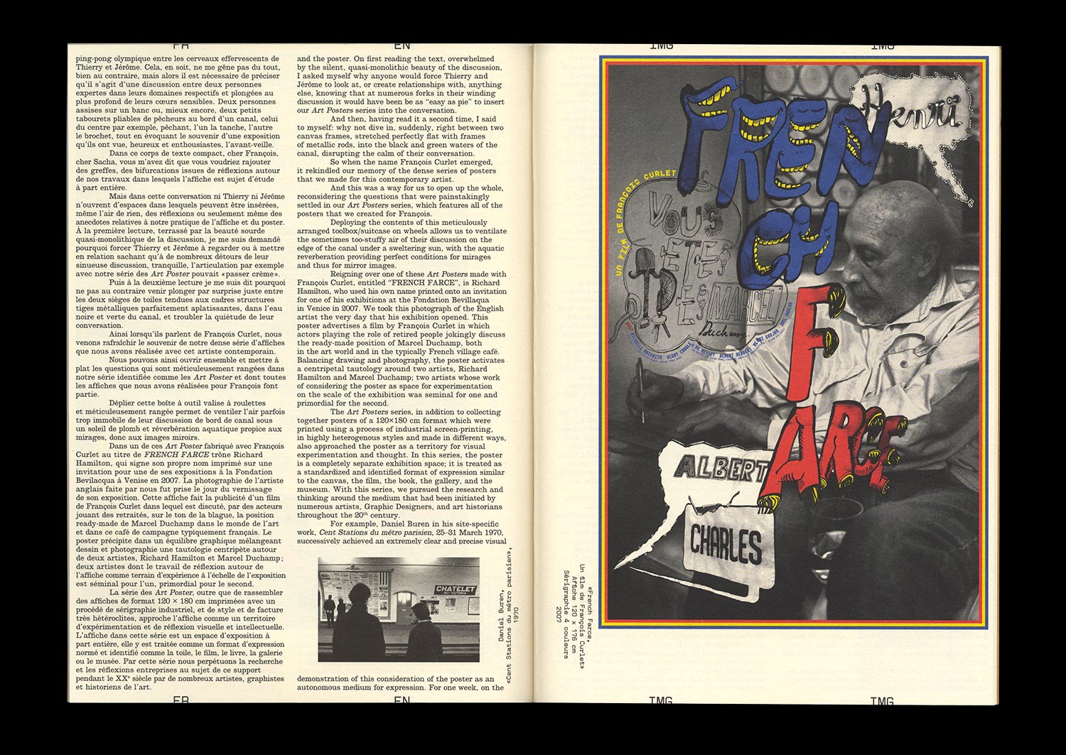
On the occasion of a visit to the exhibition at the MRAC Occitanie / Pyrénées-Méditerranée entitled Honey I rearranged the collection, Jérôme Dupeyrat and Thierry Chancogne continue their discussion of the controversial relationships that exist between art and Graphic Design, based on a historical collection of “artists’ posters”.
The artist’s poster or affiche is at once the traditional medium used to advertise artistic events, produced by the artists themselves, the historical medium of a certain passion for French-style painted posters and the desire of a particular artistic practice to democratize art, the symptom or symbol of potential new relationships between Graphic Design and art in an era where artists have acquired a new graphic culture and Graphic Designers a new artistic ambition.
The thematic exchanges nourished by theoretical, artistic, and graphic references taken from recent and contemporary history are punctuated by thoughts from Mathias Augustinyak, based on his experiences with designing posters for artists, artist posters, artistic posters, and the art of the poster.
Special 72 pages format!