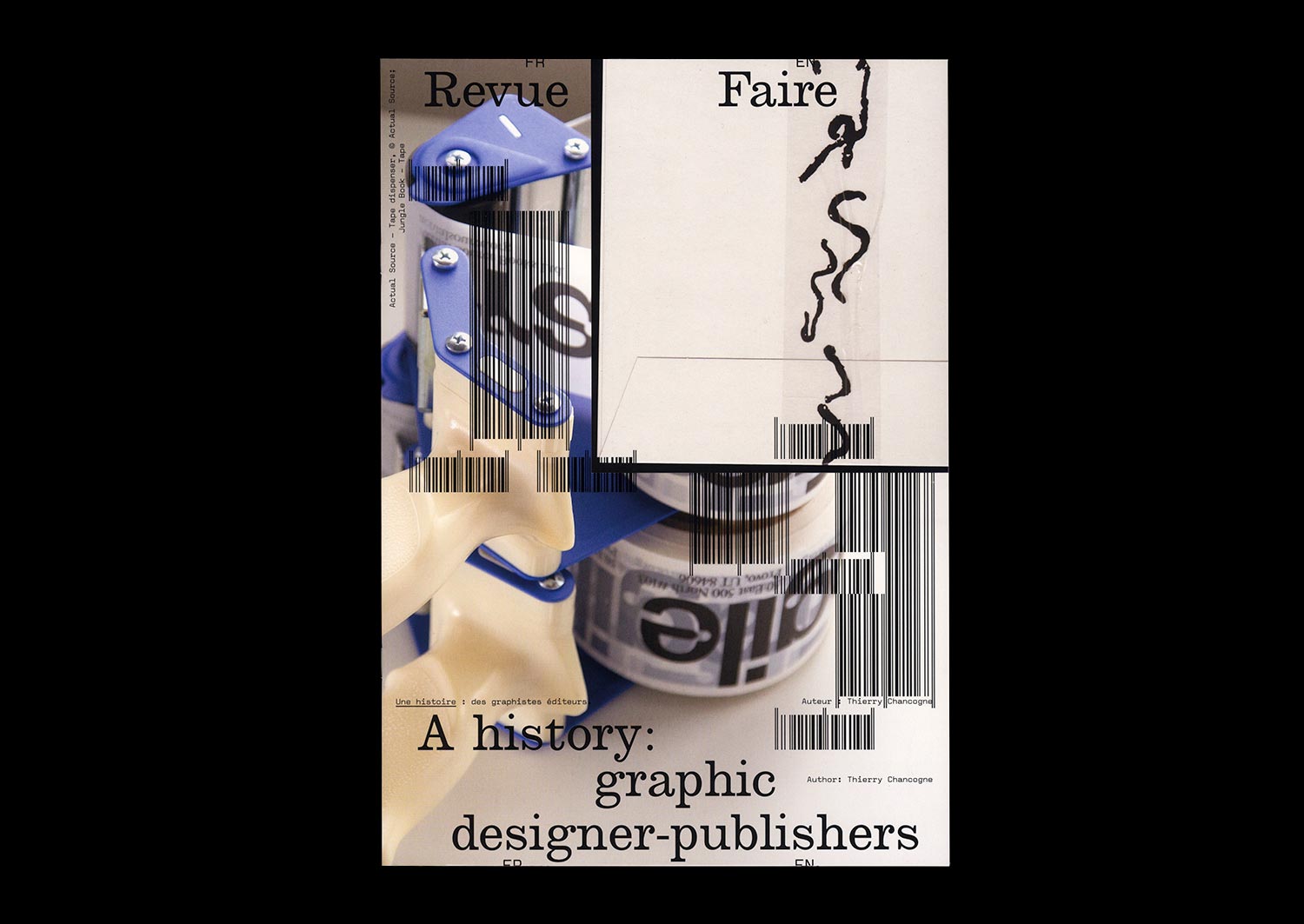
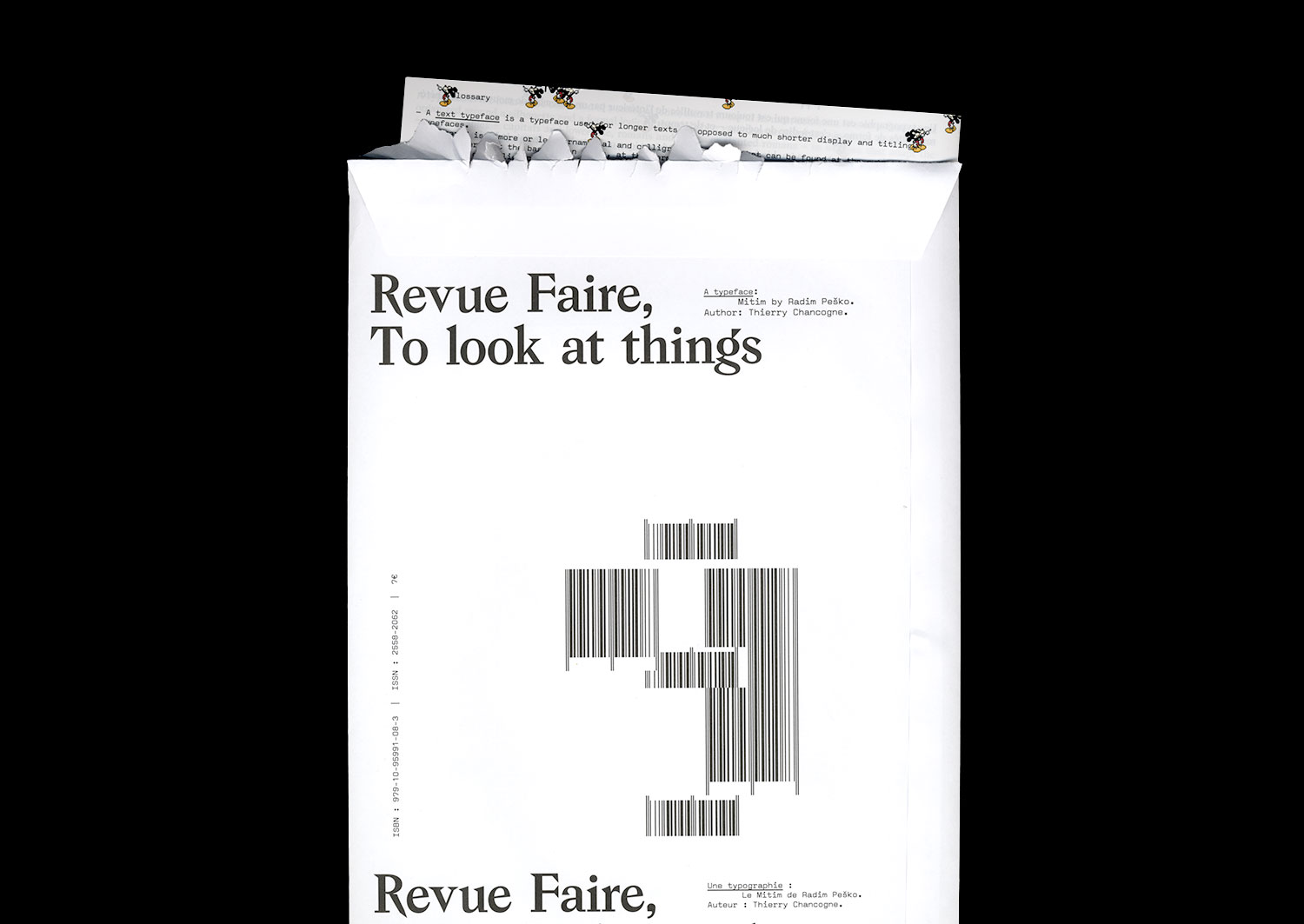
n°09 — A typeface: Mitim by Radim Pesko. Author: Thierry Chancogne
Sold out
Author: Thierry Chancogne
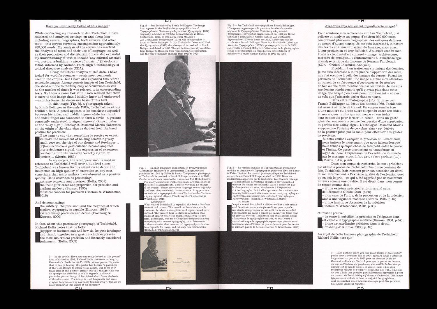
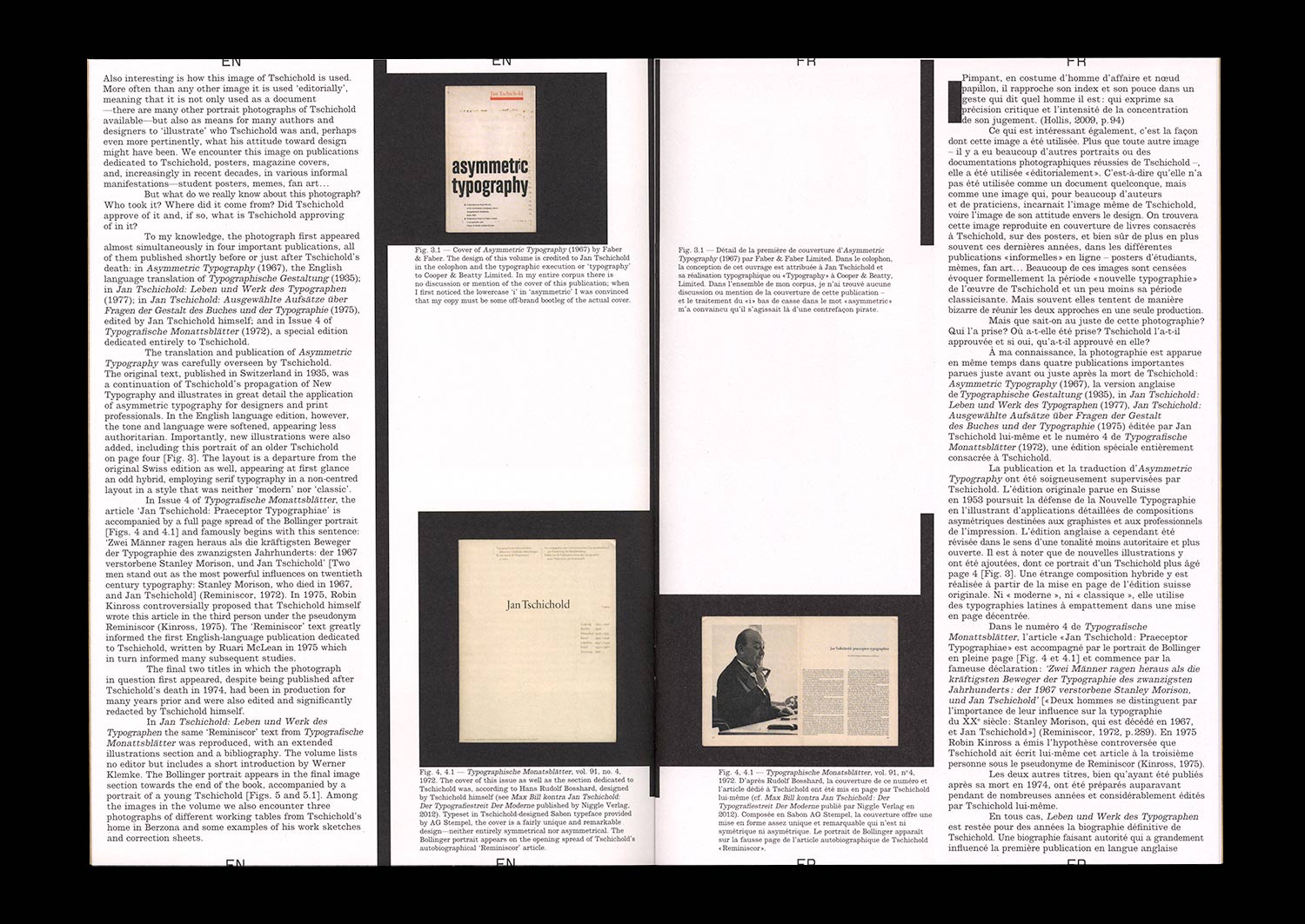
16 pages, 21 × 29,7 cm, CMYK + 4 cards in an envelope
28 February 2018
ISBN: 979-10-95991-08-3
ISSN: 2558-2062
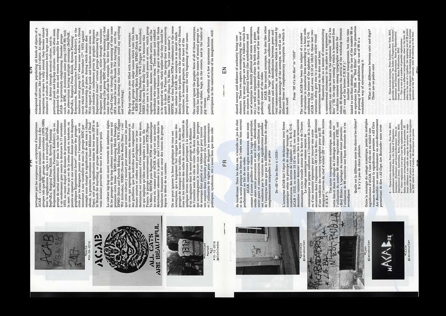
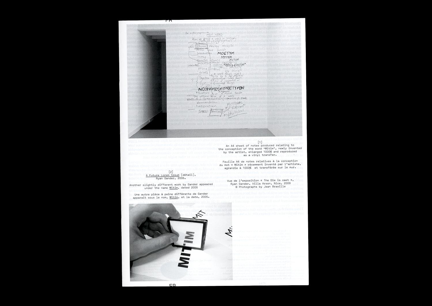
Mitim. Three letters interpolated into a palindrome and an ambigram, /Mit/ in Dutch, as in German, means “with.” Three peaks, an effect of symmetry and circulation. The triadic structure of the sign. Of what takes place. Of what binds. Signifier, Signified, Reference.
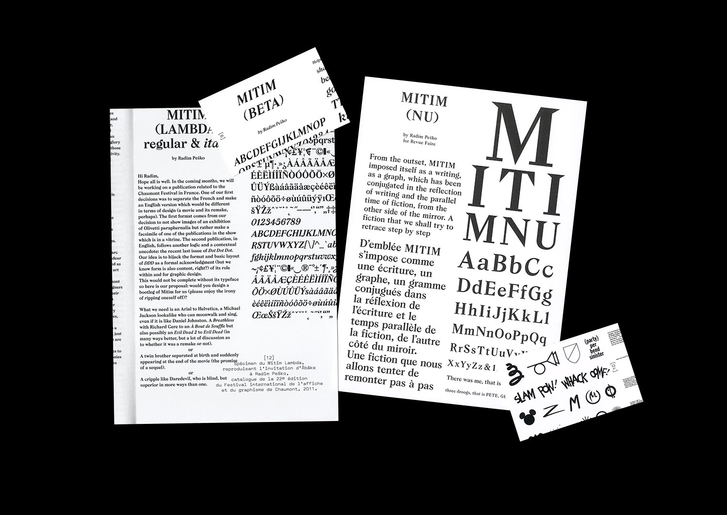
Mitim. A typeface designed by Radim Pesko for Dot Dot Dot. Again, three characters and a distribution. Three points that follow and invite pursuit, even if the period of this essential review ceased, ten years and twenty issues later.
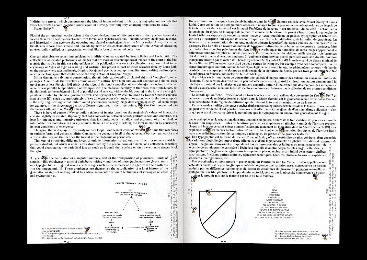
Mitim. A spun figure of a triangle that calls on asterism, a constellation of stars that is the figure of the constitution of meaning, at the same time being the typographical sign of changing paragraphs, or tailpiece. A prolific sign of rupture and continuation that marks the condition of every text and any periodical publication. A sign that proposes, in its form of a horizontal line of stars, an equivalent of the ellipsis, or “dot dot dot” as it is more commonly known.
Mitim. A triangular figure that refers to typographic signs of logic and mathematical relationships: consequence ·˙·, cause ˙·˙. In certain Masonic expressions, a figure that is one of abbreviation, of predictability, and of redundancy like that which is hidden in the sign: the sign of the secret to be deployed, the secret to be pursued.
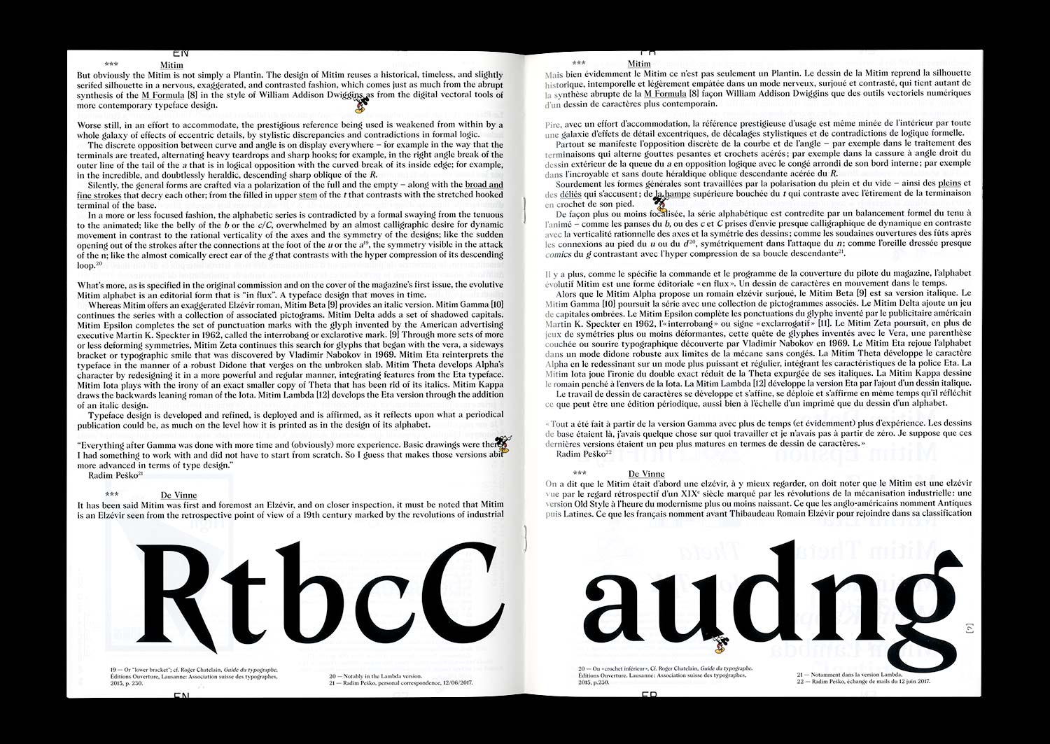
Mitim. A typeface design that extends to become a self-reflexive artistic and typographic project. An alphabet that evolves and adapts to the cycle of appearances of a publication in the form of a suite.