Season 1, 1st to 15th issue
Issues 1, 2, 3, 4, 5, 6, 7, 8, 9, 10, 11, 12, 13, 14 & 15
15 × 20 pages and sometimes more
21 × 29,7 cm, CMYK and sometimes more, Saddle stitched binding
Design: Syndicat
2017-2018
Sold out — available on demand
Season 1, 1st to 15th issue
Issues 1, 2, 3, 4, 5, 6, 7, 8, 9, 10, 11, 12, 13, 14 & 15
15 × 20 pages and sometimes more
21 × 29,7 cm, CMYK and sometimes more, Saddle stitched binding
Design: Syndicat
2017-2018
Sold out — available on demand
n°21 — An original: The Most Beautiful Swiss books 2004–2006. Authors: James Langdon, Laurent Benner & Adrian Samson
Interview with Laurent Benner by James Langdon
Photos: Adrian Samson
20 pages, 21 × 29,7 cm, CMYK
25th March 2020
ISBN: 979-10-95991-16-8
ISSN: 2558-2062
Interview with Laurent Benner by James Langdon
Photos: Adrian Samson
20 pages, 21 × 29,7 cm, CMYK
25th March 2020
ISBN: 979-10-95991-16-8
ISSN: 2558-2062
The awards programme The Most Beautiful Swiss Books has been organised almost without interruption by the Swiss Federal Office of Culture since 1943. A book design award with such history, particularly in a book-making culture as rich as Switzerland’s, offers insightful perspectives on Graphic Design for publishing, the culture that commissions and values it, and the critical discourse that surrounds it.
Each year the awarded books are documented in a substantial catalogue, made by one of the graphic designers awarded in previous years. The inherently self-reflexive tendencies of such catalogues—books about books, Graphic Design in the context of Graphic Design—present stimulating yet rather fraught conditions for graphic designers to work in. Looking back over the catalogues produced during the last two decades, a conversation-through-practice is clearly legible. After a conceptually sophisticated catalogue or series (often designers have been commissioned for series of two or three catalogues) follows a simple visual document. After a modest, finely-crafted production comes something more lavish or experimental.
The 2004–2006 catalogues were conceived by Laurent Benner, a Swiss designer working in London, and designed with English designer Jonathan Hares. Laurent’s proposition for the 2004 catalogue was audacious. He contacted the printers of each of the 20 awarded books from that year and asked them to reprint a section of their book. These reprinted sections were then transported to a single Swiss bookbinder and bound, with some additional pages of front- and back-matter, to comprise the catalogue.
n°08 — A residency: Coline Sunier & Charles Mazé at Villa Medici. Author: Thierry Chancogne
Interview with Coline Sunier & Charles Mazé by Thierry Chancogne
20 pages, 21 × 29,7 cm,
+ 1 A2 poster, black and white (reserved for subscribers or on demand)
07 February 2018
ISBN : 979-10-95991-05-2
ISSN : 2558-2096
Interview with Coline Sunier & Charles Mazé by Thierry Chancogne
20 pages, 21 × 29,7 cm,
+ 1 A2 poster, black and white (reserved for subscribers or on demand)
07 February 2018
ISBN : 979-10-95991-05-2
ISSN : 2558-2096
Typo-topographic records
While still a student in the Ésad Valence, Coline Sunier, along with Grégory Ambos, created a striking front cover for the booklet associated with the Zak Kyes programme, Forms of Inquiry, using a series of jewels sampled from the more or less heraldic graphic patrimony of highly local emblems.
When she founded her studio with Charles Mazé, the duo continued the work of collection, which is at the same time one of the etymologies of reading, and one of the characteristics of the conceptual aesthetic of the list that emerged in the 1970s—first, in the re-casting of the Ésad Valence’s identity in 2012-2013; then in the work created during a residency at the Villa Médicis, Come vanno le cose?, dedicated to records of 1,512 graffiti found on the walls of Rome illustrating the portrait of a mysterious survivor, perhaps imagined, of the Red Brigades; and more recently in the identity developed for the Centre d’art contemporain in Brittany.
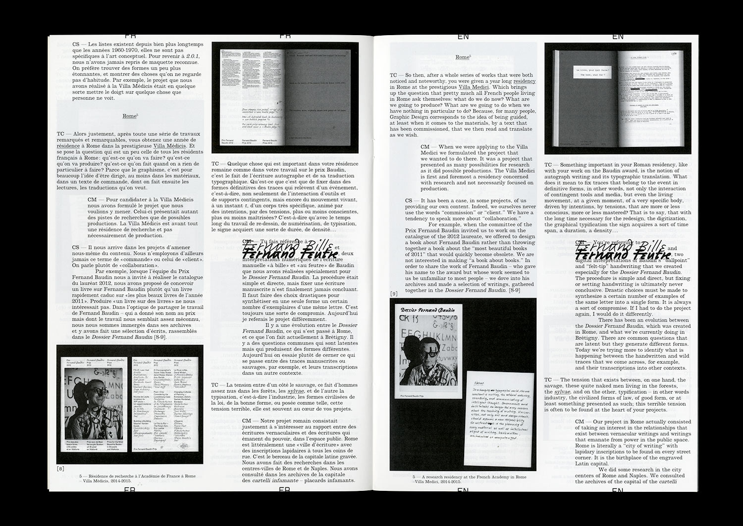
The collection of signs of power and the traces of resistance profoundly inscribed in the always political matter of the spaces is often accompanied by an attempt at typographic translation bringing to mind the work of typification in the personal writings of Fernand Baudin, created for the catalogue of the eponymous prize in 2012.
n°20 — A ski resort: Pierre Faucheux and Les Arcs. From the space to the sign. Author: Catherine Guiral
Author: Catherine Guiral
20 pages, 21 × 29,7 cm, CMYK
4th March 2020
ISBN: 979-10-95991-16-8
ISSN: 2558-2062
Author: Catherine Guiral
20 pages, 21 × 29,7 cm, CMYK
4th March 2020
ISBN: 979-10-95991-16-8
ISSN: 2558-2062
Known as “the man of a hundred million covers” and for being a major actor in the history of French Graphic Design during the Trente Glorieuses, the three decades of flourishing economic and cultural activity in France following World War II, Pierre Faucheux also had a rich activity as an architect. At the end of the 1960s, Charlotte Perriand invited him to become involved in the adventure of constructing the winter sports resort called Les Arcs. “The construction of a fantasy” designed by engineer Roger Godino, Les Arcs, a different type of Savoyard resort, would find itself embodied in a particular sign, which expresses the different instincts that Faucheux had for both the space and its transformation.
