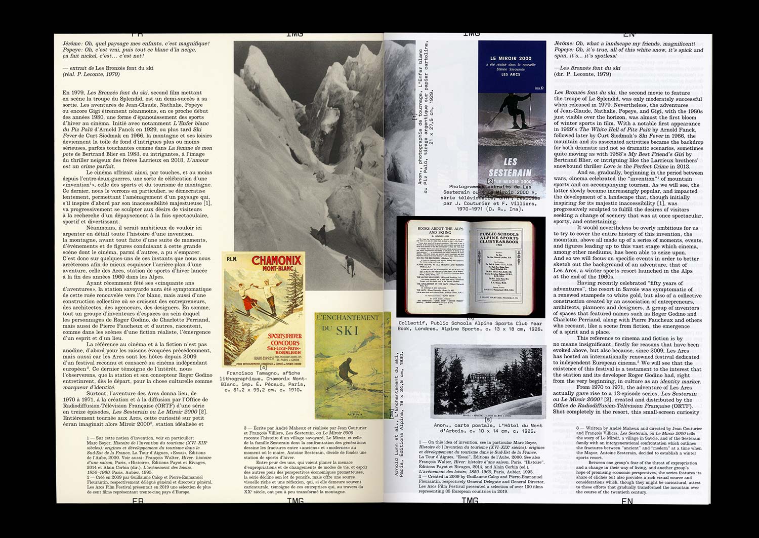
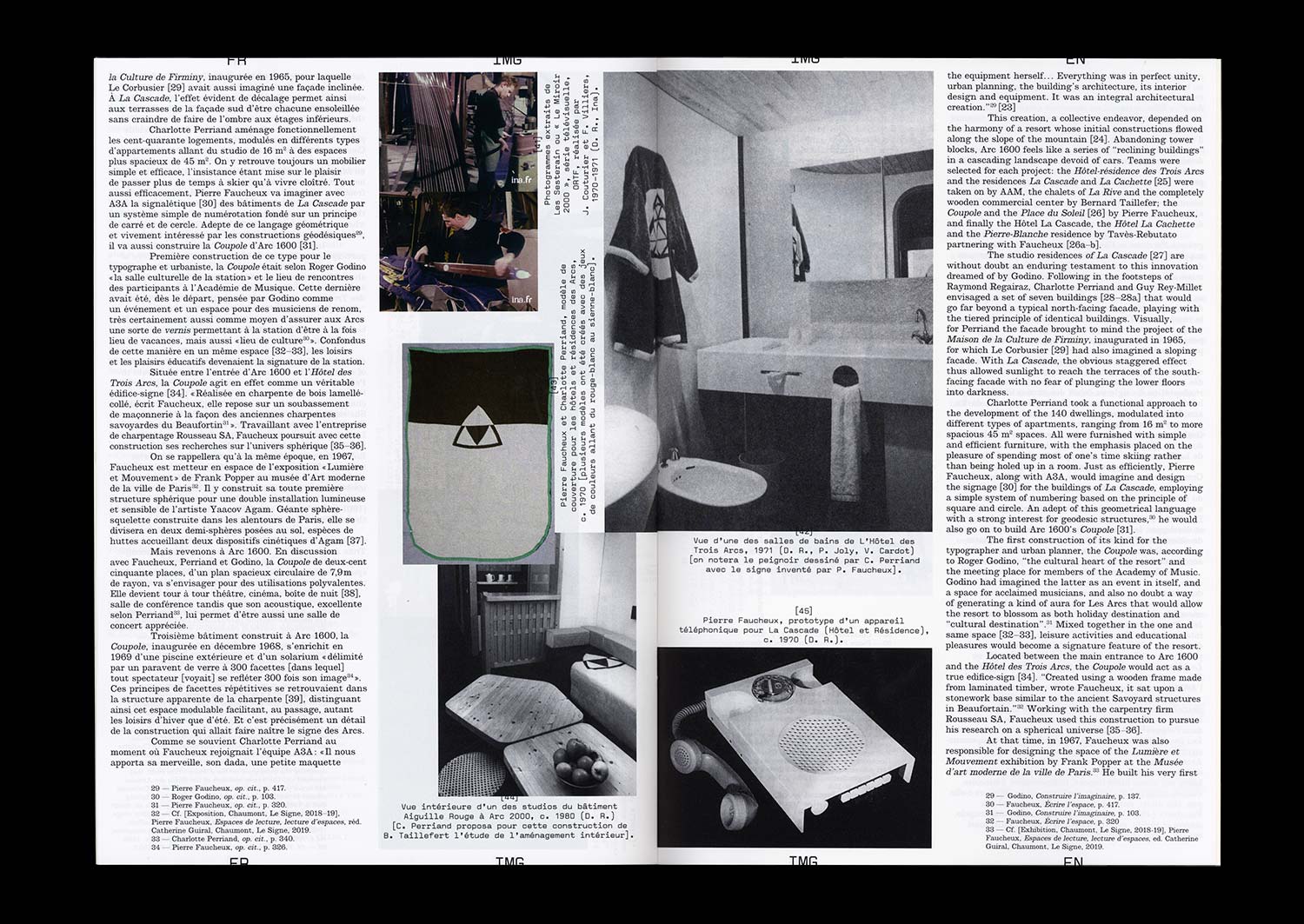
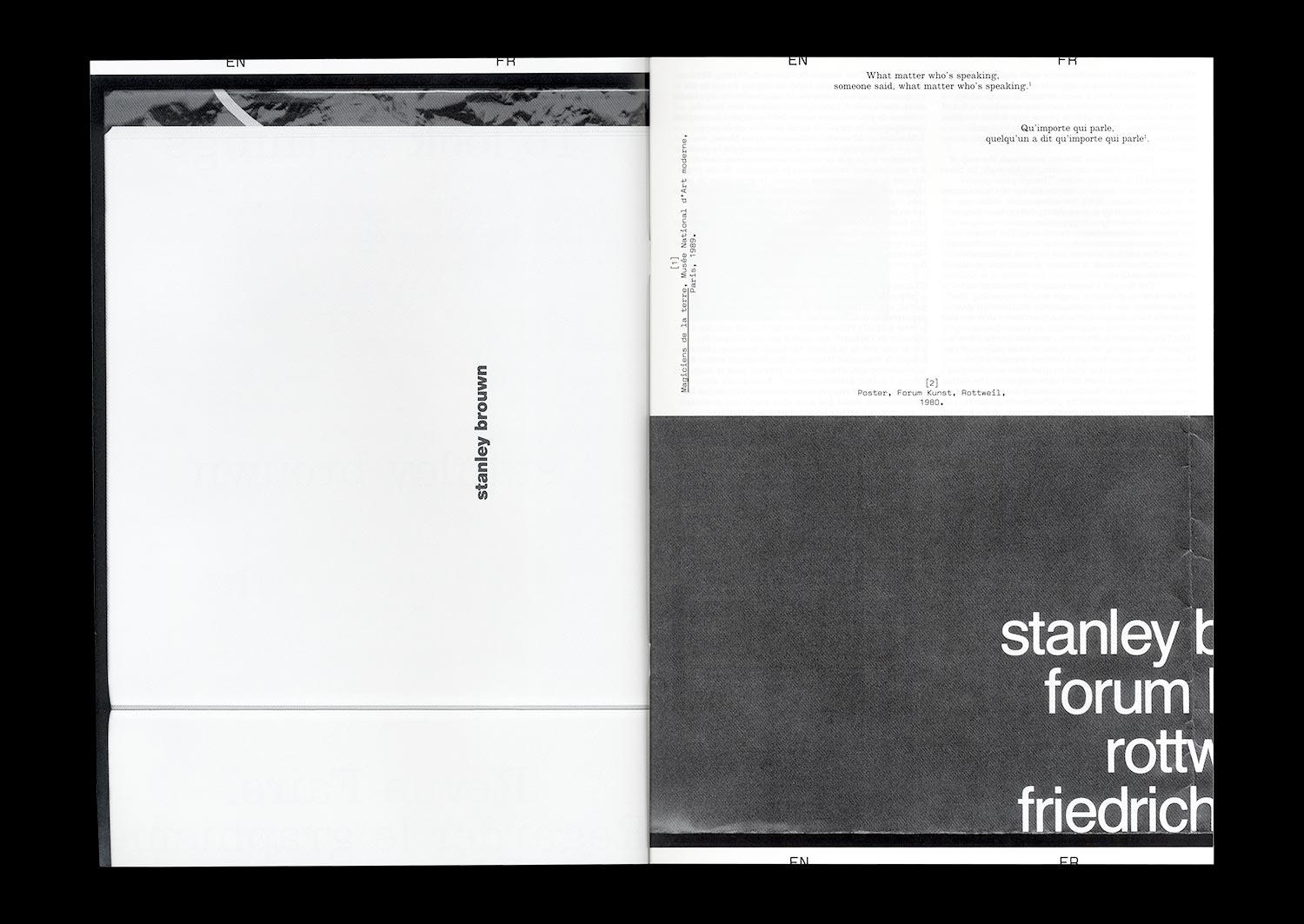
n°53 — Graphic Designers as Iconographers. Author: Thierry Chancogne


pre-order now
Author: Thierry Chancogne
80 pages, 21 × 29,7 cm, CMYK + 1 PMS
November 2025
ISBN: 979-10-95991-59-5
ISSN: 2558-2062
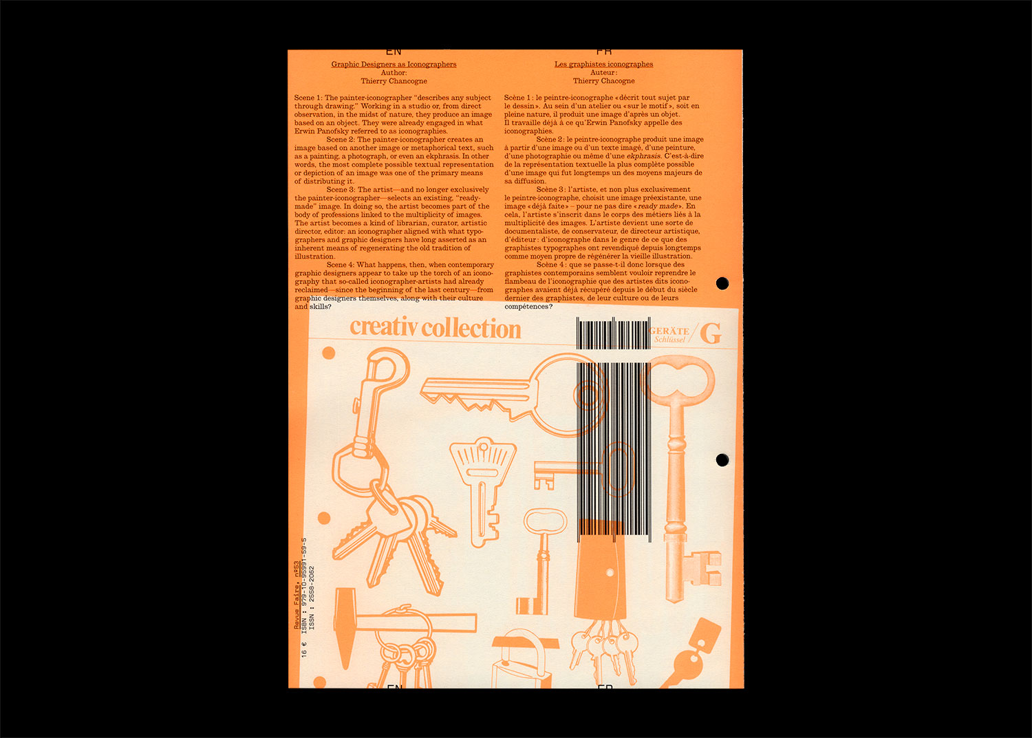
Scene 1: The painter-iconographer “describes any subject through drawing.” Working in a studio or, from direct observation, in the midst of nature, they produce an image based on an object. They were already engaged in what Erwin Panofsky referred to as iconographies.
Scene 2: The painter-iconographer creates an image based on another image or metaphorical text, such as a painting, a photograph, or even an ekphrasis. In other words, the most complete possible textual representation or depiction of an image was one of the primary means of distributing it.
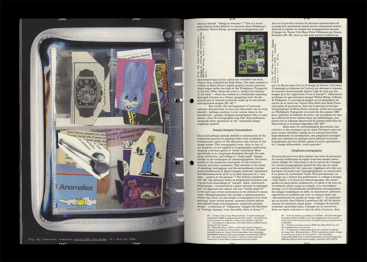
Scene 3: The artist—and no longer exclusively the painter-iconographer—selects an existing, “ready-made” image. In doing so, the artist becomes part of the body of professions linked to the multiplicity of images. The artist becomes a kind of librarian, curator, artistic director, editor: an iconographer aligned with what typographers and graphic designers have long asserted as an inherent means of regenerating the old tradition of illustration.
Scene 4: What happens, then, when contemporary graphic designers appear to take up the torch of an iconography that so-called iconographer-artists had already reclaimed—since the beginning of the last century—from graphic designers themselves, along with their culture and skills?