n°57 — Matrix font


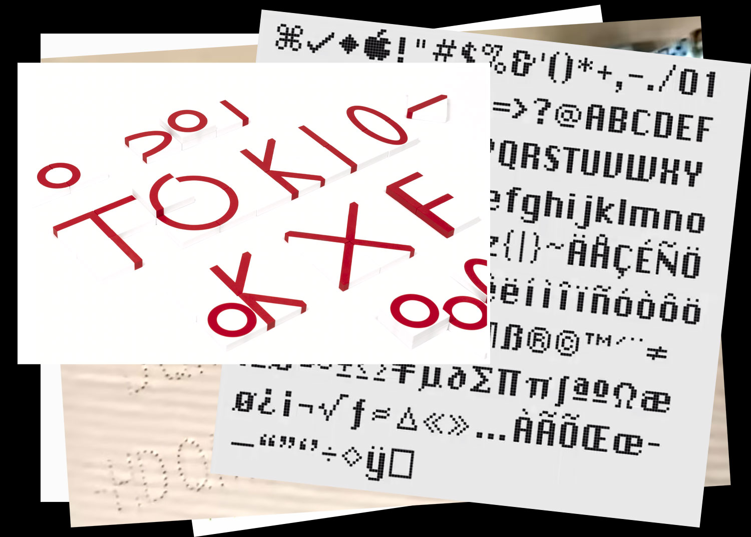
End of 2025
more infos to come
n°57 — Matrix font
End of 2025
more infos to come
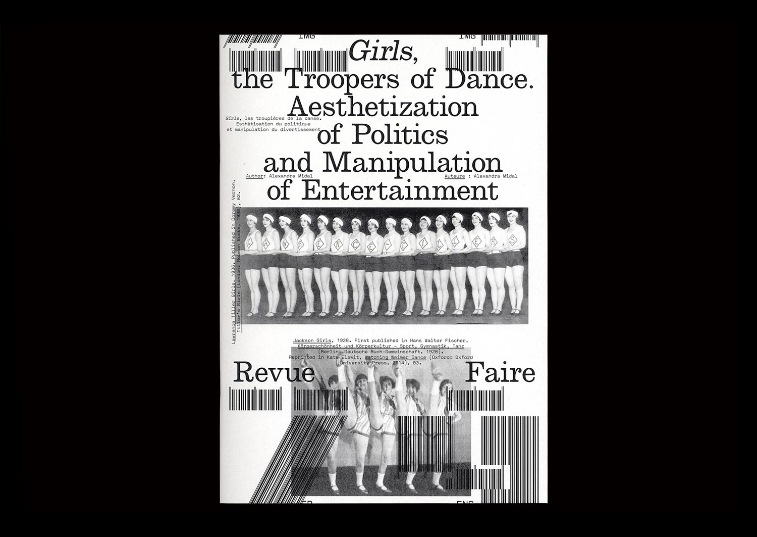
n°29 — Girls, the Troopers of Dance. Aesthetization of Politics and Manipulation of Entertainment. Author: Alexandra Midal
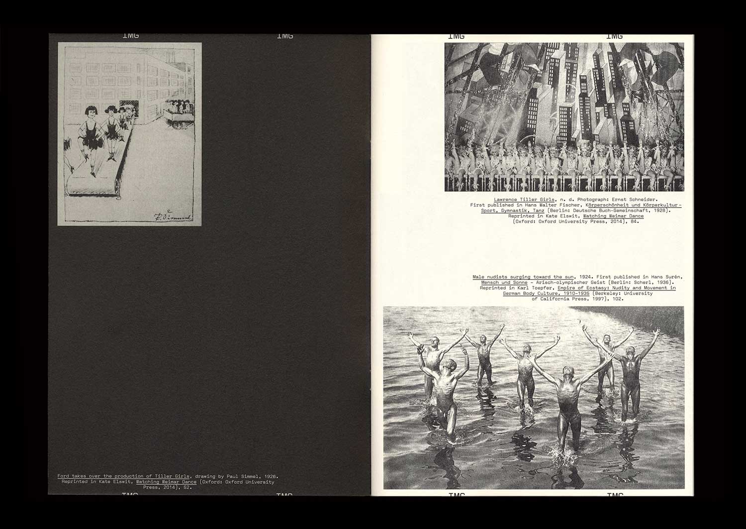
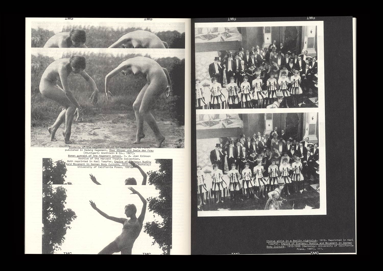
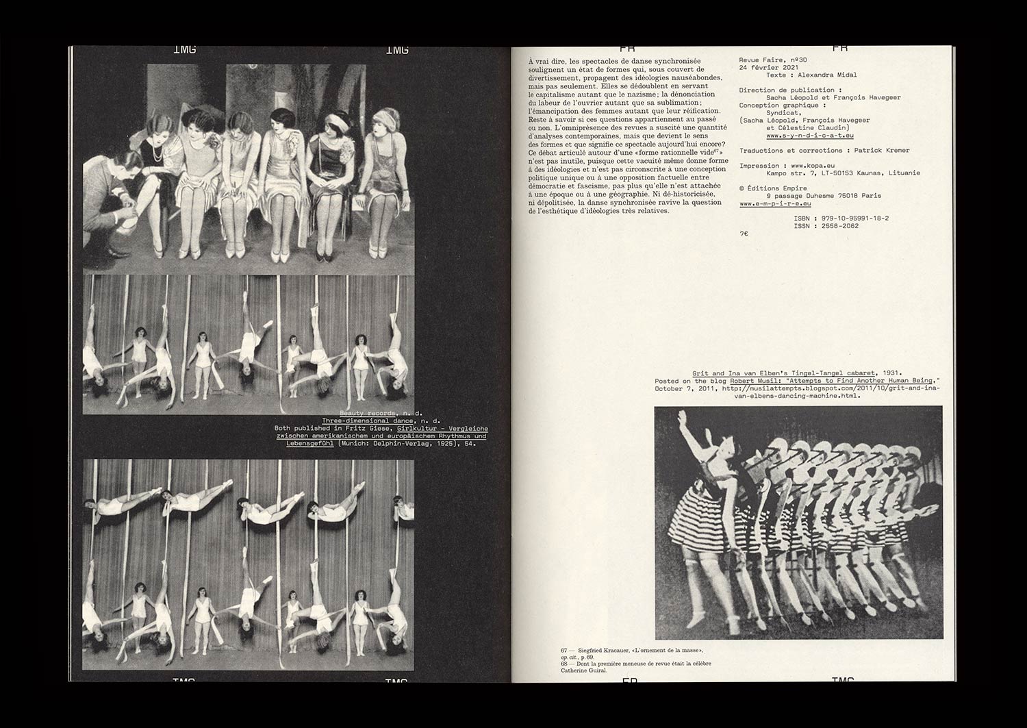
The British origins of synchronized dancing—invented in 1880 by John Tiller in a cotton mill—were quickly forgotten in Berlin, where periodicals established themselves as the expression of standardization and American capitalism. The famous Tiller Girls had become the modern figure of the “New Woman”, performing in shows attracting more than four million spectators each year. A seduced Hitler asked for his own troupe: the Hiller Girls. Face to face, both periodicals look like strictly indistinguishable replicas, apart from their opposite messages.
Synchronized dancing revealed the democratic and fascist forms given to the political discourse of the Weimar Republic when the NSDAP seized power. Between the power of forms and forms of power, amid the destruction of cities, decrees banishing the use of Fraktur, and the destruction of degenerate art, those dance shows, undoubtedly because of their popularity, showed that National Socialism was using insidious and invisible strategies to empty forms of their content only to maintain their appearance intact, thus revealing a shadow practice that, in the end, turned out to be just as barbaric as world-wide destruction or the burning of books.
n°19 — A history: graphic designer-publishers. Author: Thierry Chancogne
Sold out — Only available with season 2 subscription
Author: Thierry Chancogne
20 pages, 21 × 29,7 cm, CMYK
5th February 2020
ISBN: 979-10-95991-16-8
ISSN: 2558-2062
Sold out — Only available with season 2 subscription
Author: Thierry Chancogne
20 pages, 21 × 29,7 cm, CMYK
5th February 2020
ISBN: 979-10-95991-16-8
ISSN: 2558-2062
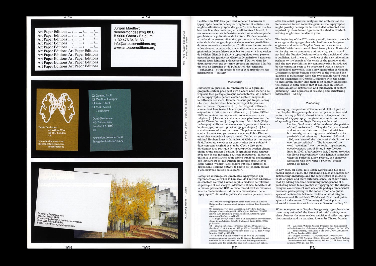
In 1275, the kingdom of France ruled on the rights of stationarii (copyists) and librarii (librairies, the French for “bookshop”), newly emancipated from the yoke of the Church (Friedrich Karl von Savigny (author and publisher), Histoire du droit romain au moyen âge, Tome III, Charles Hingray, Paris, 1839 (1815), p. 415). The main question was and has always been, even before the invention of printing, the regulation of the circulation of writing, and the designation of those responsible for their inscription and distribution.
Robin Kinross identified the emergence of the modern figure of the typographer in the 17th century, with The doctrine of handy-works: applied to the art of printing by Joseph Moxon (Robin Kinross, Modern typography: An Essay in Critical History, Hyphen Press, London, 2004 (1992) pp. 15-16). But long before this, graphic artists, copyists, and typographers such as Geoffroy Tory and Henri Estienne the elder were both booksellers and publishers who gave much thought to their practice and the contents that they released into the public space.
It would seem that the time has come to reassess this ancient tradition, with more and more graphic artists and designers choosing to establish their own publishing houses in order to defend their editorial approach in both senses of the word—that of “editing” and the choice and organization of graphic material, but also in the sense of “publishing”, applying a certain ethic to the distribution and advertising of the contents.
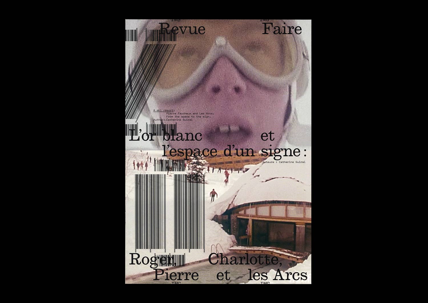
n°20 — A ski resort: Pierre Faucheux and Les Arcs. From the space to the sign. Author: Catherine Guiral
Author: Catherine Guiral
20 pages, 21 × 29,7 cm, CMYK
4th March 2020
ISBN: 979-10-95991-16-8
ISSN: 2558-2062
Author: Catherine Guiral
20 pages, 21 × 29,7 cm, CMYK
4th March 2020
ISBN: 979-10-95991-16-8
ISSN: 2558-2062
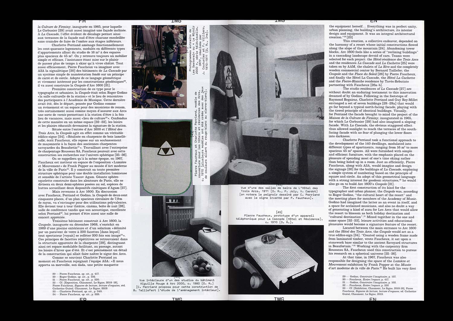
Known as “the man of a hundred million covers” and for being a major actor in the history of French Graphic Design during the Trente Glorieuses, the three decades of flourishing economic and cultural activity in France following World War II, Pierre Faucheux also had a rich activity as an architect. At the end of the 1960s, Charlotte Perriand invited him to become involved in the adventure of constructing the winter sports resort called Les Arcs. “The construction of a fantasy” designed by engineer Roger Godino, Les Arcs, a different type of Savoyard resort, would find itself embodied in a particular sign, which expresses the different instincts that Faucheux had for both the space and its transformation.