n°57 — Julia Born
end of 2025
More infos to come
n°57 — Julia Born
end of 2025
More infos to come
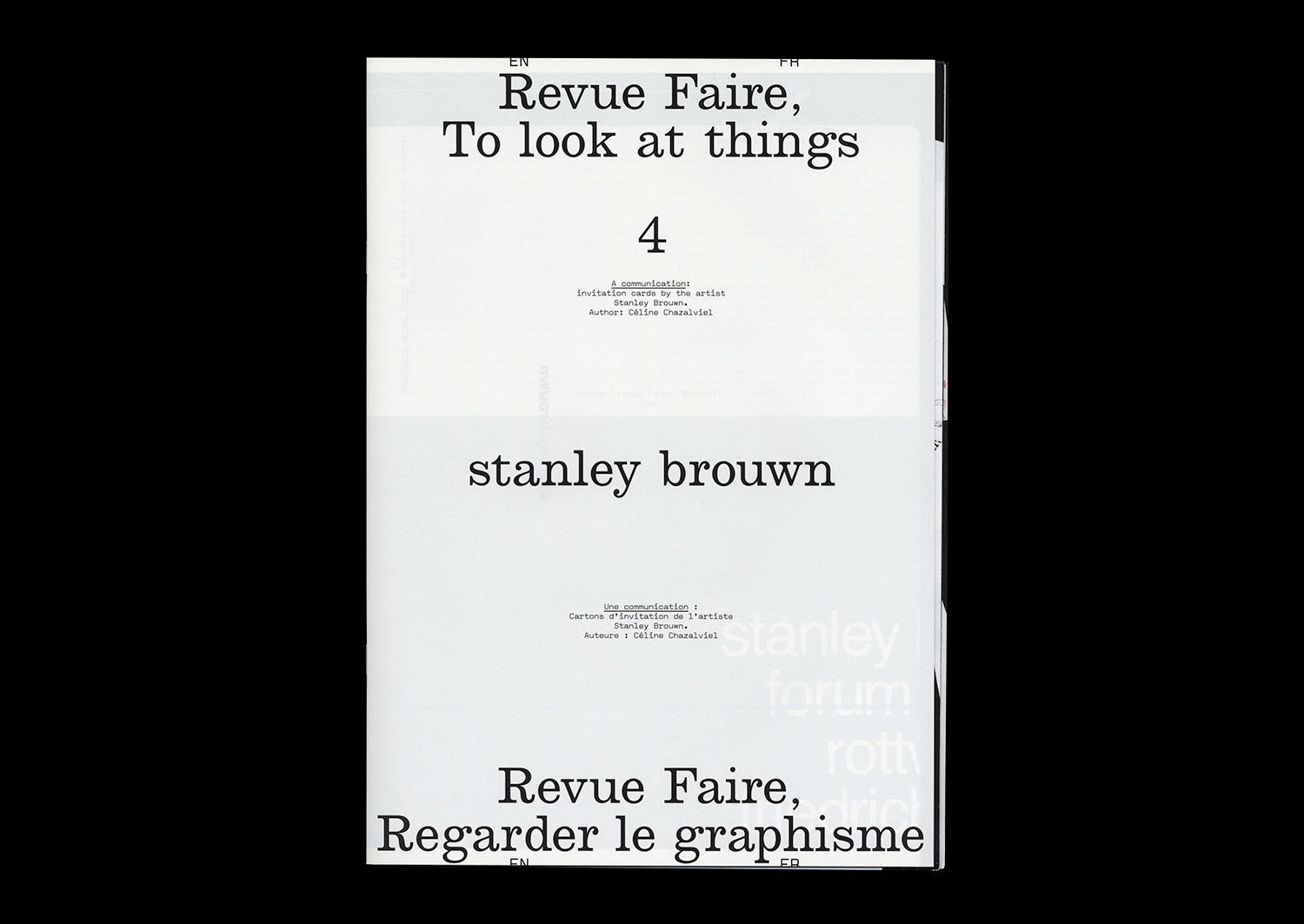
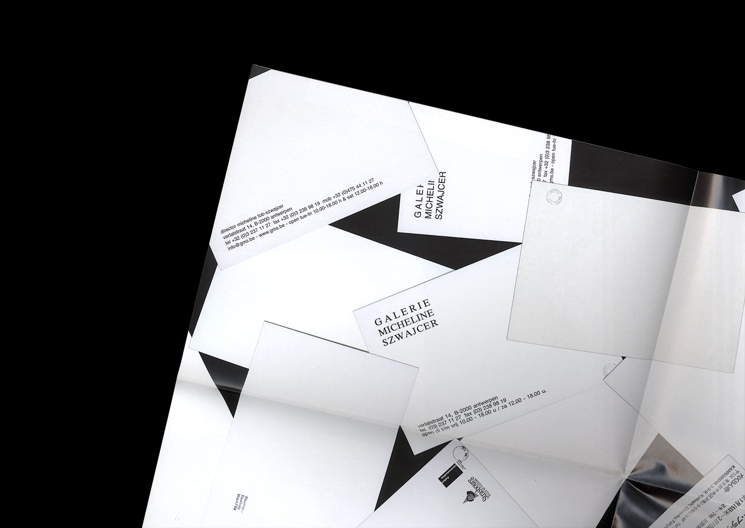
n°04 — A communication: invitation cards by the artist Stanley Brouwn. Author: Céline Chazalviel
Author: Céline Chazalviel.
20 pages, 21 × 29,7 cm, CMYK
+ 1 A1 poster, CMYK (reserved for subscribers or on demand)
6th December 2017
ISBN: 979-10-95991-04-5
ISSN: 2558-2062
Author: Céline Chazalviel.
20 pages, 21 × 29,7 cm, CMYK
+ 1 A1 poster, CMYK (reserved for subscribers or on demand)
6th December 2017
ISBN: 979-10-95991-04-5
ISSN: 2558-2062
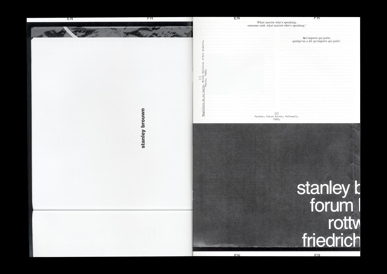
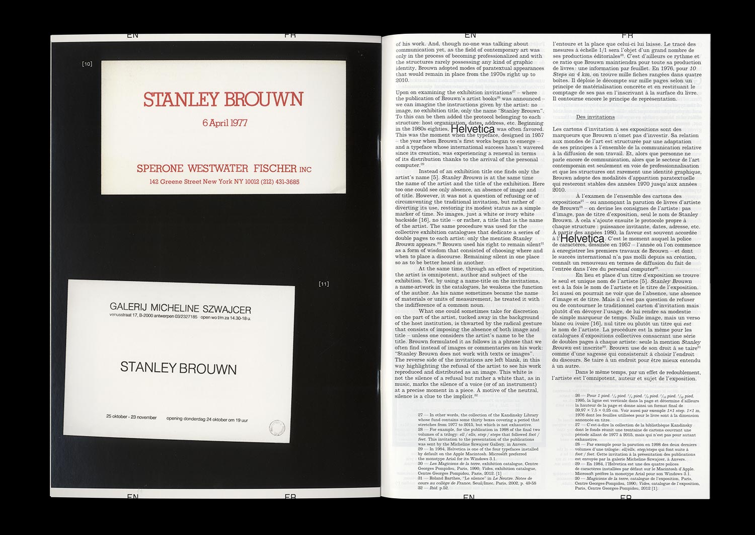
If we could attribute to Stanley Brouwn a desire to dissociate his artistic production from who he is and to reveal otherness through the mastery of his image and that of his work, we could also divine an intention to focus the public’s attention on his exhibitions. Behind the standards put in place for the communication related to his exhibitions—the use of lowercase and Helvetica exclusively, the refusal to reproduce images of his work, to produce (or allow production of) written commentary on the subject of the same work, to appear in the context of a vernissage or even to answer an interview—the artist builds his identity by way of ellipses. Since his participation in documenta 5 (1972), the stories linked to this attitude have come to draw the outlines of an artistic posture that goes beyond any one particular case. The invitation cards for his solo exhibitions provide a symptomatic example: set almost exclusively in Helvetica, the absence of uppercase, flying in the face of the graphic identity of the gallery or the host institution, they seem impossible to date, give or take twenty years.
This mastery reveals that graphic and typographic choices represent one of the spaces of neutrality built by Brouwn, like other artists and theoreticians of his generation, and generations that came after. According to one of the positions of Sol Lewitt, “conceptual artists are more mystical than rationalist,” and the case of Brouwn gives weight to this idea. Whether it be by way of a mediation adopted by the artist himself and the relationship with the institution that it entails, that of the myth of the autonomy of the artwork, of the relationship with documentation, with commentary and the analysis of an artwork or even the conditions of reception, Brouwn escapes the category of the conceptual artist and incites us to measure the contemporary echoes of his radicality.
n°22 — Special Issue: Artists posters. Authors: Thierry Chancogne, Jérôme Dupeyrat, Mathias Augustyniak
Authors: Thierry Chancogne, Jérôme Dupeyrat, Mathias Augustyniak
72 pages, 21 × 29,7 cm
CMYK + 1 PMS
27 May 2020
ISBN: 979-10-95991-21-2
Authors: Thierry Chancogne, Jérôme Dupeyrat, Mathias Augustyniak
72 pages, 21 × 29,7 cm
CMYK + 1 PMS
27 May 2020
ISBN: 979-10-95991-21-2
On the occasion of a visit to the exhibition at the MRAC Occitanie / Pyrénées-Méditerranée entitled Honey I rearranged the collection, Jérôme Dupeyrat and Thierry Chancogne continue their discussion of the controversial relationships that exist between art and Graphic Design, based on a historical collection of “artists’ posters”.
The artist’s poster or affiche is at once the traditional medium used to advertise artistic events, produced by the artists themselves, the historical medium of a certain passion for French-style painted posters and the desire of a particular artistic practice to democratize art, the symptom or symbol of potential new relationships between Graphic Design and art in an era where artists have acquired a new graphic culture and Graphic Designers a new artistic ambition.
The thematic exchanges nourished by theoretical, artistic, and graphic references taken from recent and contemporary history are punctuated by thoughts from Mathias Augustinyak, based on his experiences with designing posters for artists, artist posters, artistic posters, and the art of the poster.
Special 72 pages format!
n°05 — An Instagram post: P/Pa/Para/Paradiso by jetset_experimental (July 1 2017). Author: Manon Bruet
Author: Manon Bruet.
20 pages, 21 × 29,7 cm, CMYK
20 December 2017
ISBN : 979-10-95991-05-2
ISSN : 2558-2062
Author: Manon Bruet.
20 pages, 21 × 29,7 cm, CMYK
20 December 2017
ISBN : 979-10-95991-05-2
ISSN : 2558-2062
On July 1st, 2017, just as I was about to begin research into the use of social networks by Graphic Designers, the Dutch studio Experimental Jetset posted a slideshow containing 7 images on Instagram. Entitled “P/Pa/Para/Paradiso” it presented, as a whole and in its details, their new posters for the Paradiso center for music and culture in Amsterdam. Apart from the obvious formal relationship with the Blow Up poster that they created in 2007 for the London Design Museum, this slideshow gives very few keys to read what seemed to be a new aspect of the center’s communication, something that Experimental Jetset had been working on since 1996.
Currently having over 1,500 likes and tens of comments, this post is where my article begins. An opportunity to investigate and review this collaboration, that over 20 years has taken various forms (flyers, programs, posters), along with the singular and radical practice of Experimental Jetset. And also the opportunity to provide a more theoretical view of the way that Graphic Design is shown and seen on different platforms, that have now become an integral part of the teaching and the evolution of the discipline.