16 — A reproduction: what El Lissitzkzy wants. Author: James Langdon
Sold out — Only available with season 2 subscription
Author: James Langdon
12 pages, 21 × 29,7 cm, CMYK
+ 1 A2 poster, CMYK + 1PMS
7th November 2019
ISBN: 979-10-95991-15-1
ISSN: 2558-2062
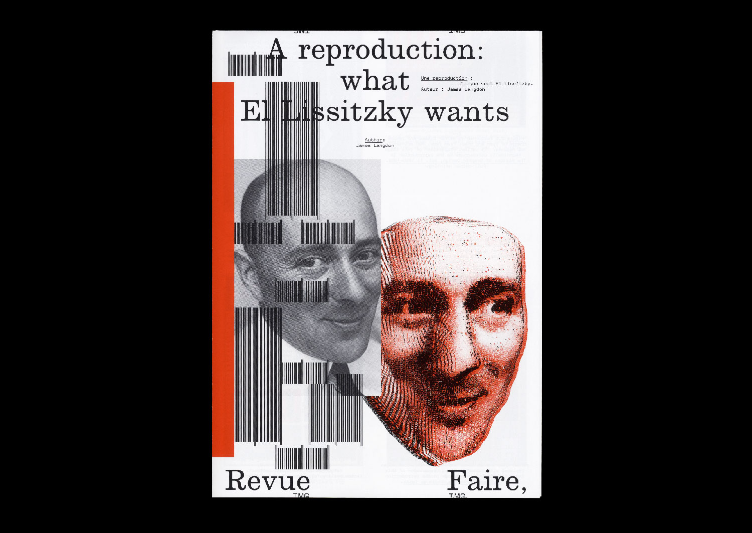
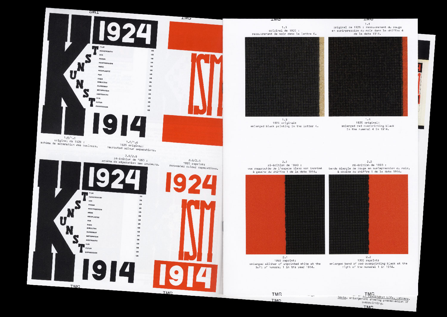
I am rarely convinced when I see graphic design that was originally printed in two inks reproduced in four- colour process. Before the advent of commercial colour offset printing, the elementary colours of printing — from Gutenberg to Tschichold — were black and red. In the early twentieth century, black and red were used by graphic designers not to attempt to recreate the spectrum of colours that appear to the human eye, but as graphic forces in themselves. To make a distinction. To create dynamism. To embody ideology on the page. In particular, the combination of black and red on white paper has become synonymous with Suprematism and revolutionary Russian graphic design.
A contemporary imaging workflow can enable extraordinary reproductions of these historical aesthetics. A high- resolution digital photograph of an original black and red printed book from the 1920s can be processed using a colour profile to calibrate its appearance across design, colour correction in computer software, proofing, and printing. This workflow can ultimately achieve a beautiful and precise image of that graphic artefact as it looks today, down to small details of its patination, its discoloration by exposure to sunlight, and the many more other subtleties that define it as an archival object.
But such a reproduction exhibits a strange technical anachronism. What about the constraints that originally shaped the design of that bookk — the implicit connection between the two colours of its graphics and the architecture of the one- or two-colour printing press on which it was printed? Are they not important? Can they even be reproduced?
I compare printed reproductions of the proud black and red cover of the book ‘Die Kunstismen’ (1925), designed by Russian artist and designer El Lissitzky. Published between 1967 and 2017, these images treat the material characteristics of the original book’s colour in different ways, appealing to contradictory notions of fidelity.