n°57 — La typographie matricielle
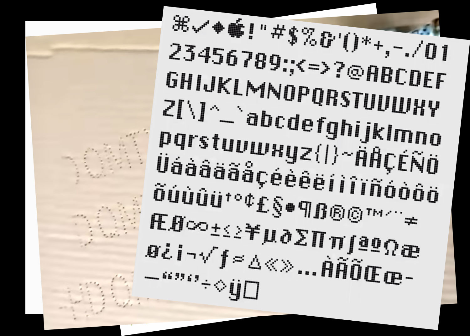
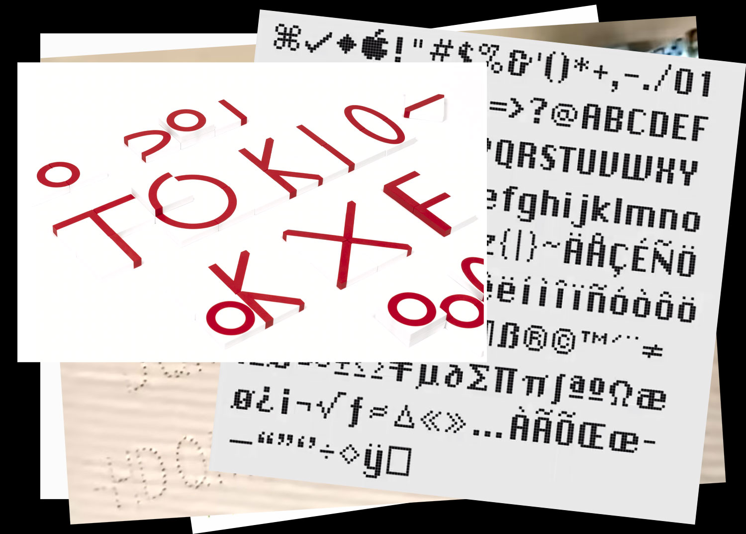
fin 2025
plus d’informations à venir
n°57 — La typographie matricielle
fin 2025
plus d’informations à venir
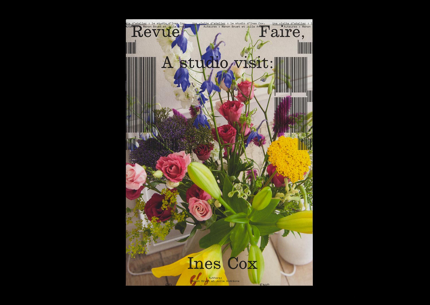
n°18 — Une visite d’atelier : le studio d’Ines Cox. Auteures : Manon Bruet et Julia Andréone
Texte : Manon Bruet
Photos : Julia Andréone
20 pages, 21 × 29,7 cm, CMJN+1PMS
17 décembre 2019
ISBN: 979-10-95991-15-1
ISSN: 2558-2062
Texte : Manon Bruet
Photos : Julia Andréone
20 pages, 21 × 29,7 cm, CMJN+1PMS
17 décembre 2019
ISBN: 979-10-95991-15-1
ISSN: 2558-2062
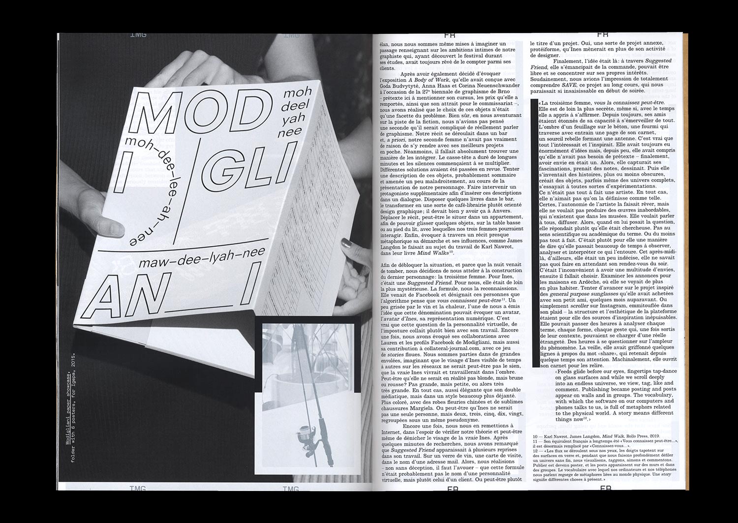
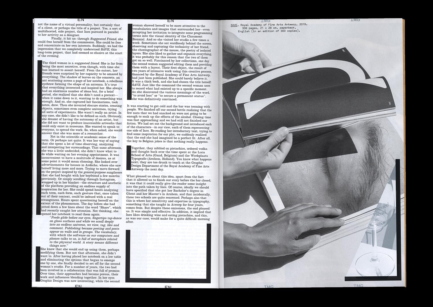
Trois femmes entrent dans un bar. La première vit dans un grand appartement à Anvers, en Belgique. La seconde est une graphiste indépendante qui a fondé son propre studio. La troisième est un avatar – vous la connaissez peut-être – qui a un intérêt certain pour les procédés créatifs, les interfaces et leurs vocabulaires. Ensemble, elles mangent des pistaches, commandent des vodkas et ne sont pas sûres de pouvoir se lever pour donner cours le lendemain à la Royal Academy of Fine Arts. Mais ensemble, elles forment surtout la troublante personnalité multiple d’Ines Cox, graphiste belge que Julia Andréone et Manon Bruet sont allées rencontrer dans son atelier en juin 2019. L’occasion de mener un récit à trois voix et de dessiner les contours d’un parcours, d’une pratique et d’un personnage.
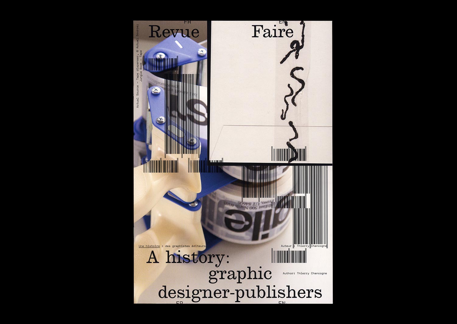
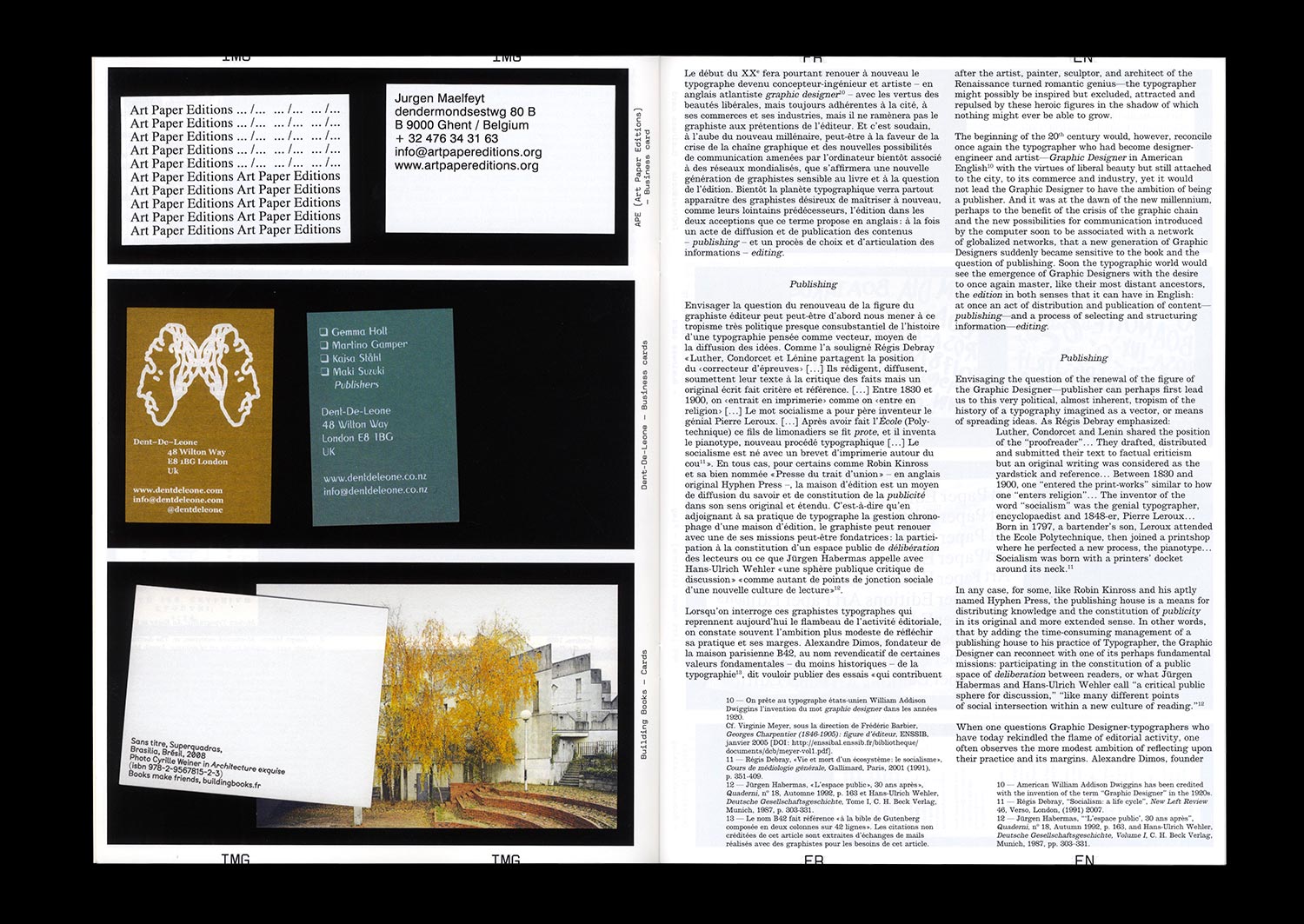
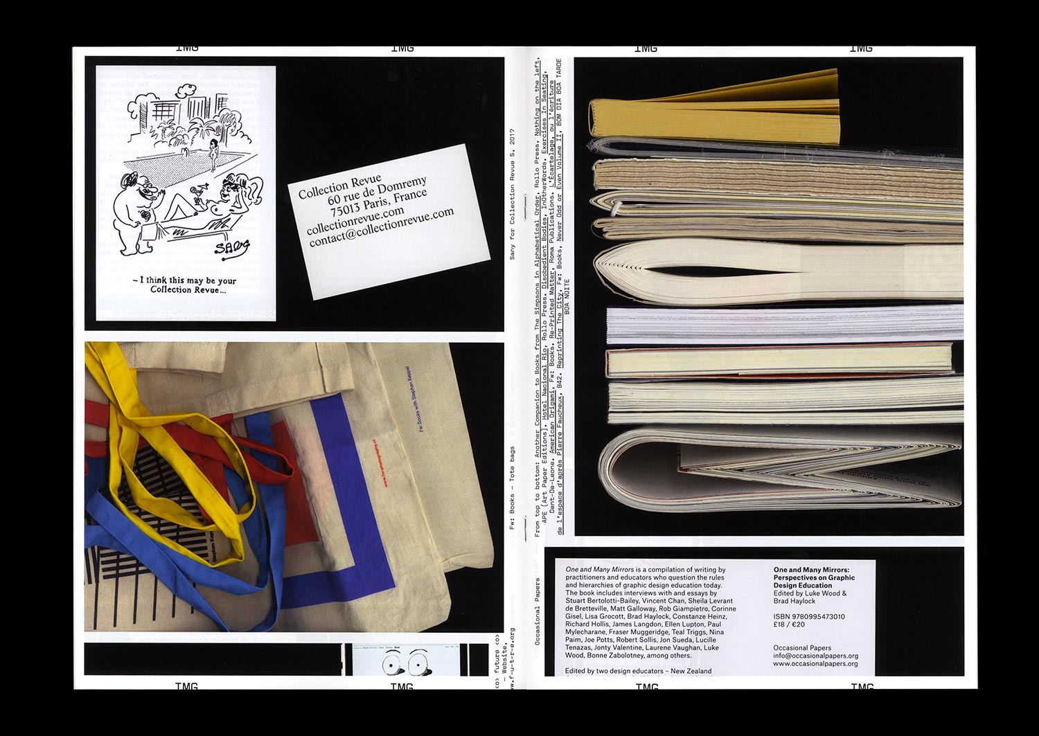
n°19 — Une histoire : des graphistes éditeurs. Auteur : Thierry Chancogne
Épuisé — Disponible uniquement avec l’abonnement à la saison 2
Auteur : Thierry Chancogne
20 pages, 21 × 29,7 cm, CMYK
5 février 2020
ISBN: 979-10-95991-16-8
ISSN: 2558-2062
Épuisé — Disponible uniquement avec l’abonnement à la saison 2
Auteur : Thierry Chancogne
20 pages, 21 × 29,7 cm, CMYK
5 février 2020
ISBN: 979-10-95991-16-8
ISSN: 2558-2062
Dès 1275, on statue dans le Royaume de France sur les droits des stationarii (copistes) et des librarii (libraires) (Friedrich Karl von Savigny (auteur et éditeur), Histoire du droit romain au Moyen-Âge, Tome III, Charles Hingray, Paris, 1839 (1815), p. 415) fraîchement émancipés du joug de l’Église.
C’est qu’il s’agit, avant même l’invention de l’imprimerie, de régler la circulation des écrits et la définition de ceux qui sont en charge de leur inscription et de leur diffusion.
C’est que, bien avant la figure moderne du typographe repérée par Robin Kinross au XVIIe avec The Doctrine of Handy-Works: Applied to the Art of Printing de Joseph Moxon (Robin Kinross, La typographie moderne : Un essai d’histoire critique, B 42, Paris, 2012 (1992) p. 11-12), les graphistes, les copistes et les typographes comme Geoffroy Tory ou Henri Estienne l’Ancien ont aussi été libraires et éditeurs en réfléchissant leur pratique et les contenus qu’ils amenaient sur la place publique.
Or il semble qu’il soit temps de refaire le point sur cette ancienne tradition, alors que de plus en plus de graphistes et de graphic designers fondent leur maison d’édition pour défendre leur ligne éditoriale dans les deux sens que prend ce mot en anglais : à la fois dans le sens de l’editing et du choix et de l’ordonnancement des matières graphiques, mais aussi au sens du publishing, soit une certaine éthique de la diffusion et de la publicité des contenus.
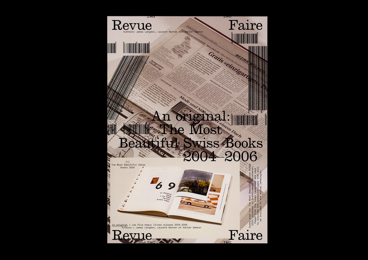
n°21 — Un original : Les Plus beaux livres suisses 2004-2006. Auteurs : James Langdon, Laurent Benner et Adrian Samson
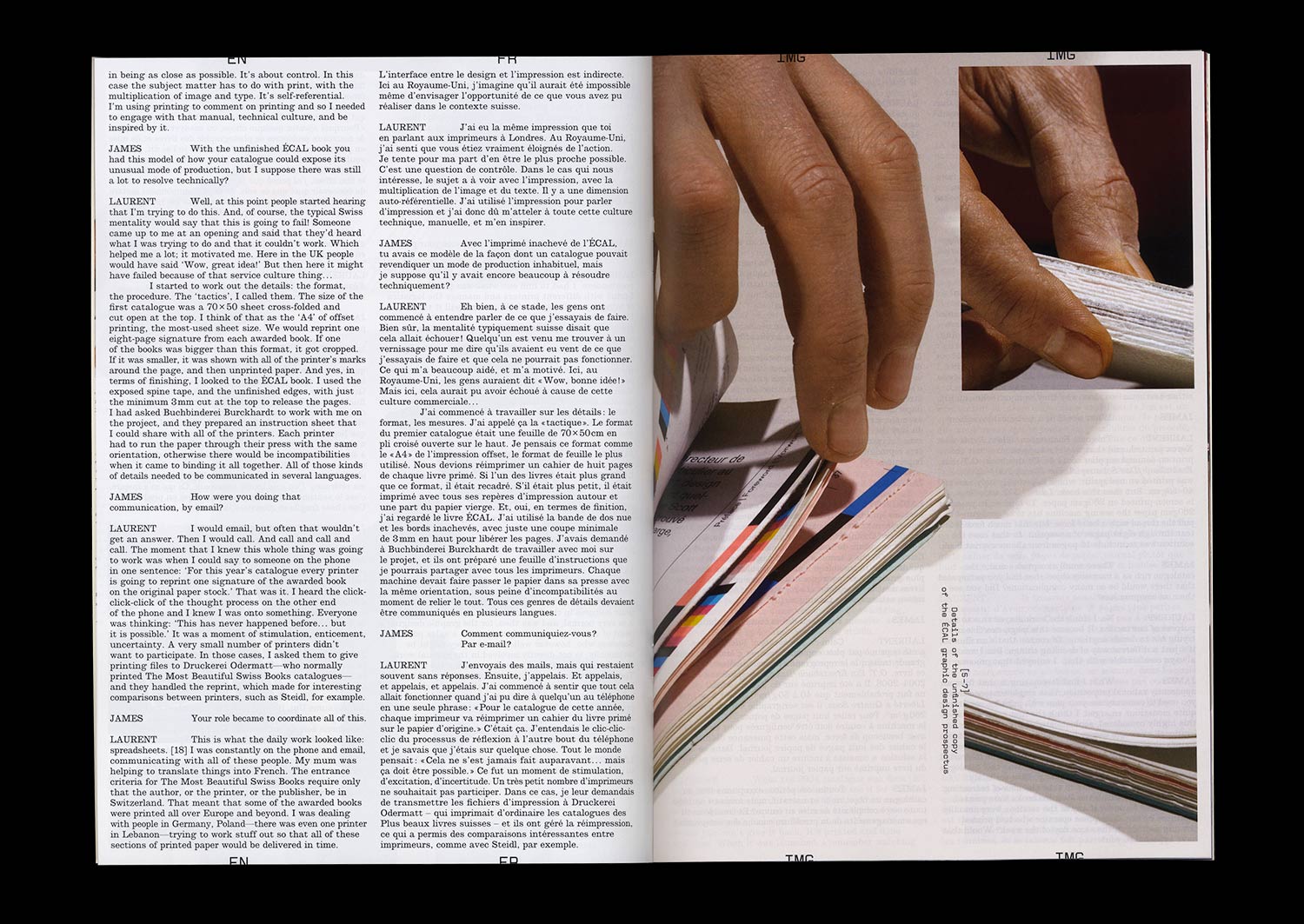
Entretien de Laurent Benner par James Langdon
Photos : Adrian Samson
20 pages, 21 × 29,7 cm, CMJN
25 mars 2020
ISBN: 979-10-95991-16-8
ISSN: 2558-2062
Entretien de Laurent Benner par James Langdon
Photos : Adrian Samson
20 pages, 21 × 29,7 cm, CMJN
25 mars 2020
ISBN: 979-10-95991-16-8
ISSN: 2558-2062
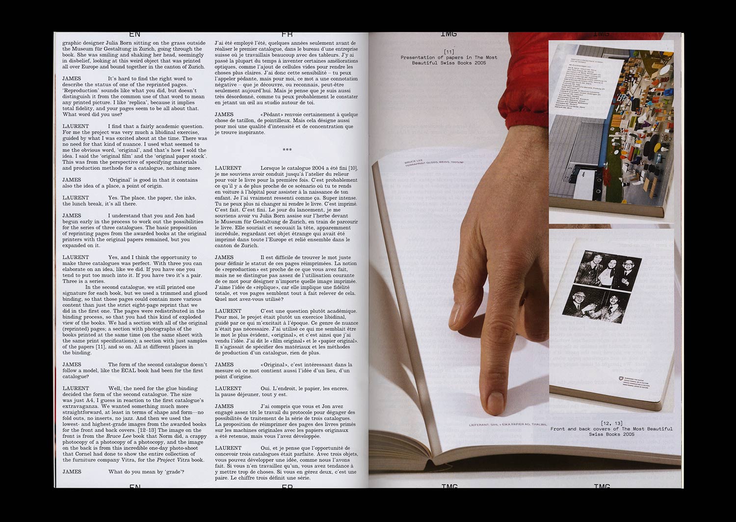
Le concours des Plus beaux livres suisses a été organisé presque sans interruption par l’Office Fédéral de la Culture depuis 1943. Un prix de la conception du livre avec une telle histoire, inscrit dans une telle culture nationale de la typographie, qui offre des perspectives significatives sur le graphisme éditorial, les valeurs culturelles de ses commanditaires et les discours critiques qui l’accompagnent.
Chaque année, un catalogue généreux réalisé par un des graphistes lauréats des années précédentes vient documenter les livres primés. La dimension auto-réflexive inhérente à ce genre de catalogue – livre de livres, graphisme de graphisme – propose un cadre aussi stimulant que risqué aux concepteurs de livres. Un regard rétrospectif sur les deux dernières décennies de catalogues donne à voir une divergence évidente des pratiques graphiques. Après un ou une série d’ouvrages – souvent les graphistes sont mandatés sur deux ou trois catalogues – d’une sophistication toute conceptuelle suit une simple documentation visuelle. Après une proposition sobre et finement ouvragée, vient quelque chose de fastueux ou d’expérimental.
Les catalogues 2004-2006 ont été conçus par Laurent Benner, un designer suisse travaillant à Londres, et dessinés en collaboration avec le designer anglais Jonathan Hares. La proposition de Laurent pour le catalogue 2004 était audacieuse. Il a contacté les imprimeurs de chacun des vingt livres primés de cette année et leur a demandé de réimprimer une section de leur livre. Toutes les sections réimprimées ont ensuite été reliées en Suisse, avec quelques pages supplémentaires au début et à la fin, pour constituer le catalogue.