n°53 — Julia Born
Avril 2025
Plus d’informations à venir
n°53 — Julia Born
Avril 2025
Plus d’informations à venir
n°17 — Un acronyme : ACAB. Auteurs : Ariane Bosshard, Jérôme Dupeyrat, Olivier Huz et Julie Martin
Épuisé — Disponible uniquement avec l’abonnement à la saison 2
Auteurs : Ariane Bosshard, Jérôme Dupeyrat, Olivier Huz et Julie Martin
20 pages, 21 × 29,7 cm, CMJN
26 novembre 2019
ISBN: 979-10-95991-15-1
ISSN: 2558-2062
Épuisé — Disponible uniquement avec l’abonnement à la saison 2
Auteurs : Ariane Bosshard, Jérôme Dupeyrat, Olivier Huz et Julie Martin
20 pages, 21 × 29,7 cm, CMJN
26 novembre 2019
ISBN: 979-10-95991-15-1
ISSN: 2558-2062
L’acronyme ACAB, souvent vu dans l’espace urbain sous forme de graffitis ou de stickers, est apparu au Royaume-Uni dans les années 1970 en lien avec la culture punk, et y a été popularisé lors des mouvements sociaux des années 1980. Signifiant « All Cops Are Bastards », il s’est largement répandu dans l’espace public international ces vingt dernières années, dans le sillage de diverses mouvances politiques, de l’altermondialisme aux gilets jaunes en passant par le black bloc et les ZAD, et en faisant également l’objet de diverses variantes telles que « All Capitalists Are Bastards », « All Colors Are Beautiful » ou encore « All Cats Are Beautiful ».
Observer les inscriptions ACAB (ou 1312, en version chiffrée) permet de traverser de multiples terrains politiques, mais aussi plusieurs cultures visuelles (anar, punk, hip-hop, LOL) parmi lesquelles migre cet acronyme. C’est au cours de cette circulation scripturale, graphique et visuelle qu’il devient à la fois un signe de reconnaissance et un énoncé polysémique.
n°02 — Une plateforme technique : www.colorlibrary.ch par Maximage. Auteure : Manon Bruet
Épuisé
Auteure : Manon Bruet.
12 pages, 21 × 29,7 cm, Noir et Cyan + 1 poster A2, 3 PMS
+ 1 poster A2, CMJN (réservé aux abonnés) (épuisé)
8 novembre 2017
ISBN : 979-10-95991-04-5
ISSN : 2558-2062
Épuisé
Auteure : Manon Bruet.
12 pages, 21 × 29,7 cm, Noir et Cyan + 1 poster A2, 3 PMS
+ 1 poster A2, CMJN (réservé aux abonnés) (épuisé)
8 novembre 2017
ISBN : 979-10-95991-04-5
ISSN : 2558-2062
Le projet de recherches Workflow, mené à l’écal par Tatiana Rhis, Guy Meldem, et Julien Tavelli et David Keshavjee (Maximage), s’intéresse aux nouvelles technologies de l’objet imprimé. Il consiste en une série d’expériences qui tentent de déjouer les technologies de production aujourd’hui à disposition, provoquer le hasard et les accidents afin d’obtenir des résultats inédits. Plus que de se questionner sur le détournement possible des outils, Workflow en explore la technicité, les modes de fonctionnement et les failles. Ce programme poursuit ainsi le champ d’expérimentations ouvert par le studio suisse Maximage depuis 2008. Déjà dans le cadre de leur diplôme à l’écal, Julien Tavelli et David Keshavjee associaient les techniques manuelles et numériques pour développer leurs propres outils de production, et notamment leurs propres modalités d’impressions. De leurs expériences sont nées, entre autres, la typographie « Programme », et la publication « Les impressions magiques », qui apparaît aujourd’hui comme un objet manifeste de leur démarche.
Un des premiers résultats du programme Workflow est la création d’une série de profils colorimétriques permettant de convertir des images numériques pour l’impression avec une, deux, trois, quatre ou cinq couleurs d’accompagnement, qu’elles soient basiques, pastels, fluos ou métallisées.
Le travail sur ces profils a deux visées. Il sert à sensibiliser les étudiants de l’écal à la gestion et la théorie de la couleur; mais il permet aussi, et ce pour la première fois, l’automatisation d’opérations et de réglages jusqu’alors réalisés au cas par cas et manuellement sur les logiciels de retouches et de PAO.
Revendiquant une solution « novatrice » et « professionnelle » pour le traitement de la couleur, l’écal et le programme Workflow lancent en 2016 le site www.colorlibrary.ch, qui propose ces profils à la vente. La plateforme apparaît comme une bibliothèque en ligne présentant une grande variété de profils aux différentes combinaisons colorées. Les différents profils s’affichent à l’écran, appliqués aux photographies de l’iranienne Shirana Shahbazi, qui semblent rejouer les codes des images types Photoshop—du papillon à l’œil et de la nature morte à la cascade.
À partir de l’analyse de la structure de cette plateforme, des langages esthétiques et terminologiques qu’elle convoque et de leurs limites, nous ouvrirons plusieurs champs d’investigations, plus largement liés à la question des outils et des modes de production des images.
n°03 — Une monographie : Recollected Work par Mevis & Van Deursen. Auteur : Étienne Hervy
Épuisé
Auteur : Étienne Hervy.
20 pages, 21 × 29,7 cm, CMJN
22 novembre 2017
ISBN : 979-10-95991-04-5
ISSN : 2558-2062
Épuisé
Auteur : Étienne Hervy.
20 pages, 21 × 29,7 cm, CMJN
22 novembre 2017
ISBN : 979-10-95991-04-5
ISSN : 2558-2062
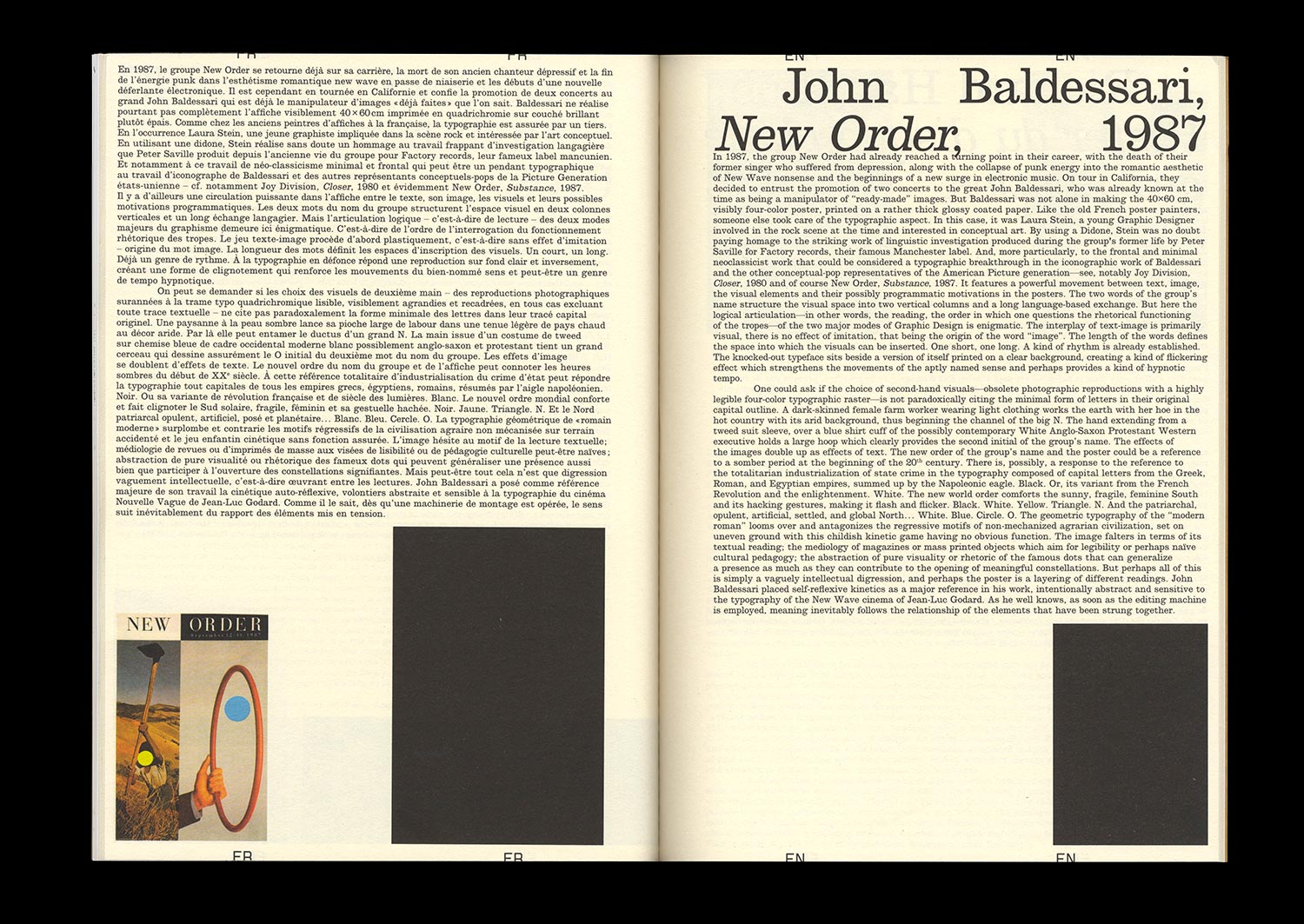
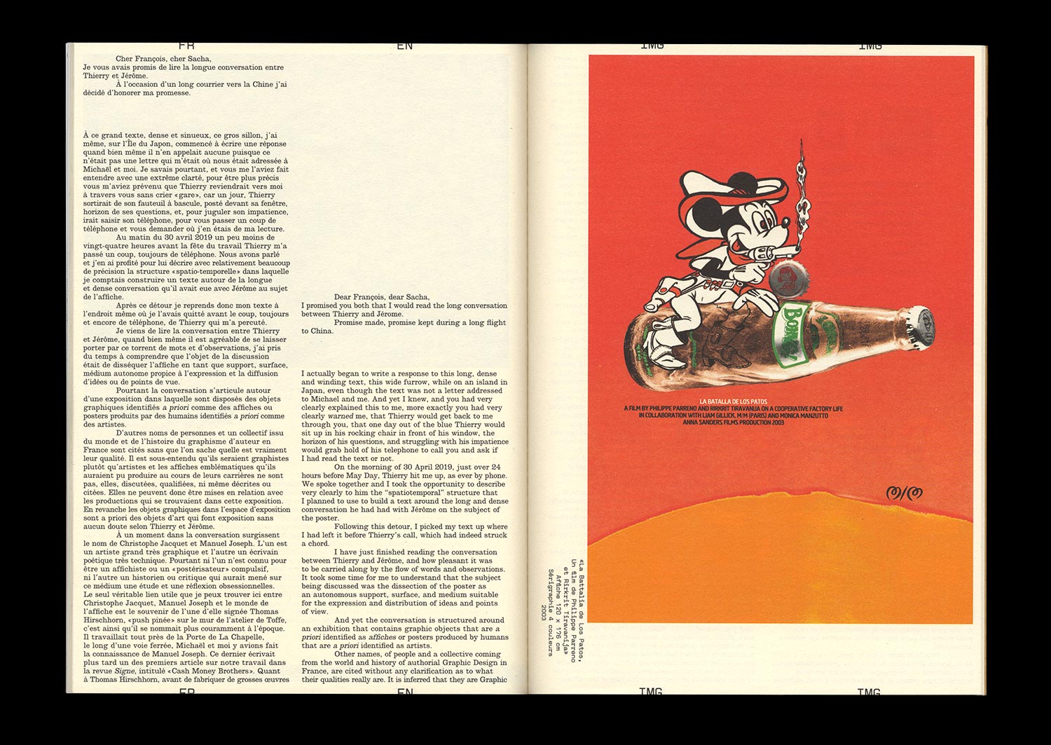
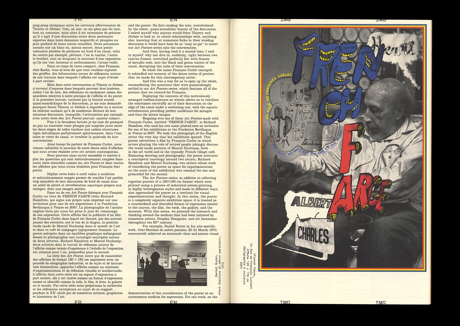
En 2006, l’éditeur Artimo confie à Linda van Deursen et Armand Mevis la direction éditoriale et la conception graphique de leur propre monographie : Recollected Works. Associés à Paul Elliman pour les textes, les deux graphistes répondent par une démarche similaire à celle qui est la leur lorsqu’ils accompagnent d’autres artistes ou photographes à travers des livres dont la pertinence a largement contribué à la réputation du studio. Mevis & van Deursen proposent au lecteur de faire l’expérience de leur travail à l’œuvre plutôt que de le contenter par une restitution de travaux présentés comme œuvres en soi. Plutôt que la nostalgie d’une organisation plus ou moins formalisée de leurs projets précédents, les deux graphistes regardent leur production passée comme le matériau d’un projet autonome que sera ce livre.
Un tel choix pose directement la question de la constitution et de la transmission d’une culture propre au design graphique que ce soit à destination spécifique des designers aussi bien qu’à l’adresse d’un public plus large. Comment transmettre les enjeux et points de qualité d’une discipline elle-même dédiée à la transmission ? Il faudra avant tout reconnaître à ce champs éminemment visuel la capacité à se confronter aux apparences.
Notre étude de ce travail sera évidemment référencée par un corpus de monographies et de publications émises par des graphistes (Christophe Jacquet, Joost Grootens, M/M (Paris), Karel Martens, Experimental Jetset, Wolgang Weingart…) en même temps qu’il regardera plus largement les formes couramment adoptées pour la transmission du graphisme (expositions, conférences…). Au delà des enjeux portés et des questionnements soulevés par Recollected Works, il s’agira tout à la fois de tirer le fil du travail de Mevis & van Deursen (existe-til une continuité entre le design editorial de Why Mister, Why ? pour Geert van Kesteren ou Library Of The Museum Museum of Contemporary African Art pour Meschac Gaba et l’identité du Stedelijk Museum) et d’interroger la pertinence d’un discours spécifique au design graphique.