n°57 — Matrix font
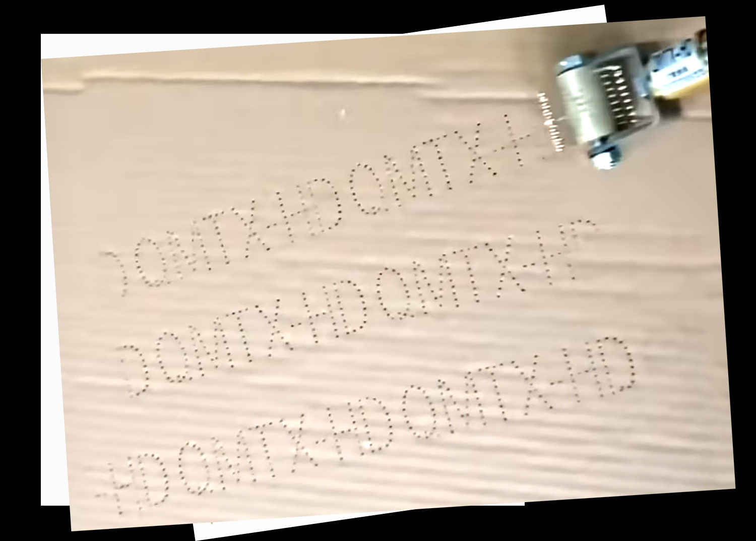
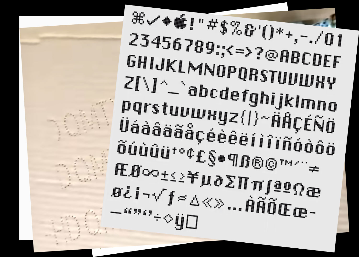
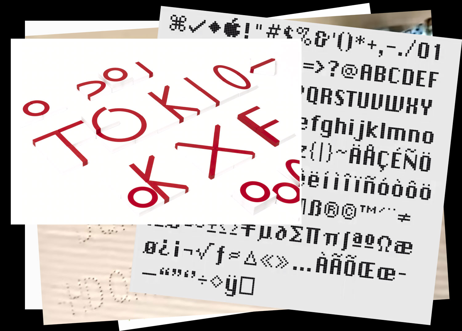
End of 2025
more infos to come
n°57 — Matrix font
End of 2025
more infos to come
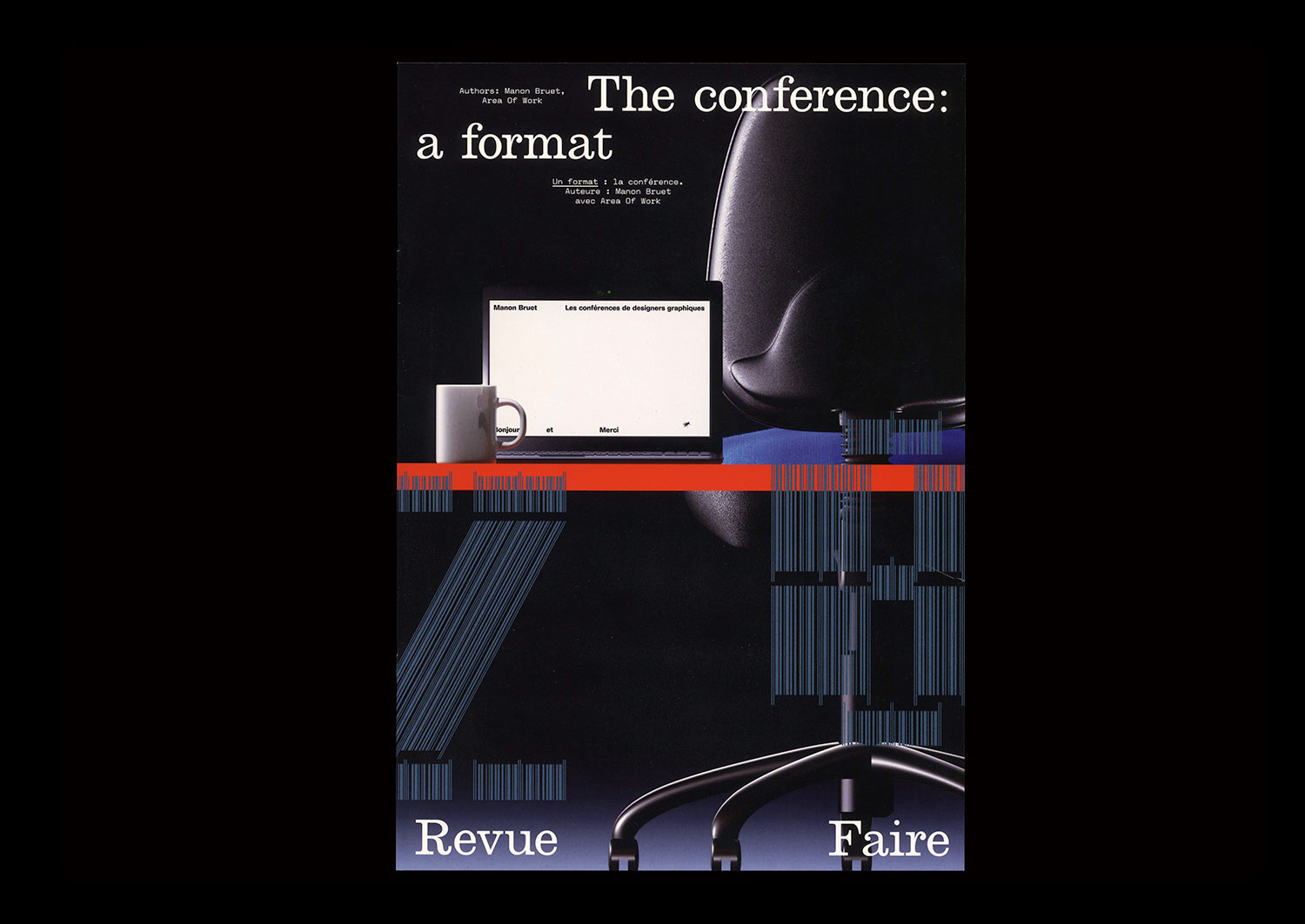
n°28 — The conference: a format. Authors: Manon Bruet, Area of Work
Author: Manon Bruet
3D: Area Of Work
28 pages, 21 × 29,7 cm, CMYK
13th January 2021
ISBN: 979-10-95991-18-2
ISSN: 2558-2062
Author: Manon Bruet
3D: Area Of Work
28 pages, 21 × 29,7 cm, CMYK
13th January 2021
ISBN: 979-10-95991-18-2
ISSN: 2558-2062
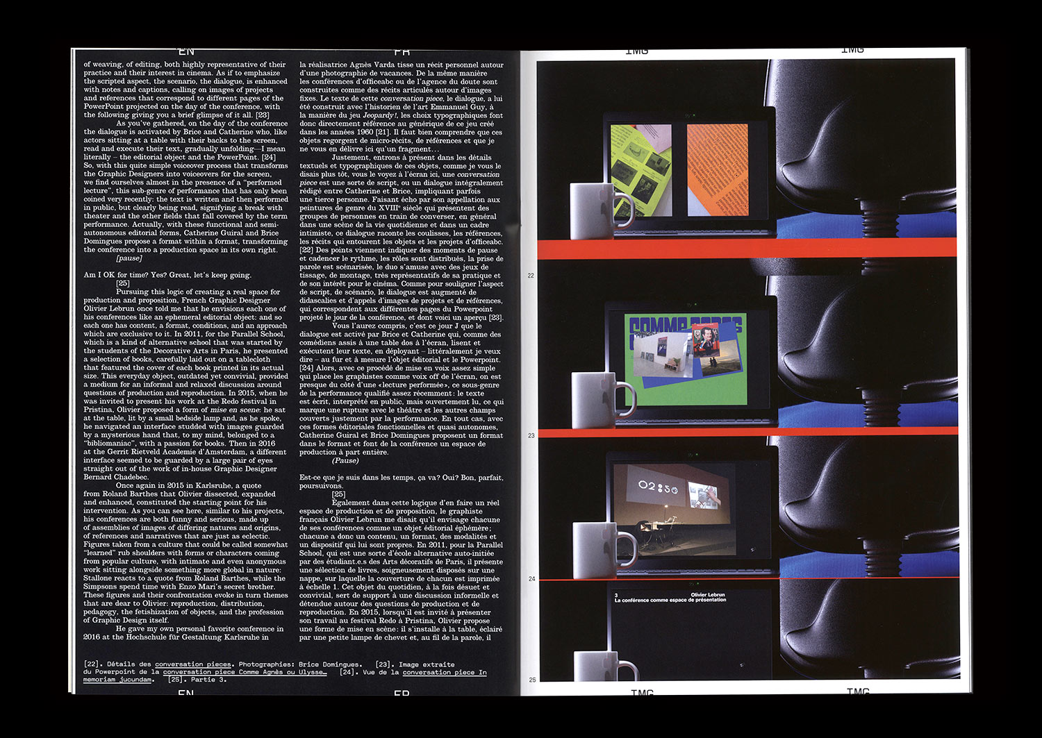
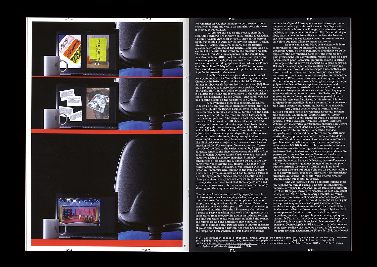
There are an increasing number of spaces in the field of Graphic Design where work can be promoted. Intermediary platforms between practitioners and the public can come in the form of specific tools (Instagram, for example) or even events that are organized for that purpose (festivals and exhibitions). The conference is one of these platforms. A true ephemeral editorial object, it is highly suited to the explanation and extension of the practices and methodologies of designers. It is, for certain designers, the opportunity to take stock of an approach, an inventory of finished forms, and for others, on the contrary, a pretext for the production of new, sometimes more performative, even experimental forms.
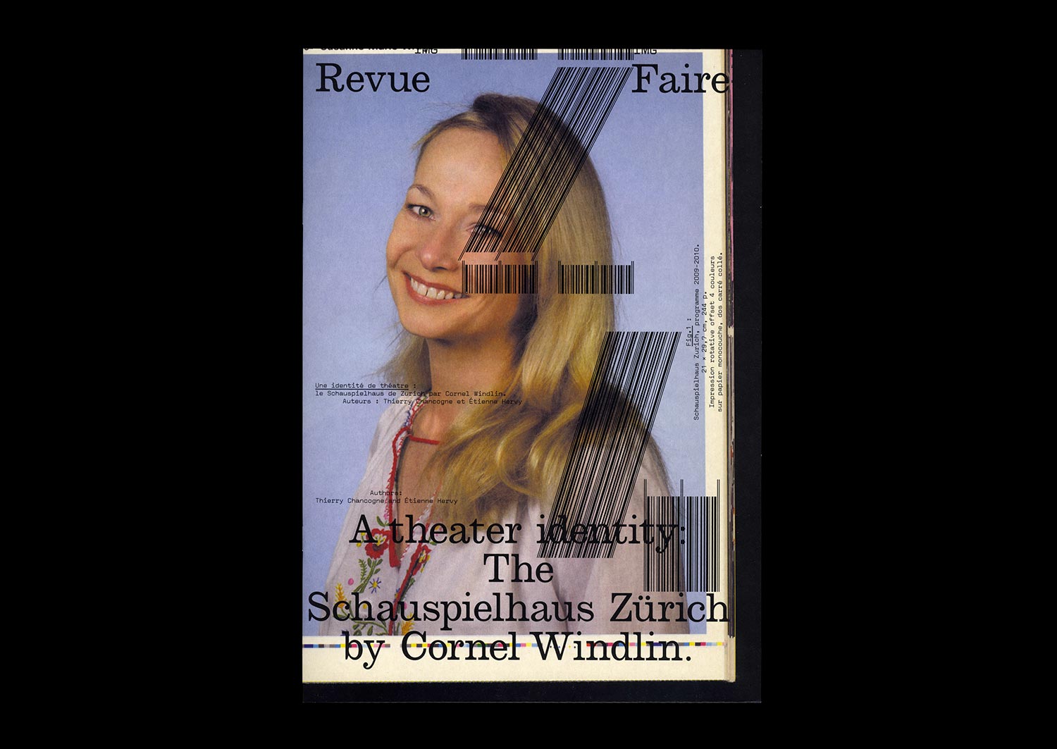
n°24 — A theater identity: The Schauspielhaus Zürich by Cornel Windlin. Authors: Étienne Hervy and Thierry Chancogne
Authors: Étienne Hervy and Thierry Chancogne
36 pages, 21 × 29,7 cm, CMYK
23th September 2020
ISBN: 979-10-95991-17-5
ISSN: 2558-2062
Authors: Étienne Hervy and Thierry Chancogne
36 pages, 21 × 29,7 cm, CMYK
23th September 2020
ISBN: 979-10-95991-17-5
ISSN: 2558-2062
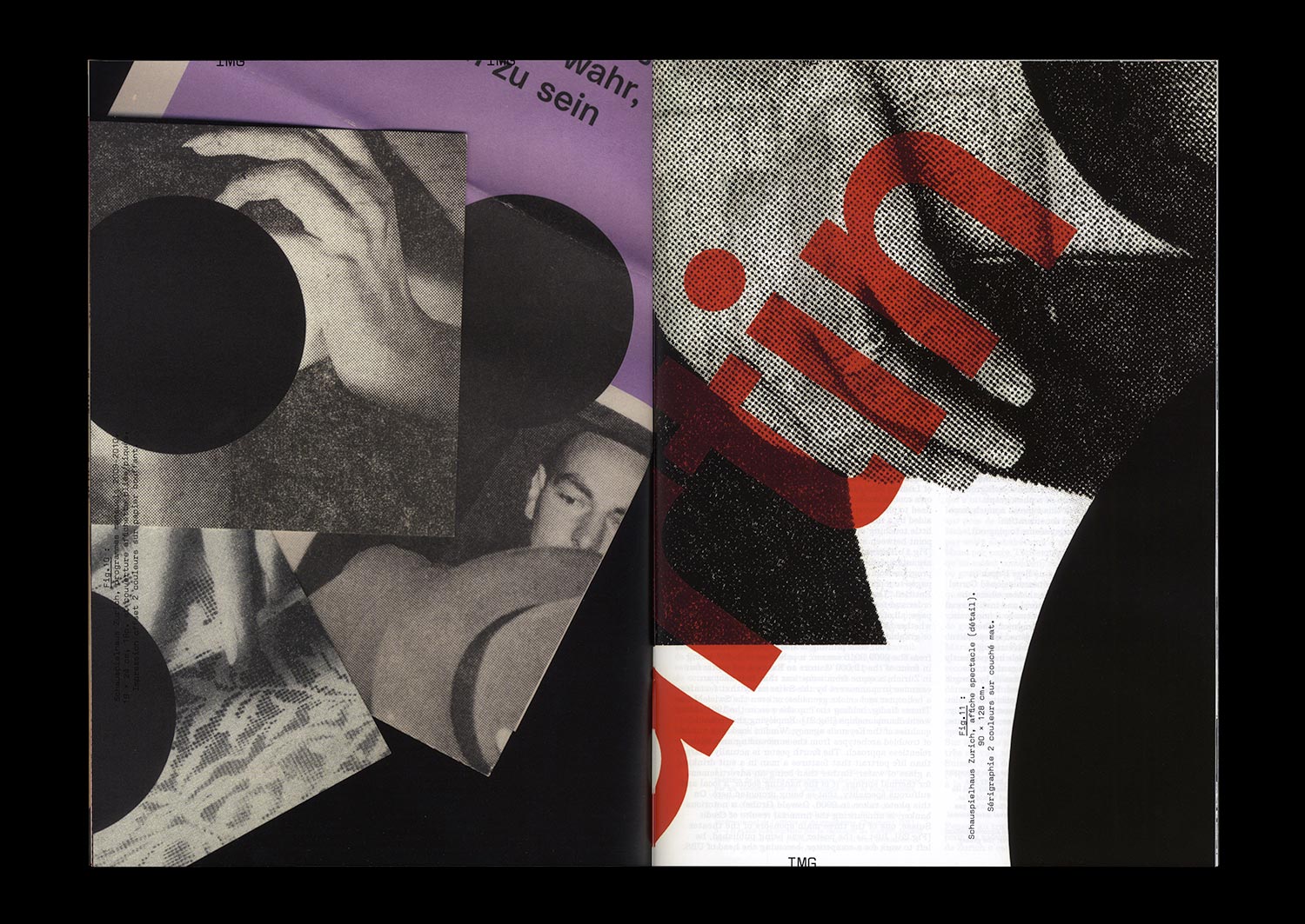
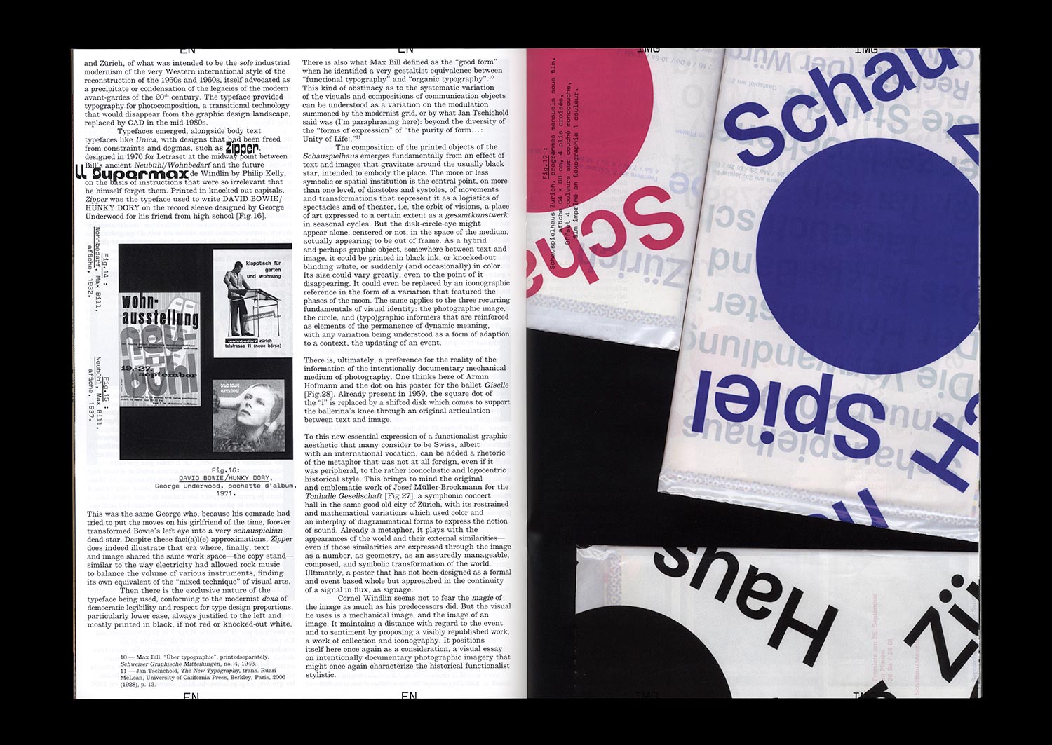
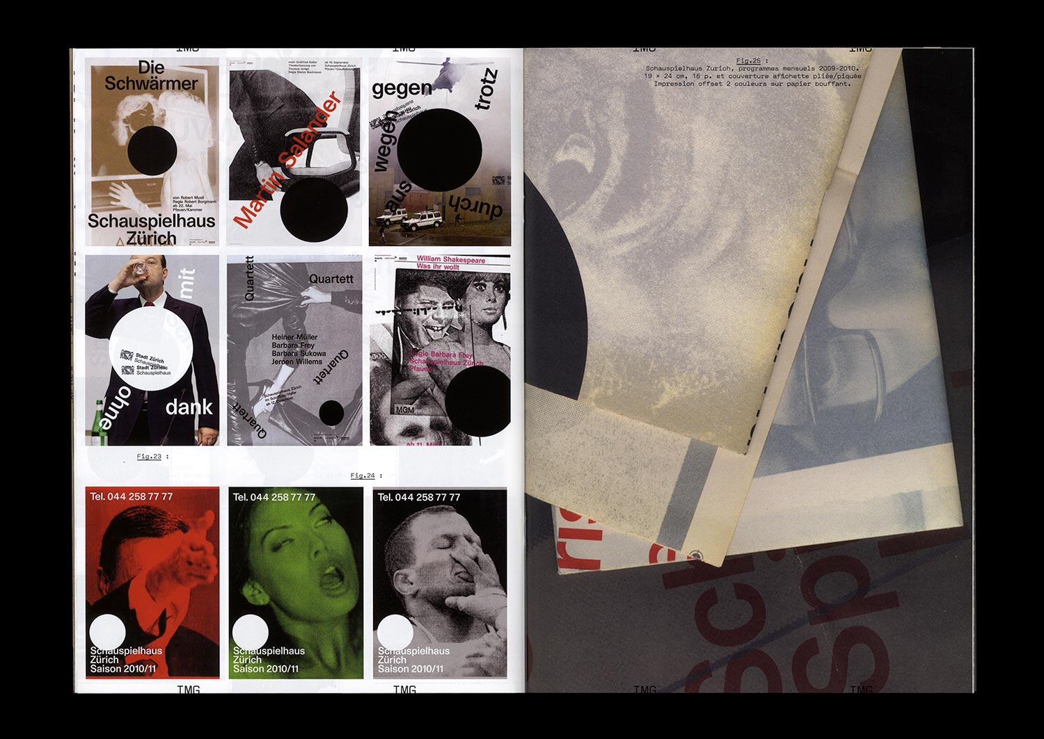
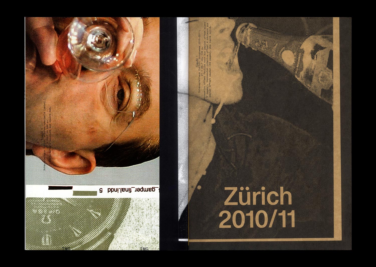
Designed by Cornel Windlin (with Gregor Huber), the communications of the Zürich Schauspielhaus for the 2009/10 and 2010/11 seasons appeared just as the collaboration between the designers and the theater ended: with the Grand Prix of the Brno Biennial in 2010, where they won first prize in the international competition, with an exhibition in Chaumont the following year at the same time as the Swiss Federal Design Award, a brief appearance in specialist magazines and on specialist sites, and then nothing at all. Once again, Cornel Windlin retreated into the shadows, leaving behind work which asserted itself through both its amplitude and completeness in the heavy silence which remained, and through the multifaceted mass of the media imagery that it reactivated. A series of seasonal posters, event posters, annual and monthly programs, booklets dedicated to each piece, invitations, flyers, graphic materials from the program for younger audiences… everything is here, set in a precisely tuned bold Unica77, digitized by the Lineto foundry with the original team of designers (along with Windlin), all coming together in that blindness inherent to times of eclipse, where the black disk chosen by Windlin as the identity of the Schauspielhaus stands out. Now, a decade later, the idea is to propose a meticulously organized reception, informed by Cornel Widlin and placed in a cavalier perspective by the analysis of Thierry Chancogne.
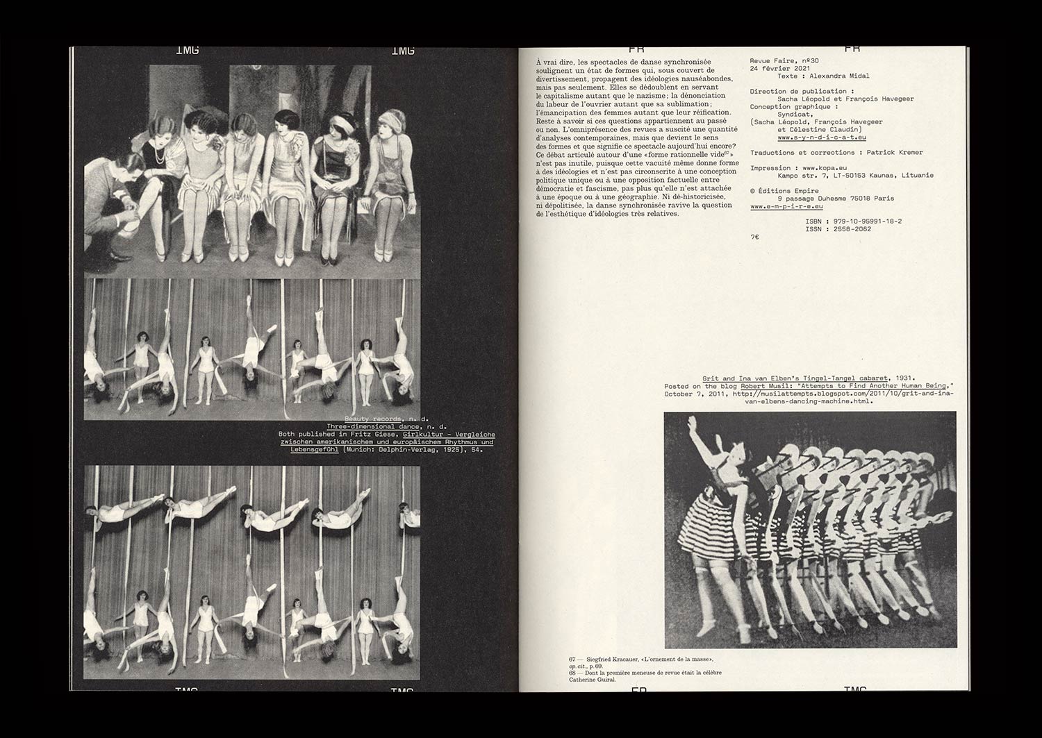
n°29 — Girls, the Troopers of Dance. Aesthetization of Politics and Manipulation of Entertainment. Author: Alexandra Midal
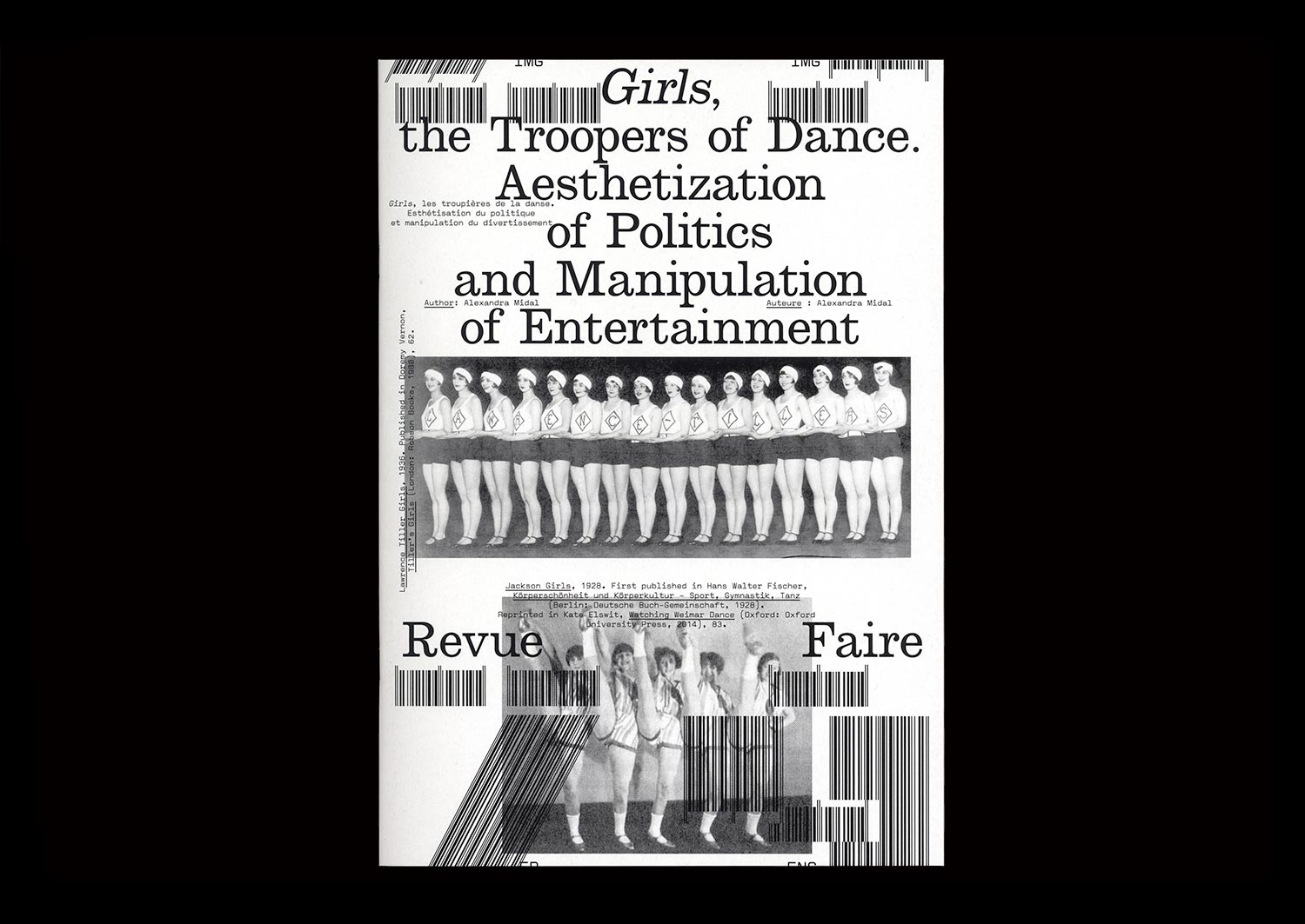
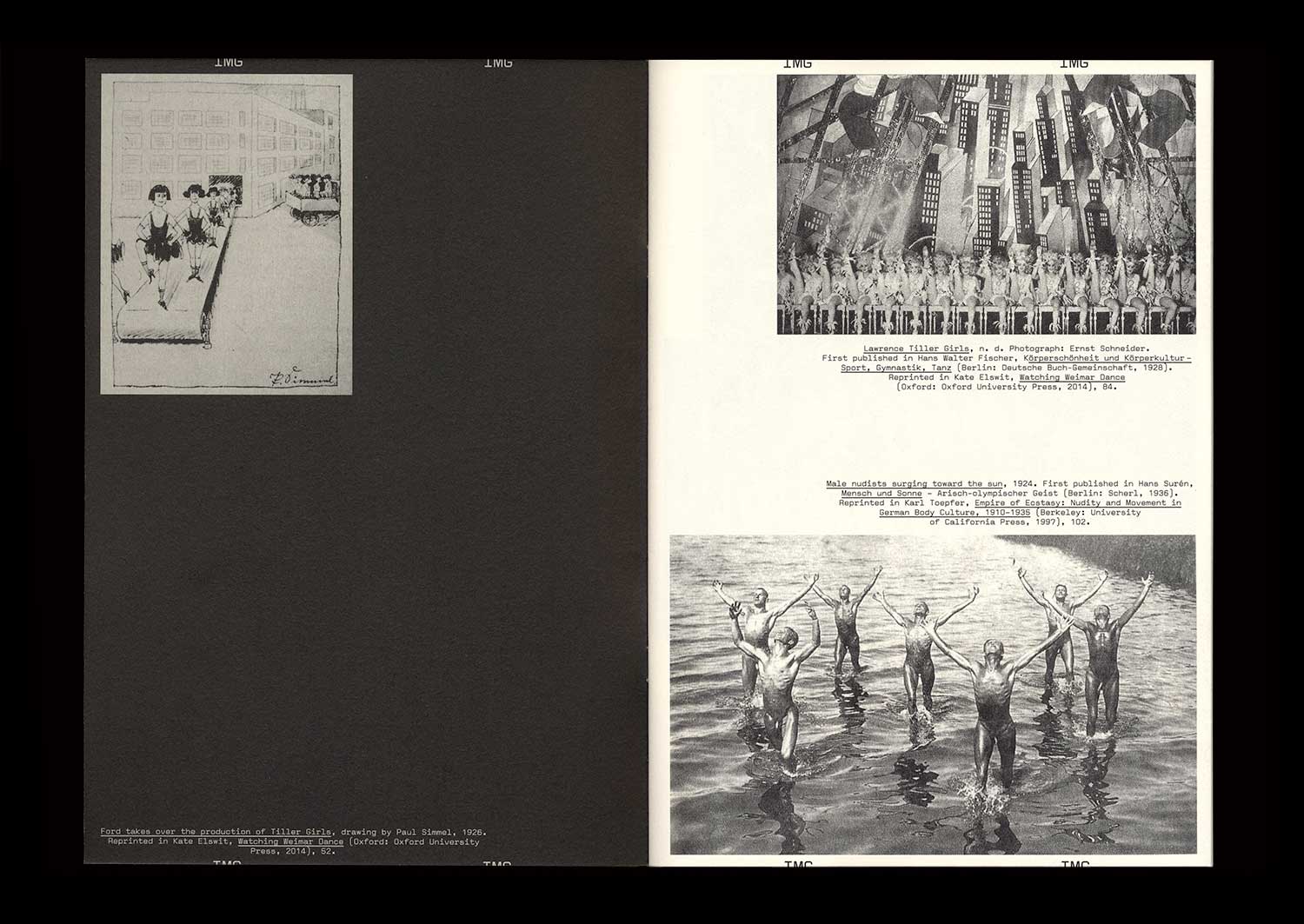
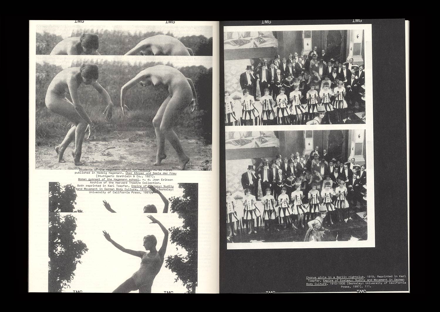
The British origins of synchronized dancing—invented in 1880 by John Tiller in a cotton mill—were quickly forgotten in Berlin, where periodicals established themselves as the expression of standardization and American capitalism. The famous Tiller Girls had become the modern figure of the “New Woman”, performing in shows attracting more than four million spectators each year. A seduced Hitler asked for his own troupe: the Hiller Girls. Face to face, both periodicals look like strictly indistinguishable replicas, apart from their opposite messages.
Synchronized dancing revealed the democratic and fascist forms given to the political discourse of the Weimar Republic when the NSDAP seized power. Between the power of forms and forms of power, amid the destruction of cities, decrees banishing the use of Fraktur, and the destruction of degenerate art, those dance shows, undoubtedly because of their popularity, showed that National Socialism was using insidious and invisible strategies to empty forms of their content only to maintain their appearance intact, thus revealing a shadow practice that, in the end, turned out to be just as barbaric as world-wide destruction or the burning of books.