n°57 — Photobook: The New Face of Photophilia. Author: Clément Chéroux + book selection with Théophile Calot
April/May 2025
n°57 — Photobook: The New Face of Photophilia. Author: Clément Chéroux + book selection with Théophile Calot
April/May 2025
n°05 — An Instagram post: P/Pa/Para/Paradiso by jetset_experimental (July 1 2017). Author: Manon Bruet
Author: Manon Bruet.
20 pages, 21 × 29,7 cm, CMYK
20 December 2017
ISBN : 979-10-95991-05-2
ISSN : 2558-2062
Author: Manon Bruet.
20 pages, 21 × 29,7 cm, CMYK
20 December 2017
ISBN : 979-10-95991-05-2
ISSN : 2558-2062
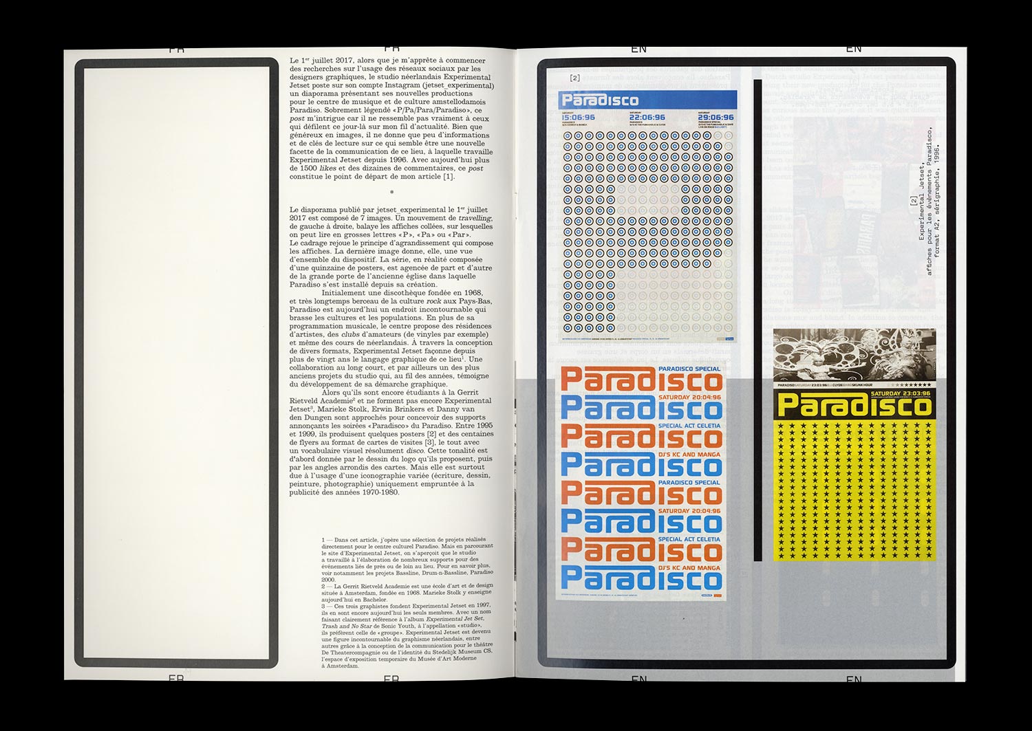
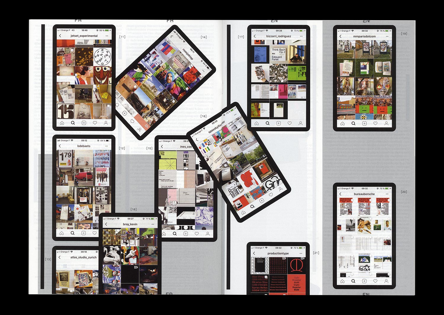
On July 1st, 2017, just as I was about to begin research into the use of social networks by Graphic Designers, the Dutch studio Experimental Jetset posted a slideshow containing 7 images on Instagram. Entitled “P/Pa/Para/Paradiso” it presented, as a whole and in its details, their new posters for the Paradiso center for music and culture in Amsterdam. Apart from the obvious formal relationship with the Blow Up poster that they created in 2007 for the London Design Museum, this slideshow gives very few keys to read what seemed to be a new aspect of the center’s communication, something that Experimental Jetset had been working on since 1996.
Currently having over 1,500 likes and tens of comments, this post is where my article begins. An opportunity to investigate and review this collaboration, that over 20 years has taken various forms (flyers, programs, posters), along with the singular and radical practice of Experimental Jetset. And also the opportunity to provide a more theoretical view of the way that Graphic Design is shown and seen on different platforms, that have now become an integral part of the teaching and the evolution of the discipline.
n°23 — Jan Tschichold: The Master approving of his own work. Author: Žiga Testen
Author: Žiga Testen
24 pages, 21 × 29,7 cm, CMYK
9 September 2020
ISBN: 979-10-95991-17-5
ISSN: 2558-2062
Author: Žiga Testen
24 pages, 21 × 29,7 cm, CMYK
9 September 2020
ISBN: 979-10-95991-17-5
ISSN: 2558-2062
Design history as an independent discipline and field of study appears to be in trouble. Design historians complain about its diminishing influence within universities due to the ongoing instrumentalisation of higher education. The Eurocentric canon built upon values and methods adopted from art and architecture history has been contested by decolonial theories. And finally, it appears that the trust in the institution of ‘history’ itself and its meta-narratives has eroded.
A discipline that was once considered to provide reflection on what came before and guidance on what could come to be—under the auspice of a grand narrative of continuous progress—has been replaced by modest narratives, social anthropologies, and claims of the ‘end of history’.
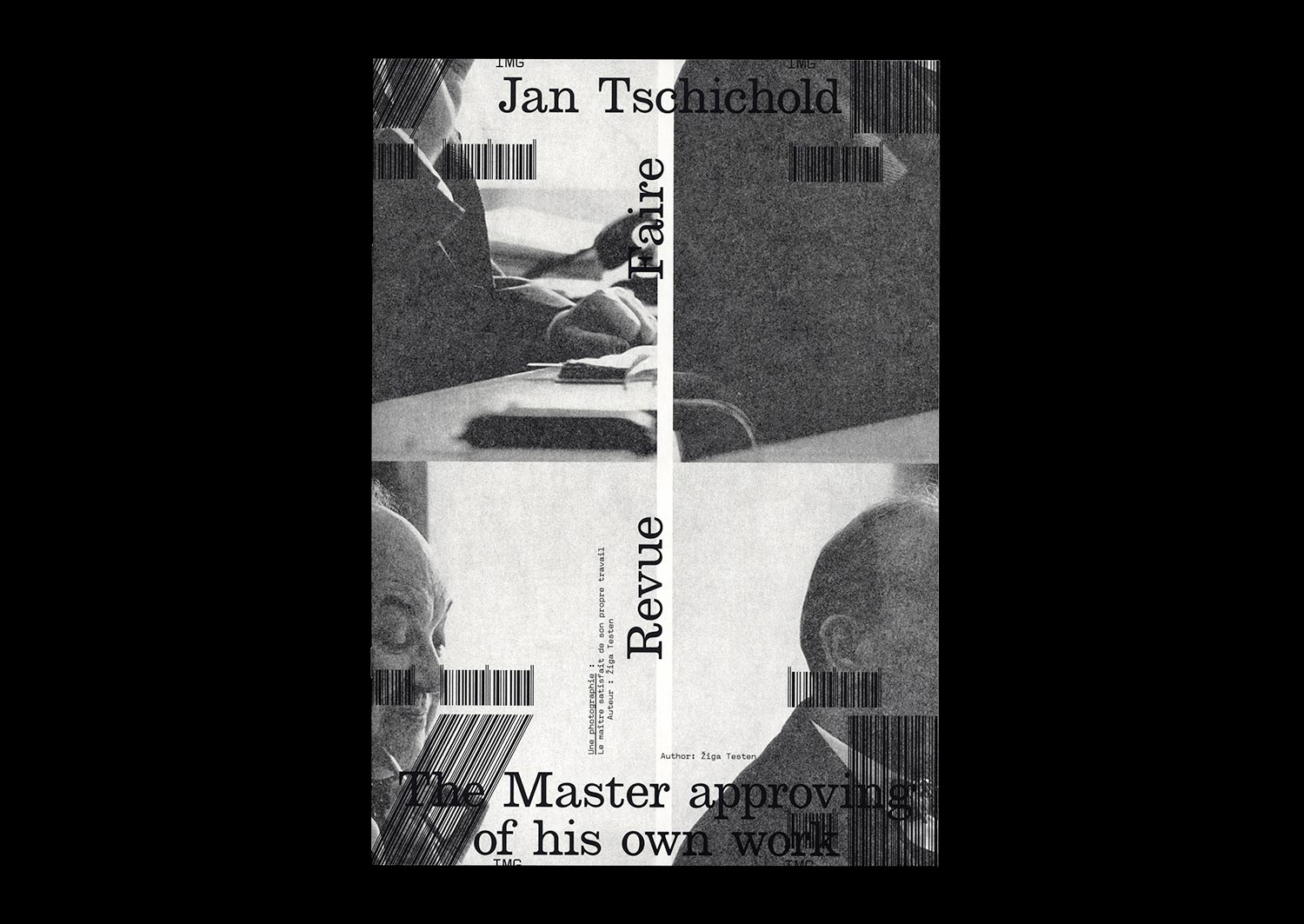
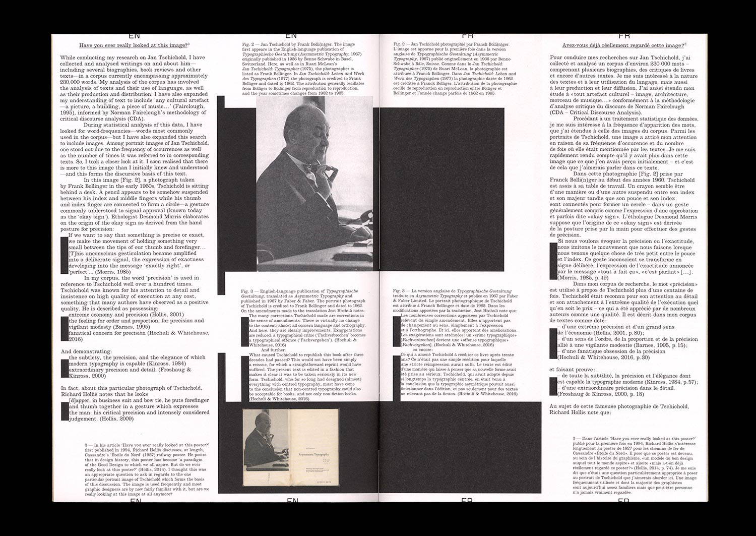
In this article, I rummage through the ruins of design history and try to unpack what it was that we once considered design history and our design history canon, how we wrote about it and to what end. In particular, I focus on this one image: a portrait photograph of a well-known historical figure, the designer and typographer Jan Tschichold. How is it used? And what stories do we tell about it?
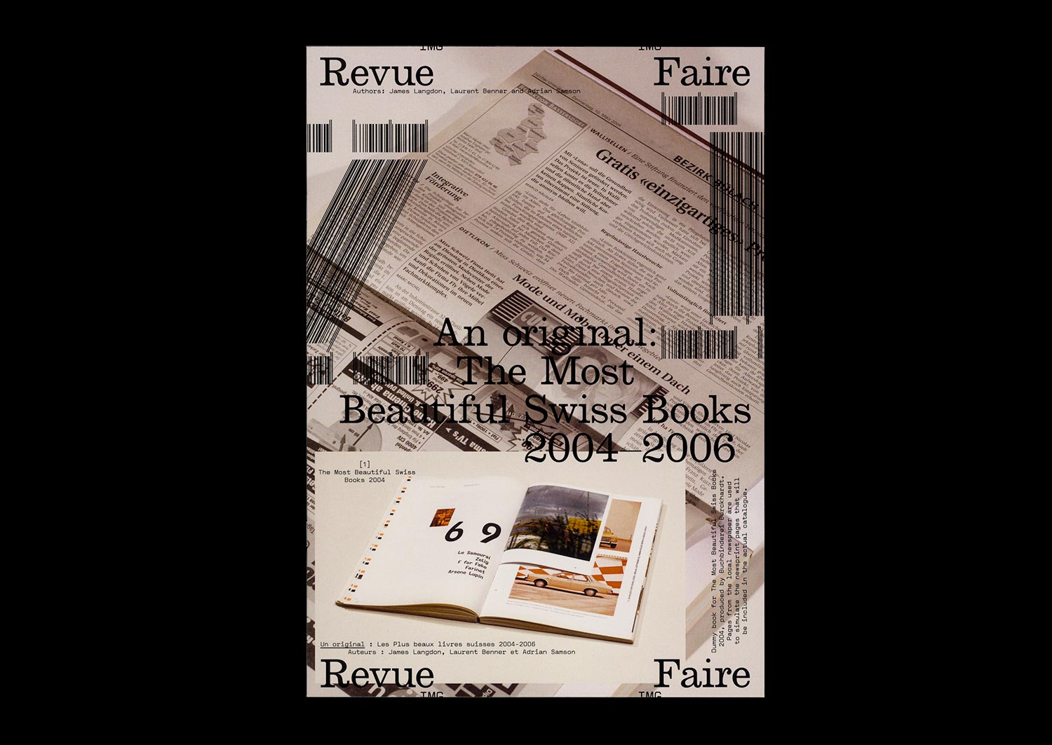
n°21 — An original: The Most Beautiful Swiss books 2004–2006. Authors: James Langdon, Laurent Benner & Adrian Samson
Interview with Laurent Benner by James Langdon
Photos: Adrian Samson
20 pages, 21 × 29,7 cm, CMYK
25th March 2020
ISBN: 979-10-95991-16-8
ISSN: 2558-2062
Interview with Laurent Benner by James Langdon
Photos: Adrian Samson
20 pages, 21 × 29,7 cm, CMYK
25th March 2020
ISBN: 979-10-95991-16-8
ISSN: 2558-2062
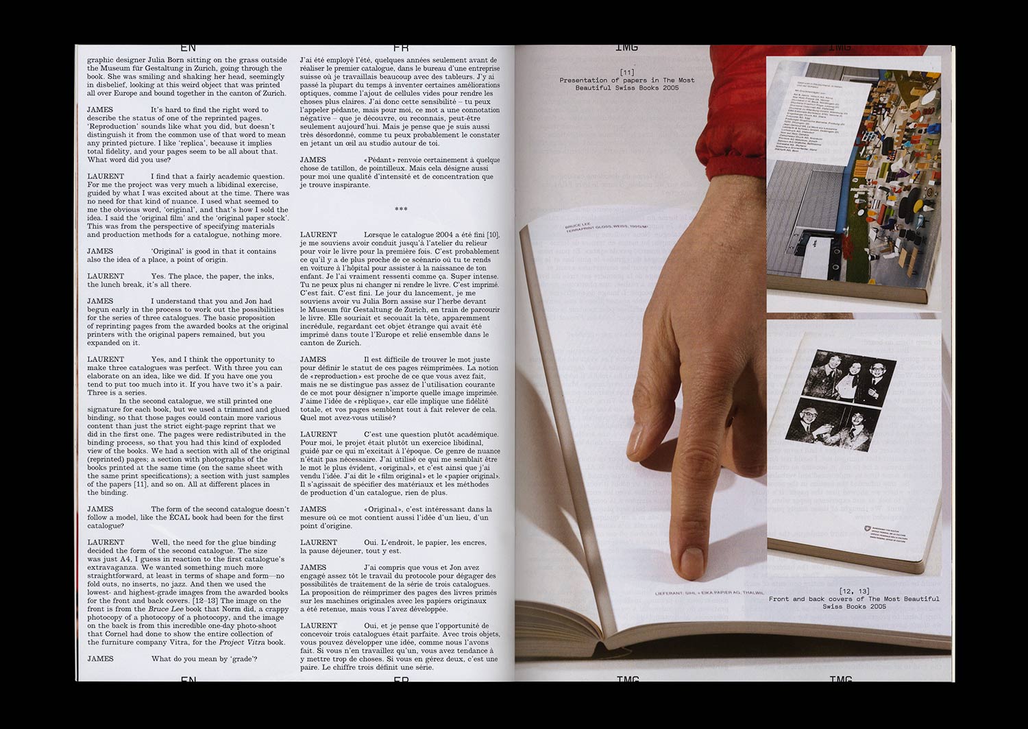
The awards programme The Most Beautiful Swiss Books has been organised almost without interruption by the Swiss Federal Office of Culture since 1943. A book design award with such history, particularly in a book-making culture as rich as Switzerland’s, offers insightful perspectives on Graphic Design for publishing, the culture that commissions and values it, and the critical discourse that surrounds it.
Each year the awarded books are documented in a substantial catalogue, made by one of the graphic designers awarded in previous years. The inherently self-reflexive tendencies of such catalogues—books about books, Graphic Design in the context of Graphic Design—present stimulating yet rather fraught conditions for graphic designers to work in. Looking back over the catalogues produced during the last two decades, a conversation-through-practice is clearly legible. After a conceptually sophisticated catalogue or series (often designers have been commissioned for series of two or three catalogues) follows a simple visual document. After a modest, finely-crafted production comes something more lavish or experimental.
The 2004–2006 catalogues were conceived by Laurent Benner, a Swiss designer working in London, and designed with English designer Jonathan Hares. Laurent’s proposition for the 2004 catalogue was audacious. He contacted the printers of each of the 20 awarded books from that year and asked them to reprint a section of their book. These reprinted sections were then transported to a single Swiss bookbinder and bound, with some additional pages of front- and back-matter, to comprise the catalogue.