Order Subscription, 31st to 38th issue
Issues 31, 32, 33, 34, 35, 36, 37 & 38
8 × 20 pages and sometimes more
21 × 29,7 cm, CMYK
Design: Syndicat
2021-2022
Order Subscription, 31st to 38th issue
Issues 31, 32, 33, 34, 35, 36, 37 & 38
8 × 20 pages and sometimes more
21 × 29,7 cm, CMYK
Design: Syndicat
2021-2022
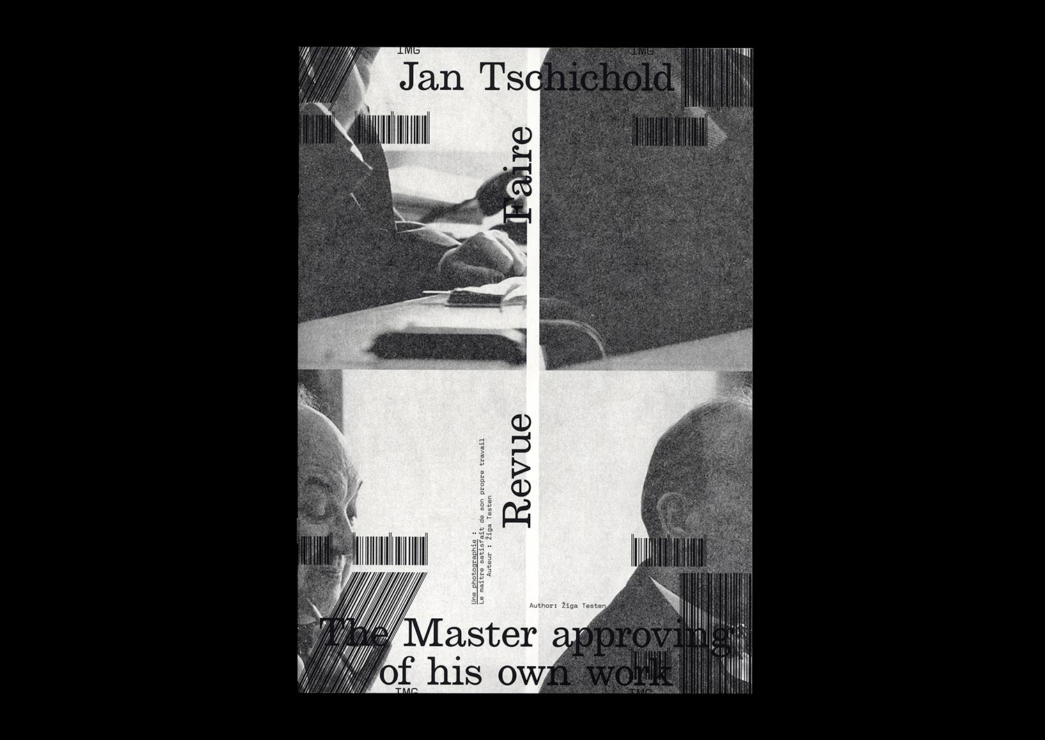
n°23 — Jan Tschichold: The Master approving of his own work. Author: Žiga Testen
Author: Žiga Testen
24 pages, 21 × 29,7 cm, CMYK
9 September 2020
ISBN: 979-10-95991-17-5
ISSN: 2558-2062
Author: Žiga Testen
24 pages, 21 × 29,7 cm, CMYK
9 September 2020
ISBN: 979-10-95991-17-5
ISSN: 2558-2062
Design history as an independent discipline and field of study appears to be in trouble. Design historians complain about its diminishing influence within universities due to the ongoing instrumentalisation of higher education. The Eurocentric canon built upon values and methods adopted from art and architecture history has been contested by decolonial theories. And finally, it appears that the trust in the institution of ‘history’ itself and its meta-narratives has eroded.
A discipline that was once considered to provide reflection on what came before and guidance on what could come to be—under the auspice of a grand narrative of continuous progress—has been replaced by modest narratives, social anthropologies, and claims of the ‘end of history’.
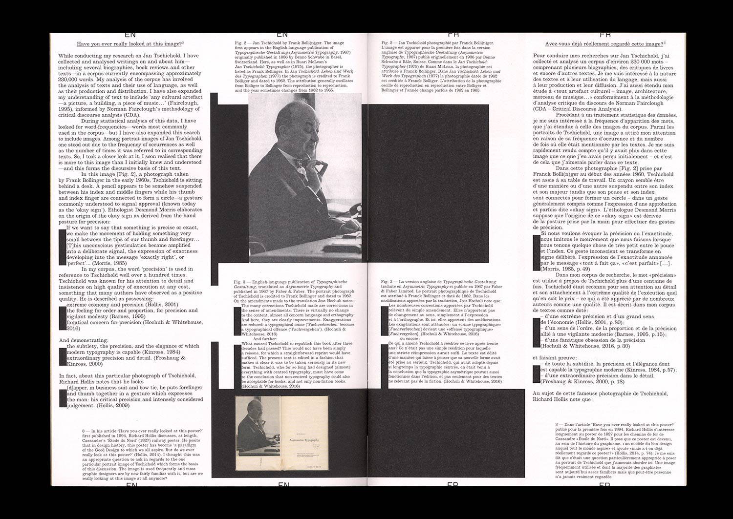
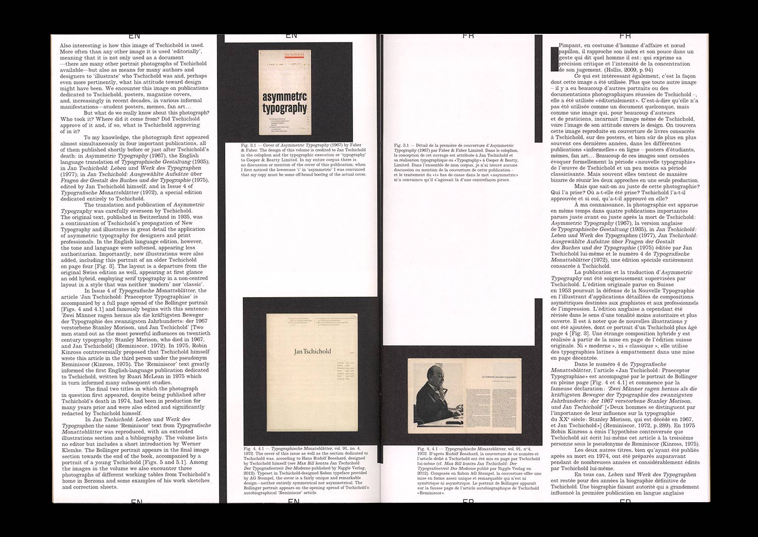
In this article, I rummage through the ruins of design history and try to unpack what it was that we once considered design history and our design history canon, how we wrote about it and to what end. In particular, I focus on this one image: a portrait photograph of a well-known historical figure, the designer and typographer Jan Tschichold. How is it used? And what stories do we tell about it?
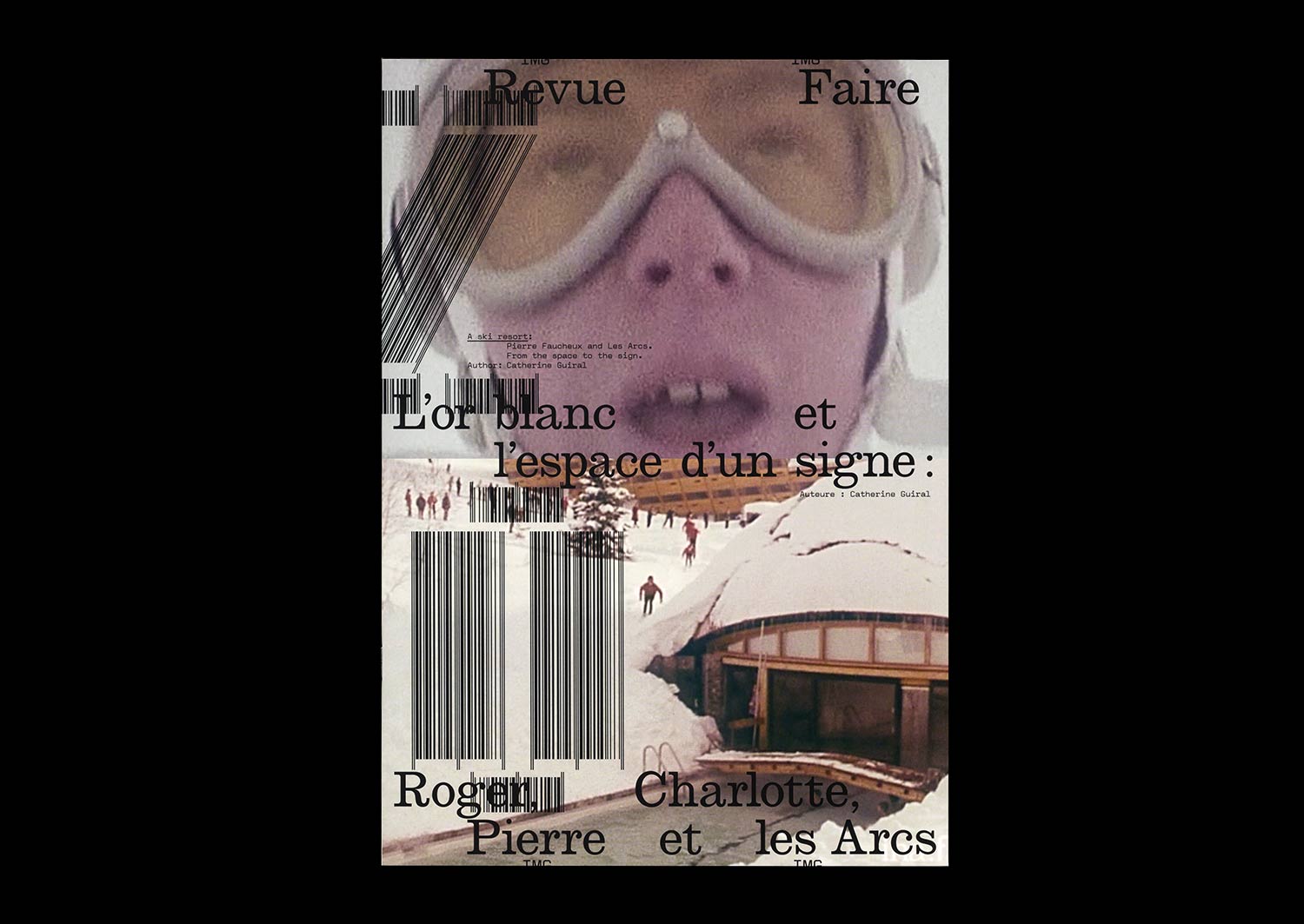
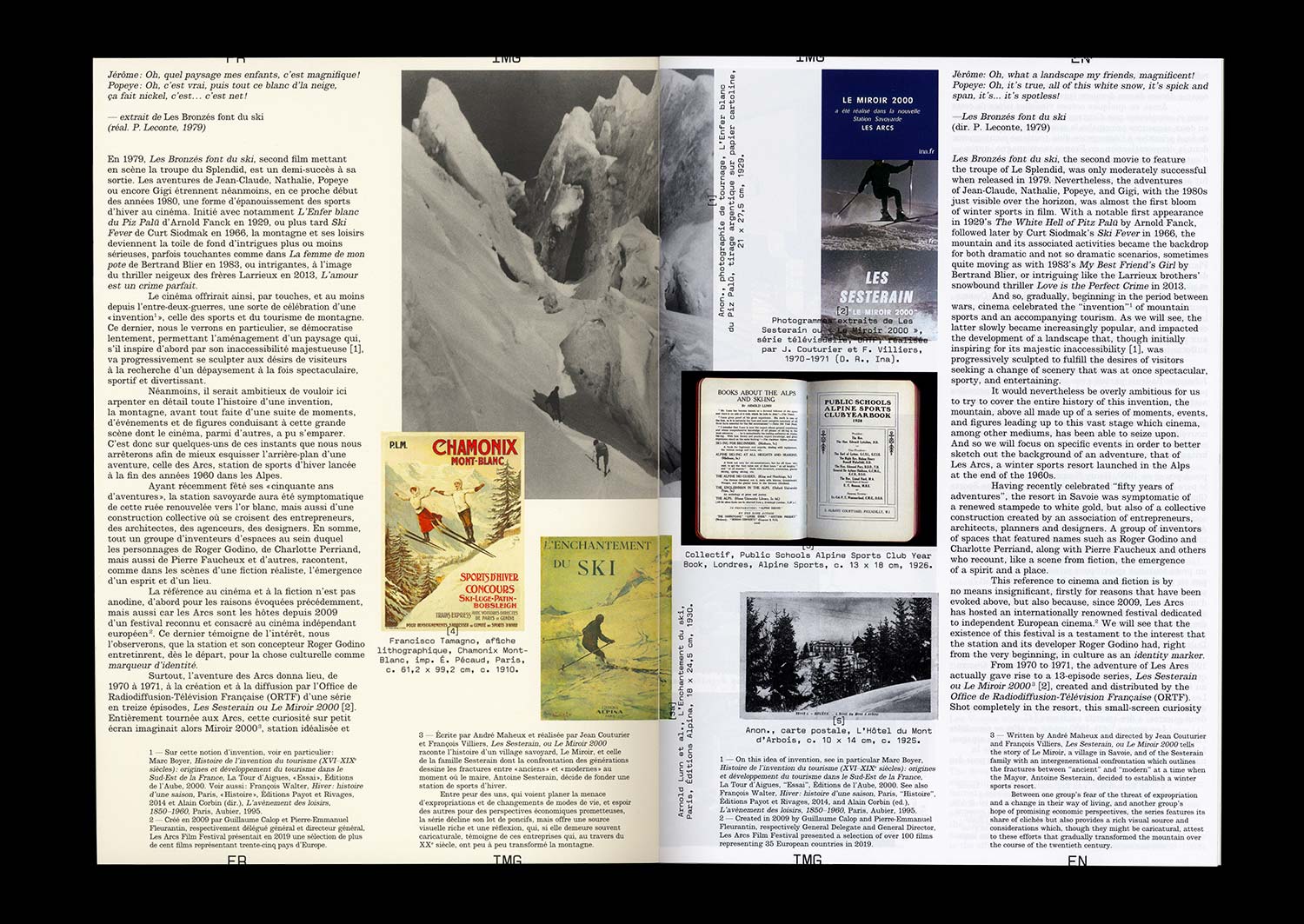
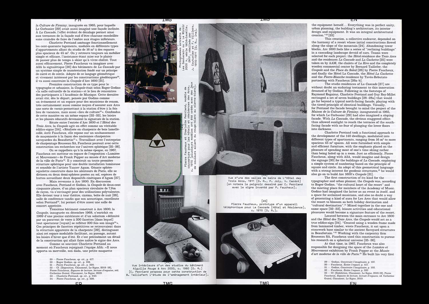
n°20 — A ski resort: Pierre Faucheux and Les Arcs. From the space to the sign. Author: Catherine Guiral
Author: Catherine Guiral
20 pages, 21 × 29,7 cm, CMYK
4th March 2020
ISBN: 979-10-95991-16-8
ISSN: 2558-2062
Author: Catherine Guiral
20 pages, 21 × 29,7 cm, CMYK
4th March 2020
ISBN: 979-10-95991-16-8
ISSN: 2558-2062
Known as “the man of a hundred million covers” and for being a major actor in the history of French Graphic Design during the Trente Glorieuses, the three decades of flourishing economic and cultural activity in France following World War II, Pierre Faucheux also had a rich activity as an architect. At the end of the 1960s, Charlotte Perriand invited him to become involved in the adventure of constructing the winter sports resort called Les Arcs. “The construction of a fantasy” designed by engineer Roger Godino, Les Arcs, a different type of Savoyard resort, would find itself embodied in a particular sign, which expresses the different instincts that Faucheux had for both the space and its transformation.
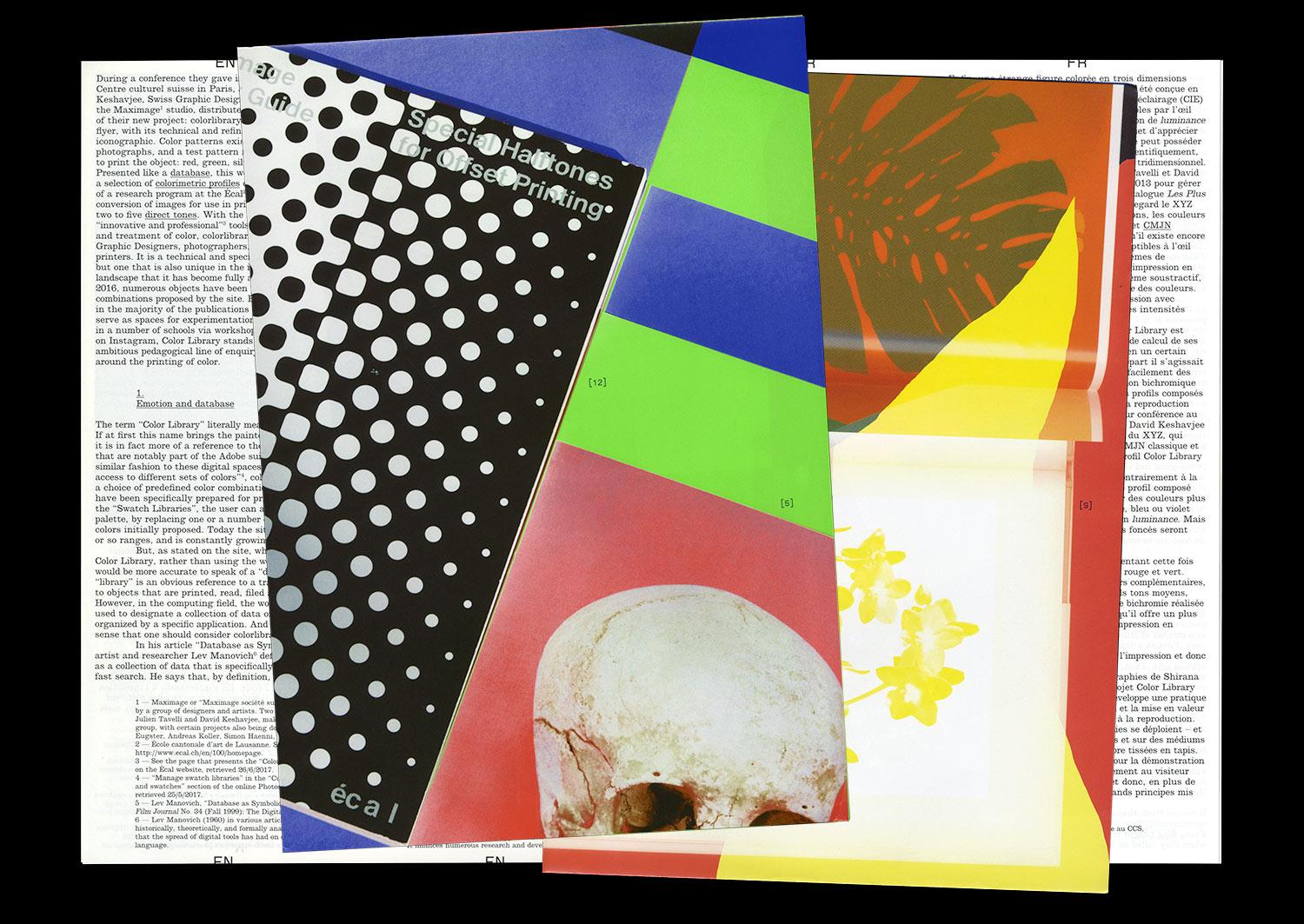
n°02 — A technical platform: Colorlibrary.ch by Maximage. Author: Manon Bruet
Sold Out
Author: Manon Bruet
12 pages, 21 × 29,7 cm, black and cyan + 1 A2 poster, 3 PMS
+ 1 A2 poster, CMYK (reserved for subscribers) (sold out)
8th November 2017
ISBN: 979-10-95991-04-5
ISSN: 2558-2062
Sold Out
Author: Manon Bruet
12 pages, 21 × 29,7 cm, black and cyan + 1 A2 poster, 3 PMS
+ 1 A2 poster, CMYK (reserved for subscribers) (sold out)
8th November 2017
ISBN: 979-10-95991-04-5
ISSN: 2558-2062
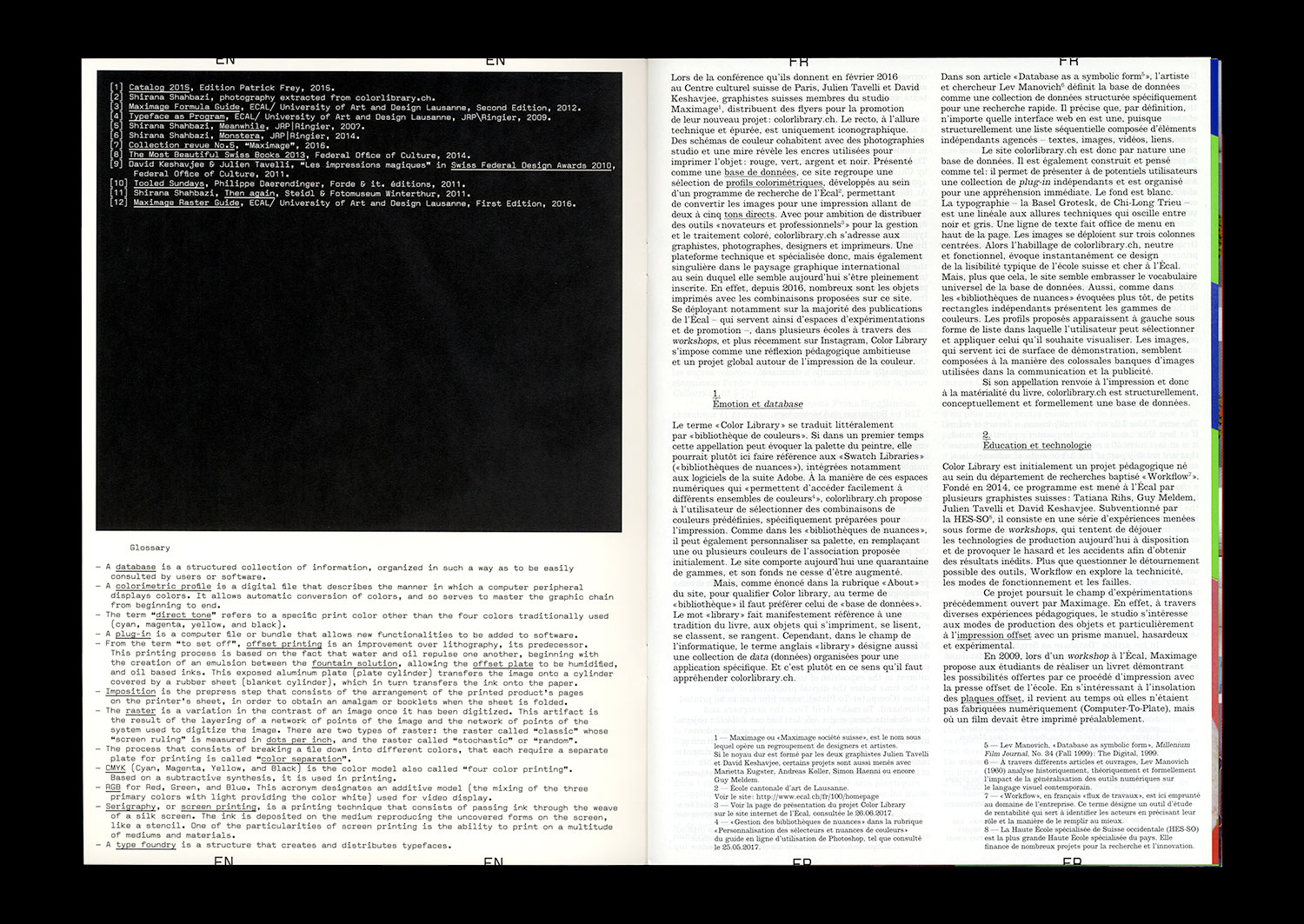
The Workflow research project, run by Tatiana Rhis, Guy Meldem, and Julien Tavelli and David Keshavjee (Maximage) at the Écal, is interested in current technologies of the printed object. It consists of a series of experiences that attempt to circumvent currently available production technologies, provoking coincidences and accidents with the goal of obtaining new outcomes.
More than simply questioning the possible circumvention of tools, Workflow explores technicality, modes of functioning, and flaws. In this way, the programme pursues the field of experimentation opened up by the Swiss studio Maximage since 2008. In the context of their degree project at the Écal, Julien Tavelli and David Keshavjee already combined manual and digital techniques so as to develop their own production tools, and notably their own printing methods. From their experiments have emerged, among other things, the Programme typeface, and the Les impressions magiques publication, that appears today as a manifest object of their approach.
One of the first results of the Workflow programme has been the creation of a series of colorimetric profiles that allows the conversion of digital images for printing with one, two, three, four, or five accompanying colors, whether they are basic (CMYK), pastels, fluorescent, or metallic.
The work on these profiles has two aims. It serves to increase the awareness of students at the Écal with regard to the management and theory of color, but it also allows, for the first time, the automation of operations and settings that have until now been done on a case-by-case basis through the manual use of image-editing software and CAD.
Advocating an “innovative” and “professional” solution for the treatment of color, the Écal and the Workflow programme launched the website colorlibrary.ch in 2016 and offered the profiles for sale. The platform appears as an online library that presents a large variety of profiles with different colorful combinations. The different profiles are displayed on screen, applied to images by Iranian photographer Shirana Shahbazi; they seem to replay the codes of Photoshop type images–from the butterfly to the eye, the still life to the waterfall.
Beginning with an analysis of the structure of this platform, the aesthetic and terminological languages that it summons, and their limits, we will open a number of fields of investigation, more widely linked to the question of the tools and modes of production of images.