n°53 — Les graphistes iconographes. Auteur: Thierry Chancogne


Texte : Thierry Chancogne
80 pages, 21 × 29,7 cm, CMJN + 1 PMS
octobre 2025
ISBN : 979-10-95991-59-5
ISSN : 2558-2062
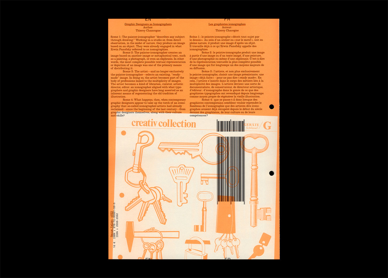
Scène 1 : le peintre-iconographe « décrit tout sujet par le dessin ». Au sein d’un atelier ou « sur le motif », soit en pleine nature, il produit une image d’après un objet. Il travaille déjà à ce qu’Erwin Panofsky appelle des iconographies.
Scène 2 : le peintre-iconographe produit une image à partir d’une image ou d’un texte imagé, d’une peinture, d’une photographie ou même d’une ekphrasis. C’est-à-dire de la représentation textuelle la plus complète possible d’une image qui fut longtemps un des moyens majeurs de sa diffusion.
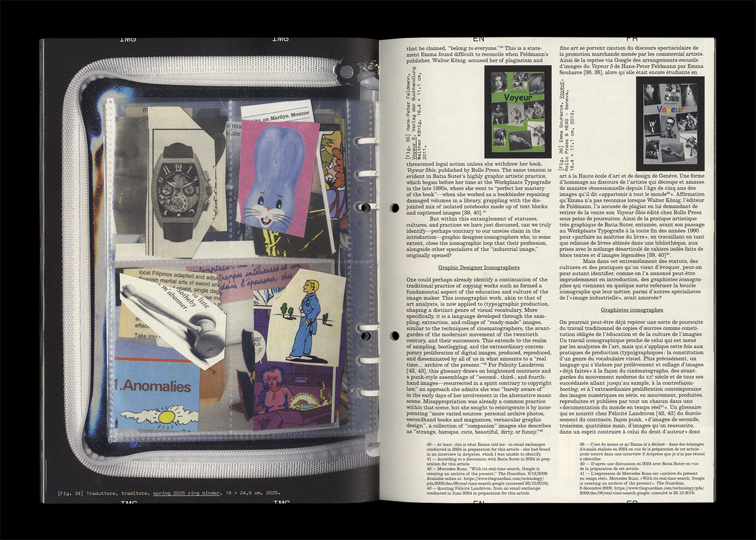
Scène 3 : l’artiste, et non plus exclusivement le peintre-iconographe, choisit une image préexistante, une image « déjà faite » – pour ne pas dire « ready made ». En cela, l’artiste s’inscrit dans le corps des métiers liés à la multiplicité des images. L’artiste devient une sorte de documentaliste, de conservateur, de directeur artistique, d’éditeur : d’iconographe dans le genre de ce que des graphistes typographes ont revendiqué depuis longtemps comme moyen propre de régénérer la vieille illustration.
Scène 4 : que se passe-t-il donc lorsque des graphistes contemporains semblent vouloir reprendre le flambeau de l’iconographie que des artistes dits iconographes avaient déjà récupéré depuis le début du siècle dernier des graphistes, de leur culture ou de leurs compétences ?